UNIT ONE
THE BUILT ENVIRONMENT
Statement of Intent
No matter where you look, you are bound to find a rich variety of structures and buildings. Whilst on rare occasions we may be awestruck by modern and innovative designs, its habitual to encounter some that may appear run-down or dilapidated. But every single mark that has ever been made, from the tarmac on a road to breathtaking ancient ruins, all has a history and has been constructed with human dedication. Too many of us fall guilty to disregarding these creations on a daily basis and taking our surroundings for granted. However, simply the environment around us can determine cultural heritage and disclose more about a place than words ever could. Through this project, my aim is to showcase the wonder and beauty of this built environment. I aim to not only shed light on its importance, but also the sense of community and emotions it can create.
Research
What constitutes as 'the built environment'?
The built environment, by definition, is simply the man made surroundings that provide a setting for human activity. Whilst this typically connotes with city buildings or ancient structures, it actually entails much more than we may initially think. This could be any material, spacial or social product of human labour: from parks, green spaces, neighbourhoods and energy supplies. All of these things, no matter how big or small, contribute to the built environment that surrounds us.
The importance of the built environment
Various studies have shown that the built environment around us can be a contributing factor to one's overall wellbeing. A study conducted by the World Green Building Council states that access to natural light and views of nature not only improves ones mood, but can increase productivity and enhance overall wellbeing. Similarly, research undergone by the University of Exeter found that individuals who live in areas with more green spaces reported less mental distress. However, even something as simple as building design can have a profound impact. According to the Project for Public Spaces, well-designed public spaces can create a sense of connection and belonging, promoting social interaction. On the contrary, poorly designed spaces can lead to feelings of isolation and disconnect.
Gathering ideas
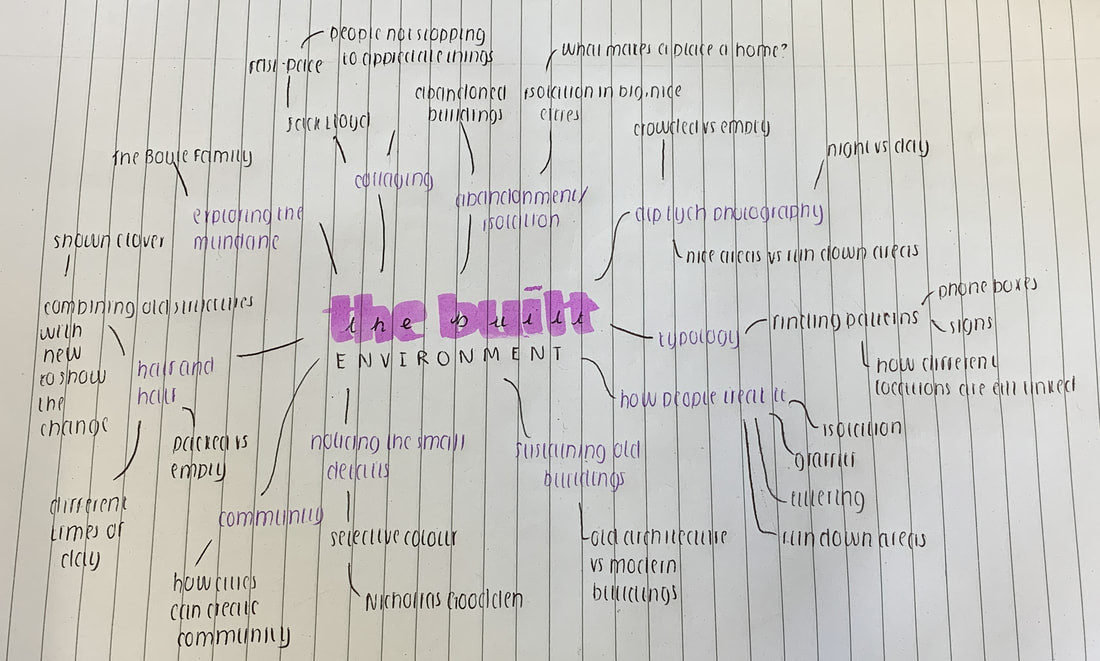
Mood board
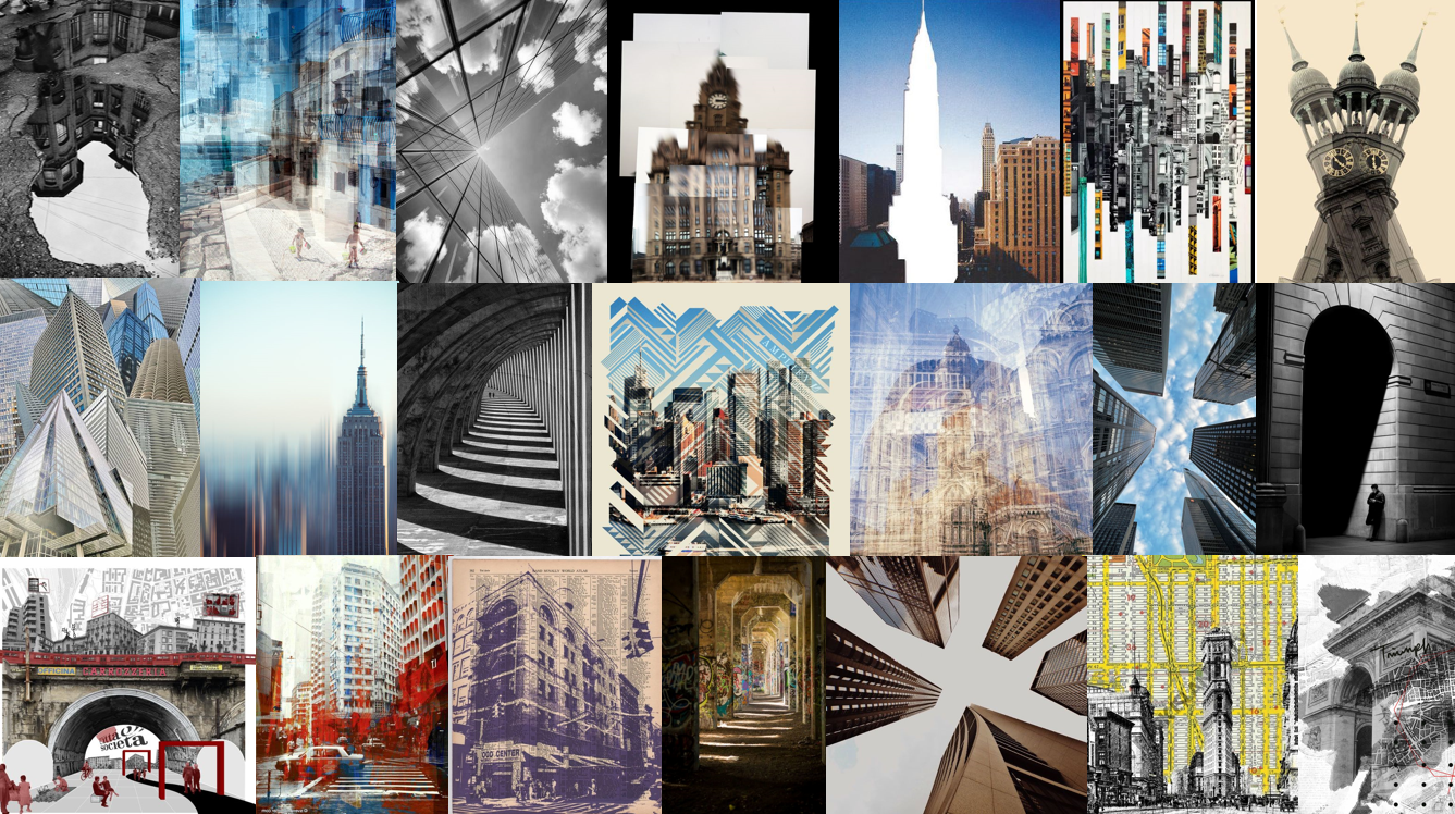
Reflection and targets
Artist analysis
Artist one: Karen Vikke
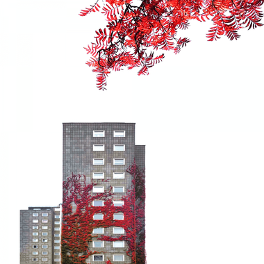
This piece has been created by Karen Vikke, a mobile photographer most well-known for her minimalist shots of buildings. This image combines a simple structure with elements of nature. Vikke displays architecture using a minimalist style, making her work stand out amongst the rest.
Vikke has displayed colour interestingly, using predominantly greyscale shades with a burst of warmth for the leaves. This creates a stark contrast between the man-made structures and the natural elements of the piece, giving the illusion that they are both fighting for the attention. Additionally, Vikke does not display much tone in the piece to create the effect that the piece is two-dimensional. Rather than immersing the viewer in a real location, this makes the work feel more abstract and places a focus on shapes rather than the place itself. Vikke effectively draws attention to this structure by using the rule of thirds and filling the rest of the frame with a plain background. Not only does this set the intention but also ensures that the viewer cannot be distracted by anything else. This empty space also helps the texture in the building and leaves stand out.
To reach this outcome, Vikke has likely used an editing software, such as 'Photoshop.' This can be assumed as this work is from the modern day, when there is an abundance of technology for this. Additionally, the clean and precise lines hint to this, since this level of accuracy would be incredibly difficult to replicate manually. Vikke has likely used the 'Object selection' tool to select the objects she wishes to keep and eliminate the rest, achieving a plain background. This tool would also come in handy to create the selective colour as it would allow her to only use a filter for certain areas.
This piece may evoke feelings of serenity due to its simplicity. Architectural photography is typically jam-packed with bustling city-scrapes, making this piece feel like a breath of fresh air. The warm colours of the leaves emphasize this mood as they evoke feelings of warmth and energy. Furthermore, the negative space plays a role in this feels more calming rather than a shot filled with people and action. This piece can evoke a sense of peace and serenity due to the simplicity of the work. Architectural photography is often jam-packed with big city scrapes, yet this piece feels like a breath of fresh air with not much going on. The warm colours of the leaves add to this mood as they evoke feelings of warmth and energy. Additionally, the negative space plays a role in this as it creates that space and calmness.
Through her photography, Vikke could be trying to encourage her audience to celebrate the mundane and notice the minor details. From day to day, many people walk past these structures without a second thought. Vikke's message to people could be to look around and appreciate the beauty in the little things that are so often overlooked. An additional interpretation of this piece could be exploring the conflict between humanity and nature. Vikke could be trying to highlight that nature is slowly fading and fighting for attention. This work differs from modern photography as it is typically experimental due to an abundance of technology available. Society often values quality over quantity, therefore taking things away and celebrating simplicity is relatively unheard of.
Artist two - Sergio Castiglione
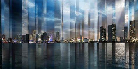
This piece has been created by Sergio Castiglione, an award-winning Argentine photographer with an eye for capturing urban, travel and architectural shots. With this piece he has used clever collaging to combine different lighting together, subsequently creating a stunning wide-angle shot of a city as the result. This piece, taken from the collection 'SegMoments,' is called 'Chicago.' The name of this collection suggests that rather than photographing random segments of buildings, he is instead capturing the feelings that come from moments spent in the city. Whilst the genre of this piece is architectural photography, Castiglione takes an interesting spin on the subject as he focuses more on emotion rather than structures.
Castiglioni has displayed a clever use of several techniques, including the use of 'negative space.' This combined with the wide angle shot creates an effective outcome as it makes the viewer feel separated from the action and as though they are merely observing from afar. Because of this, rather than being able to see texture and minor details, there is instead a focus on the rectangular shapes of the structures. However, these shapes are not completely visible as they are distorted and separated into sections, creating a sense of mystery and allowing the viewer to draw their own conclusions. Sporadic lines of different sizes divide this image, effectively portraying the unpredictable and spontaneous nature of big cities. With each new section comes different lighting choices, with some brighter and dimmer than others, highlighting how ever-changing this place is. The variety of lighting creates a dramatic contrast, mirroring the diversity that can be found in these cities. Despite the uniqueness of these sections, there is a generally cool colour scheme prevalent throughout the piece. One on hand, this could evoke feelings of peacefulness due to its connotations of nighttime when the world winds down. However, it could also create a sense of energy as this could also be the time when the city comes to life.
Castiglione undertook a clear process to achieve this result. One can assume that an editing software, such as Photoshop, has been used to due to the clean and precise lines. The date of the work also hints to this as in the modern day there is access to an abundance of technology like never before. To reach this outcome, Castiglione likely captured multiple different shots of the same location and collaged them together. This would not be as successful without a tripod as this ensures the camera will remain still so that the sections can align perfectly.
One could describe the mood of this piece as serene and peaceful. This is due to the wide angle shot that creates a sense of separation from the hustle and bustle of everyday life. This disconnection effectively puts things into perspective and makes life feel less overwhelming and hectic. Furthermore, the cool colour scheme adds to this mood as it has connotations of winding down and calmness.
One can assume that through his work, Castiglione is trying to bring different locations to life and ultimately capture the feelings of the place rather than just the structure. Since not everybody has the resources to visit these places, Castiglione may want to recreate the feelings associated with places so that more people worldwide can appreciate them from the comfort of their home. Additionally, Castiglione could be trying to communicate the importance of gaining perspective. When you are amid action and chaos, things can feel overwhelming and hectic. However, Castiglione could be trying to provide people with comfort from stepping back and focusing on the bigger picture. This is linked to other works of the time as in the modern-day access to an abundance of new technology makes it easier for artists to be much more experimental. Furthermore, this relates to the geographical history of the time as it depicts modern architecture that could not be found centuries ago.
Artist three - David Hockney
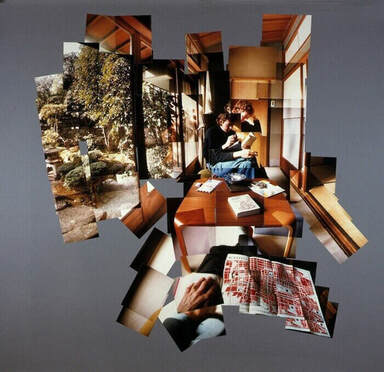
This photograph was captured by David Hockney in the 1970s and captures the inside of a house, with beautiful scenery outside the window. Hockney named this work, 'Joiners' as it is evident that the final product has been made by joining several photographs together. The style of his work would be experimental landscape as he has clearly come up with this by being creative and trying new techniques.
The many techniques in this image are what make the photograph so interesting. Firstly, Hockney cleverly uses space by intentionally choosing not to fill the entire frame. By doing this, it disconnects the viewer from the image and makes them feel like more of an observer, rather than being part of it. When looking closely, different lines can be seen where the pictures don't quite line up. This intentionally 'messy' look adds more interest to the image and explains why Hockney didn't just take a single photograph in the first place. Additionally, Hockney uses repetition as every individual photograph is the same size. This has been done to ensure that the image still looks organized, even if it is supposed to be slightly imperfect. Furthermore, Hockney uses warm and natural colours for this image rather than making it overly saturated. This ensures that the piece looks realistic and natural as he wants it to seem like an ordinary occurrence taken from everyday life. The strong contrast that can be seen In many areas make certain places stand out and ensures that the outline of the room is clear. Finally, Hockney uses texture as the different images stacked on top of each other are evident, creating a cluttered look.
There are several different processes that may have led Hockney to his finished outcome. Firstly, he would have needed to take several different photographs and compile them together, which can be done by using one of two processes. One of those could be using the editing software 'Photoshop,' to automatically compile them together. However, another possible method could be printing these Photographs out and physically sticking them together. This is the more likely method, as it is evident that the photos don't align perfectly together and have an intentionally messy look.
This work may make a person feel invasive, as it is almost like the viewer is observing someone's home and invading their personal space. Since Hockney hasn't filled the entire frame, it creates the illusion that a viewer is peering in and not fully included in the image, adding to the invasive feel. The fact that Hockney has included humans in this image also adds to this since this feels very personal to them, as though you are watching their daily lives.
I think this artist is trying to say that photographs don't need to be 'perfect' and that making them look somewhat 'messy' can have an equally as successful outcome. This could be since Hockney was quite critical of photography in his early career, meaning this may be his way of compromising. This image differs from art of the time because in the 1970s photorealism was increasingly popular, so here Hockney could be trying to make something different than the norm and more abstract. This could also link to films of the time since the amateur filmmakers began to have more control over their films and more creative freedom, which could have also been translated into photography, explaining why this is so experimental. Furthermore, at this time wide angle lenses were popular, which Hockney didn't like the idea of, so this could have been his way around that.
Artist four - Giacomo Costa
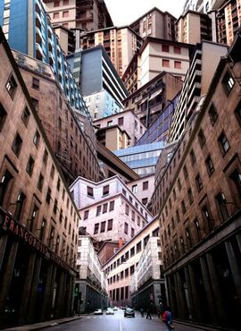
This Photograph, captured by Giacomo Costa, appears to be showing a city street with several buildings stacked on top of each other. Costa calls this piece, 'Kyle Bunker Macdonald,' which gives me the impression that this is a very specific location which could mean something to him personally. The style of this photograph is experimental landscape as he has clearly taken a creative approach.
Costa has used a variety of techniques to create the final image. Firstly, his use of leading lines creates the sense that the viewer is included in the image and standing in this street. The road growing increasingly smaller also helps with this illusion. Costa uses many different shapes in the buildings, purposefully making each one unique. This gives the image a 'busy' look and makes it appear less predictable. Costa also adds to this unpredictability by using a mixture of colours, some more natural and others slightly more vibrant. Additionally, Costa makes the middle of the image the most brightly lit so that the viewer's attention is immediately drawn there. Costa has chosen to make this place the brightest as it is at the end of the road, which adds to the feeling of being part of the image. It is evident that the buildings closest to the front are darker to deter the viewer from looking there and directing their focus towards the centre. Furthermore, Costa uses a strong contrast between light colours and darker colours to make the piece more interesting and eye-catching. If he had filled it with bright colours, it may not have stood out as much or looked slightly unrealistic. However, if he had done the opposite and filled the piece with darker colours it may have looked dreary and lifeless. By establishing a balance between the two, he creates a realistic but eye-catching image. Finally, by filling the entire frame it makes the buildings feel overpowering but also makes them the focus of the image, so that the viewer can't be distracted by other elements.
Costa has used a clear process to reach the final image. One can assume that the editing tool 'Photoshop' has been used. There are many indications to this in the image, such as the way the buildings slot perfectly together, even though the viewer knows it can't be real. One can also assume that Costa has photographed many different buildings from different locations and added them into this image since many of the buildings look completely different and don't look as though they'd be found together.
This piece could make a viewer feel small or slightly claustrophobic. This is due to Costa filling much of the frame with huge overpowering buildings. This gives the illusion that the buildings are towering over you, making the viewer feel small. This could also make a viewer feel claustrophobic as there is no other space in the image apart from buildings. Additionally, Costa adds to this mood by taking the image from a low angle. This creates the illusion that the viewer is included in the image and standing in the city street whilst also creating the effect that the buildings are towering over them.
One may believe Costa is investigating the relationship between cities and human behaviour and nature in his work. Perhaps this image could represent how humans are constantly expanding and growing cities to the point where they are overpowering and there is less and less nature. This can be seen in the image as the humans look miniscule compared to the huge overpowering buildings. Furthermore, this relates to other art of the time as in the 90s abstract art was growing increasingly popular. However, this also slightly differs from the common themes as it lacks the vibrant and bright colours of this time. Additionally, this piece also links to context of the time since technology was steadily improving meaning that new software could be used to experiment with.
Artist five - Varun Thota
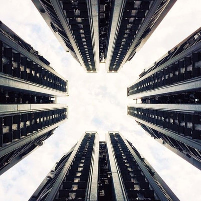
This image was captured by Varun Thota, a product designer and photographer situated in Hong Kong. It depicts a low angle shot of skyscrapers towering over the camera. This piece relates to his other works as he is notorious for his architecture shots of buildings taken from low down.
Through the low angle shot, Thota effectively immerses the viewer in this location. This technique makes an observer feel small, as though the buildings are towering over them. By using a central composition and leading lines, Thota cleverly draws the focus to the sky. This area is more well-lit than the buildings, which not only draws attention there, but could also suggest that there is a brighter world beyond the city. Furthermore, the piece is made up of perfectly symmetrical rectangular shapes, with each building being perfectly the same. This repetition is not only visually appealing but is also what makes the illusion so effective. These buildings really come to life because of the tone, which creates a three-dimensional effect.
Since this image is perfectly symmetrical, one could assume that Thota photographed only one building and then went on to duplicate and flip this using Photoshop. However, certain clues in the image suggest otherwise. The subtle reflection in the buildings shows that this is just the natural state of the buildings that has not been adjusted by an editing software. To create this outcome, Thota would have instead simply taken the shot at a low angle.
One could say that this piece has an uncomfortable and eerie mood. The low angle shot adds to this since the towering buildings create a sense of claustrophobia. Additionally, the lack of colour has a significant impact as it creates a more solemn tone that does not evoke any strong emotions.
Through his work, Thota could be trying to show his audience the sheer scale of cities. Since many people may not be able to experience these locations first hand, Thota could be trying to capture the feeling of being there. However, rather than glamorizing these locations, he could be trying to point out the harsh reality of how overwhelming and suffocating these places can be. This relates to the history of the modern day as since resources and technology are expanding, cities are also expanding. This comes as no surprise that Thota is trying to show the nature of how overpowering these structures are becoming.
SHOOT ONE
Nichollas Goodden
Examples of artist
Artist analysis
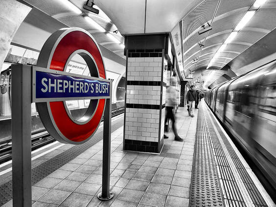
This piece has been captured by Nichollas Goodden, a full-time photographer based primarily in London and the South. This is evident throughout his work since most of his images explore different areas in the city of London. This piece is included, capturing a wide angle shot of the London Underground. This piece fits into the genre of documentary photography as it shows the mundane everyday lifestyle.
Goodden has made this image predominantly black and white, excluding a small area of vibrant colour. This could imply that the real colour and beauty in life is found in the little details that are often overlooked. Goodden cleverly uses leading lines and an eye-level shot to create the illusion that the viewer is part of the image rather than being distant from the scene. Moreover, the use of positive space makes the piece feel jam-packed with a lot of action and conveys the chaotic nature of the underground. The use of long exposure not only emphasizes this, but also brings the piece to life and creates a sense of movement. Other details, such as texture on the floor, make this piece more lifelike and allows the viewer to be able to place themselves in that scenario.
To reach this outcome, Goodden has likely used a tripod, as evidenced by the motion blur in certain areas contrasting with the sharpness throughout the rest of the image. This outcome would only be possible if the camera was kept completely still for a prolonged period. Additionally, to achieve the selective colour, Goodden would have edited this image using Photoshop. To do this, he would have simply used the 'object selection' tool followed by a use of filters to bring colour to a specific area.
One could argue that this piece has an uncomfortable and claustrophobic feel to it. This has been created by the composition of the image, as the eye-level shot combined with the curved lines of the ceiling makes the viewer feel like they are part of the image and trapped in the confined space. Moreover, the lack of colour contributes to this as it removes any feelings of comfort or reassurance.
Through his work, Goodden could be trying to communicate that in big cities, life can often feel dull simply because people are in a constant rush and hardly stop to look around. In doing so, they could be missing the colour of life that can be found in the minute details if only one looks for it. Goodden could be trying to encourage people to slow down and appreciate the little things around them, which will subsequently bring the colour back into their hectic lives. This work could be targeted at those who live in big cities, such as London, who are accustomed to the hustle and bustle. This is accurate to the modern day as overpopulation of cities means that they can become easily crowded and overwhelming.
Elements to take inspiration from
- Low shutter speed
- Selective colour
- Vibrant red colours
- Photographing vehicles and signs
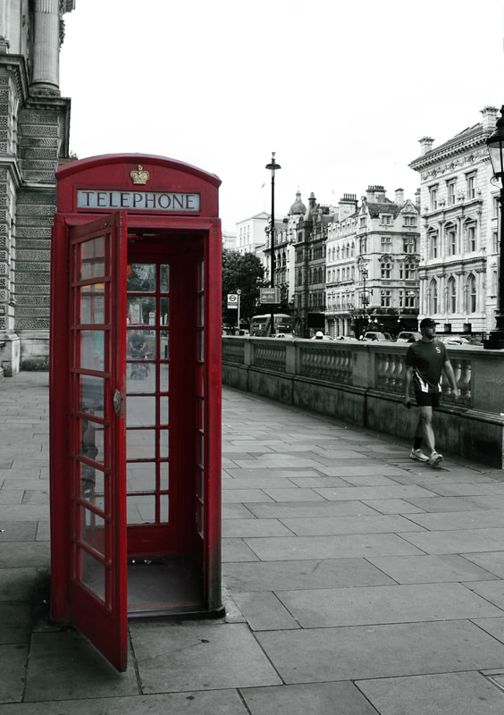
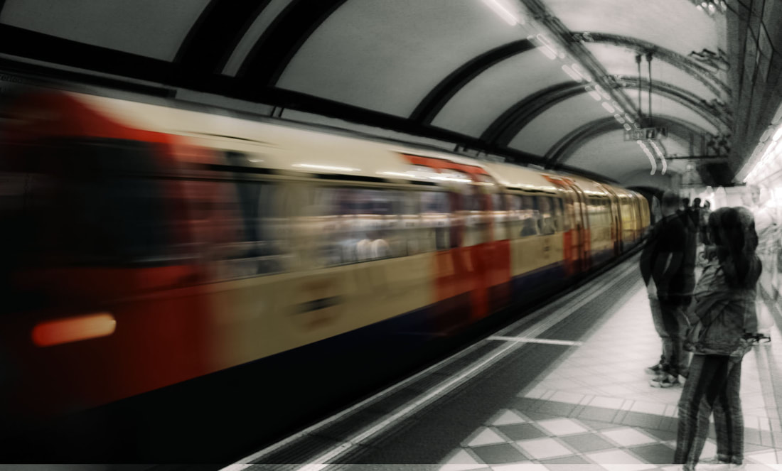
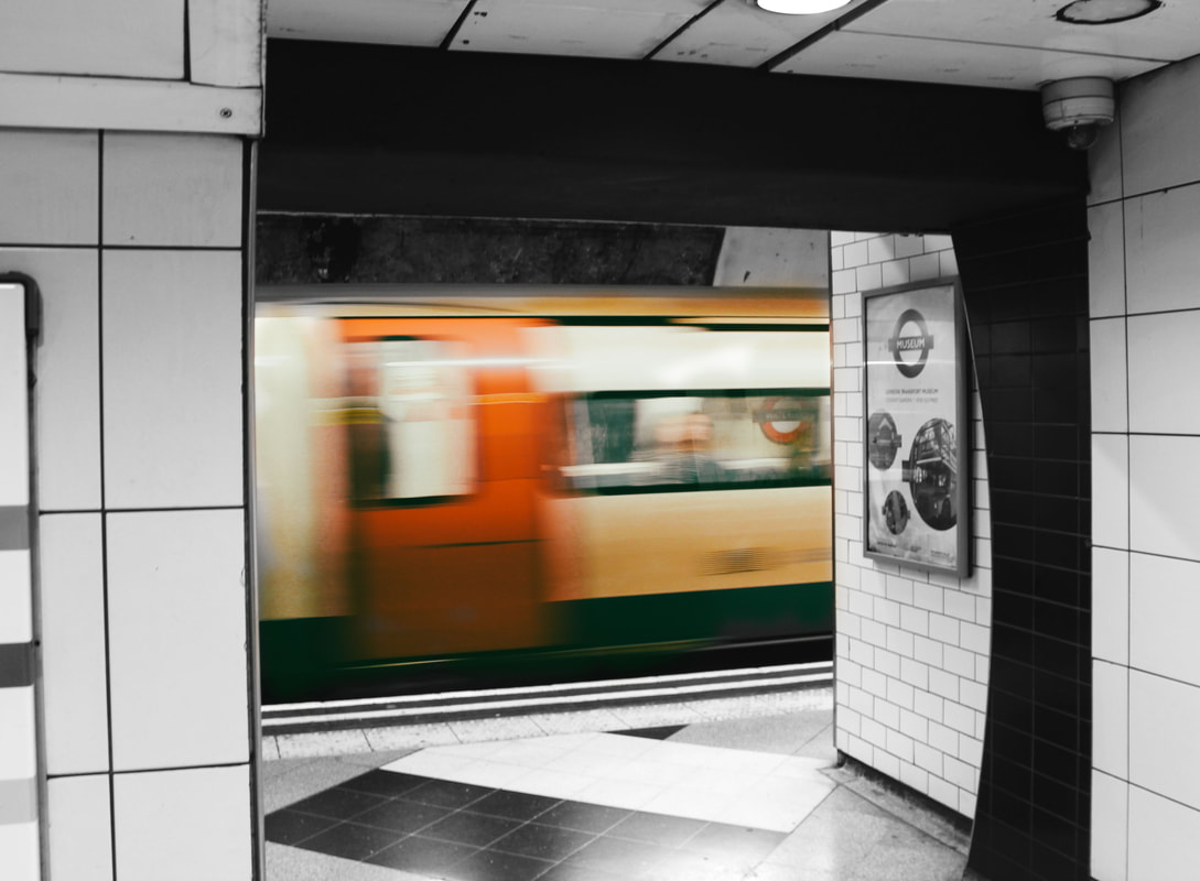
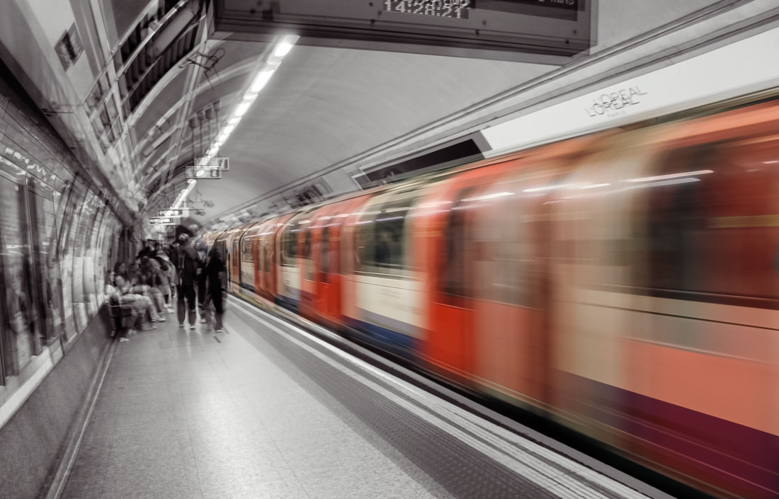
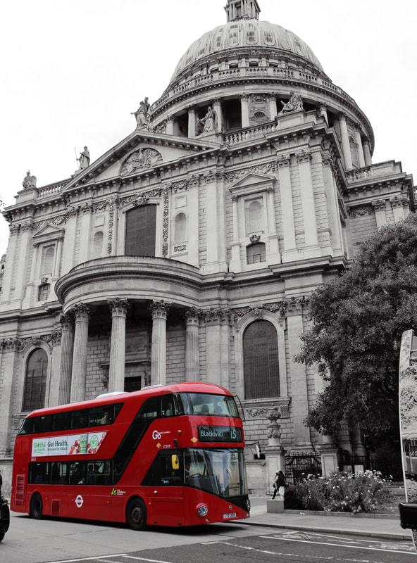
Informed by the work of Gooden, I decided to capture images of iconic symbols assosciated with London. Gooden inspired me to find art and beauty in the small, mundane things that locals would encounter day to day rather than renowned landmarks. For example, red buses, subways and signs, all things that are seen on a day-to-day basis and may be overlooked. This technique shows that the built environment does not need to be magnificent, but is all around us.
Contact sheets
Process
Step one - Firstly, I opened two copies of the same image on Photoshop and layered them on top of each other.
Step two - Following this, I converted one of these to black and white and left the other in colour to create a contrast between two areas.
Step three - Taking the top image, I used the 'object selection' tool to select the area I wished to have in colour.
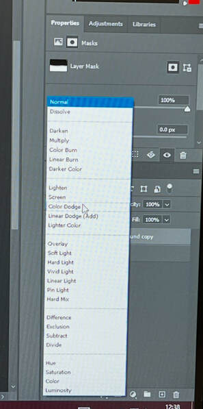
Step four - Once I had this area selected, I used the mask tool along with a soft brush to reveal the colour from the layer underneath, to place emphasis on this specific area.

Final edits
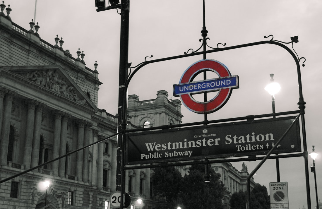
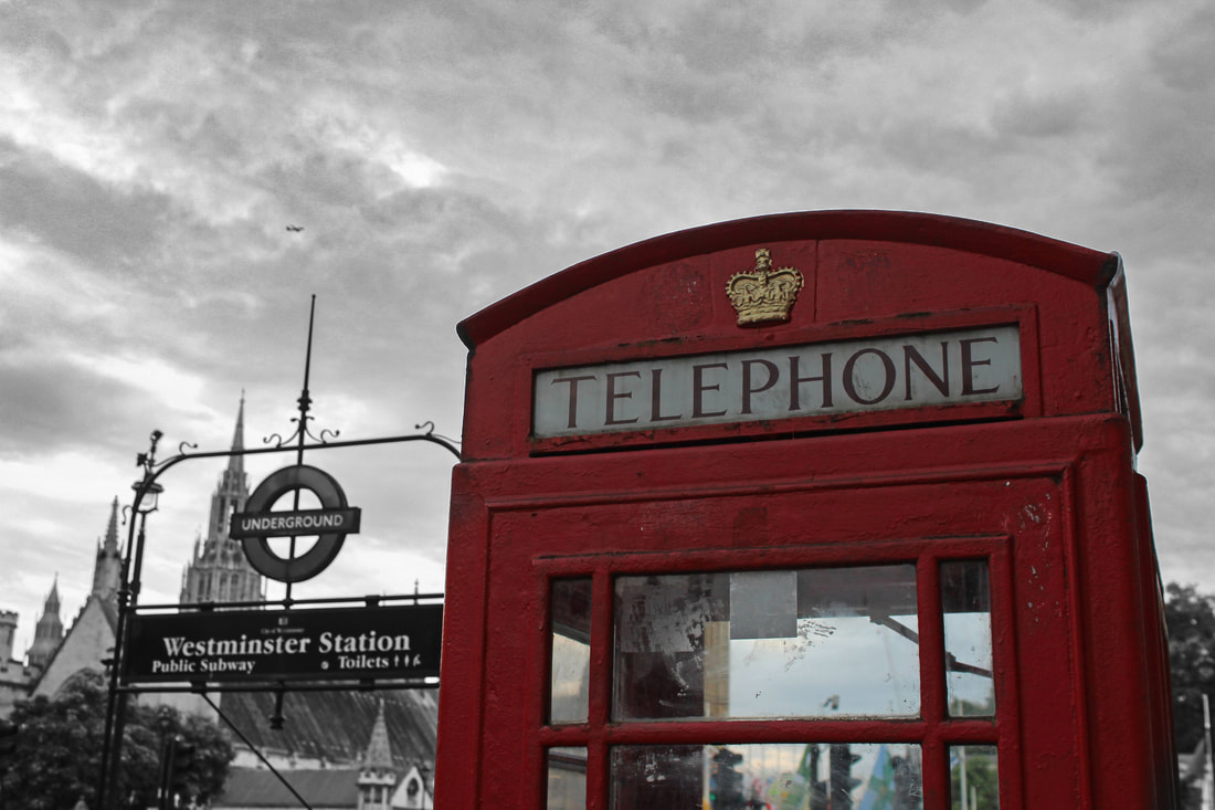
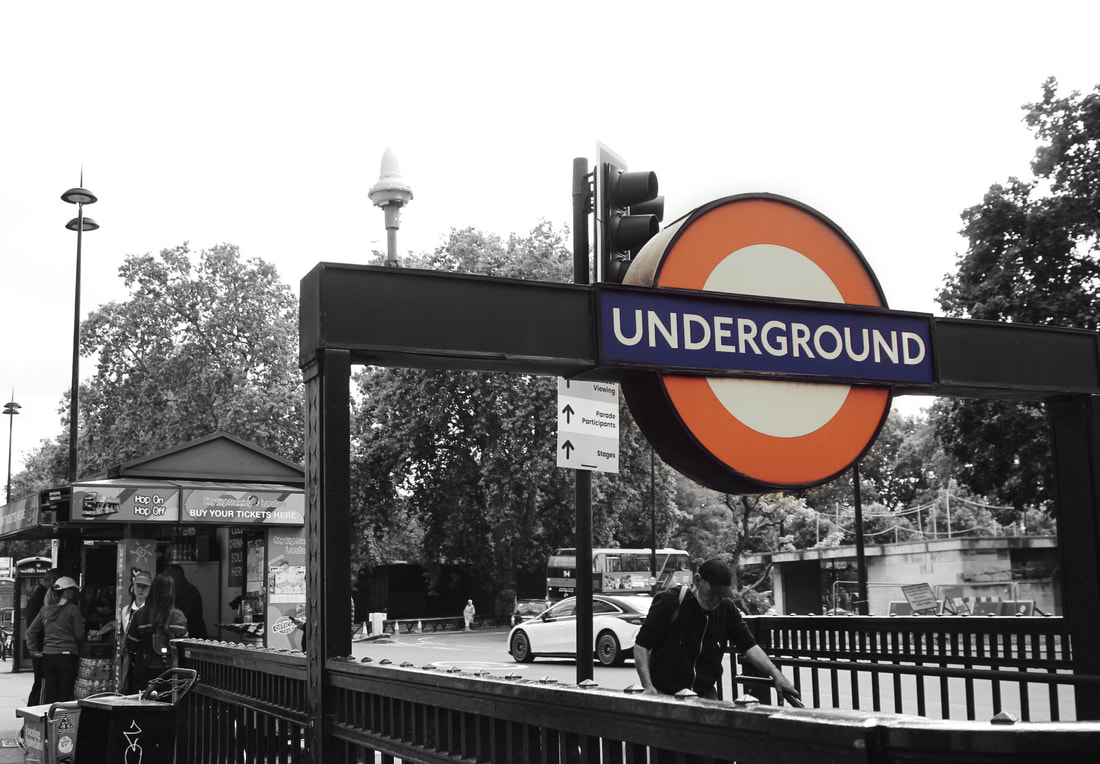
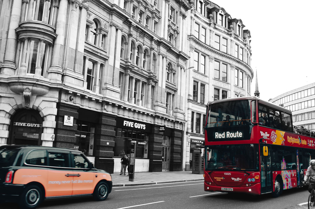
Meta data
Image one - 1/20 sec, f/3.5, ISO 400
Image two - 1/10 sec, f/3.5, ISO 125
Image three - 1/40 sec, f/5.0, ISO 3200
Image four - 1/100 sec, f/5.6, ISO 640
Image five - 1/100 sec, f/5.6, ISO 200
Image six - 1/200 sec, f/5.6, ISO 100
Image seven - 1/160 sec, f/6.3, ISO 100
Image eight - 1/10 sec, f/3.5, ISO 200
Image nine - 1/320 sec, f/6.3, ISO 100
Hanging plan
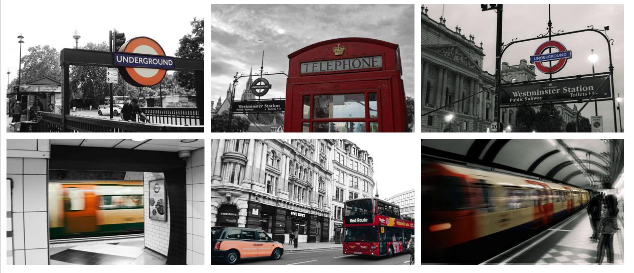
When presenting these images, I decided to display them as a set of six landscape photographs. Whilst I had several portrait images, I ultimately decided to exclude these as they didn't work as well as a set. If I did choose to include these, it could have become quite repetitive, as they contain similar subjects that appear in the final images such as telephone boxes and vehicles. Notably, there was one more landscape image that I excluded, which was an image of a London subway system. Since this was so similar to the other Subway image, I decided that there was no need for both as this could become repetitive. Out of the two, I concluded that the one in the final presentation was a stronger image since I liked the darker, dramatic tones. With these six final images, I kept all vehicle related photographs on the bottom row, and all the photographs related to signs or structures on the top. With this bottom row, I then placed the images of trains on either side, with the bus in the middle. This similar effect is mirrored on the top row, where I placed the signs on either side and the phone box in the middle. All of these decisions help to neatly present the images and make the outcome clear and organised. This also creates visual symmetry and ensures that none of the images clash.
Evaluation
Studying this artist has allowed me to expand my skillset, teaching me how to use masks effectively to make different layers show through. However, this artist has taught me the importance of colour in photography and how the use of it or lack thereof can have a profound effect on the outcome. Throughout this process, I have had to use a creative eye to select which areas work best in colour and what effect this can create. So much about the piece can differ depending on which areas are in colour, and going forward this will help me to understand how I can use this to my advantage and evoke different emotions through my decisions around colour. If I was to repeat this process, I would experiment with how these shoots would look in a completely secluded setting in contrast to bustling settings. It would be interesting to see not only how colour can affect an image, but also how the amount of people in the piece can have a significant impact on the overall mood. To develop this work, I have decided to use these techniques of colour to take a more graphic approach.
Development
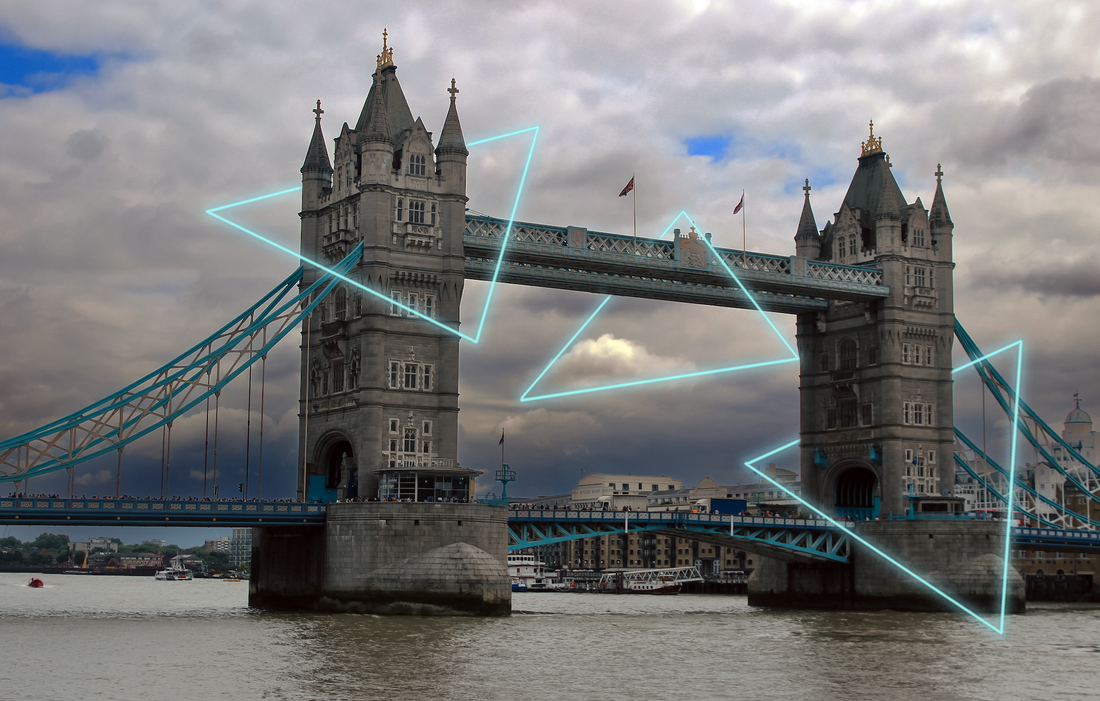
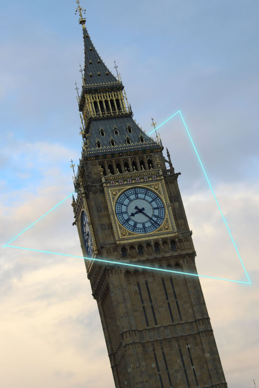
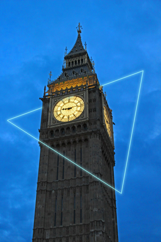
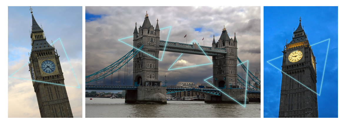
All of my images so far use colour to draw the viewer's attention to a given area. This has been useful, as not only can it create a moody effect, but it can change the focus of the image. However, I decided to see how manipulating colour could be used to do the complete opposite. Instead of using colour to restrict the viewer's attention to one area, I wanted to use it to be a celebration of architecture and place focus on all the buildings as a whole. To achieve this, I decided that instead of changing the colour of the buildings, I would take a more graphic approach and add colourful shapes on top. I placed these shapes around the important landmarks, to make it appear like they are haloing them. This is a great way to celebrate the built environment and make the viewer notice all of it, not just one part.
Meta data
Image one - 1/20 sec, f/3.5, ISO 400
Image two - 1/200 sec, f/5.6, ISO 100
Image seven - 1/10 sec, f/3.5, ISO 200
Hanging plan
Evaluation
Through these shoots, I have learned how colour can be a useful tool in storytelling. This will be useful for my project, as I know now how to effectively use colour to place emphasis on certain areas of the built environment, changing the overall mood of the piece. With this development, I have also pushed myself out of my comfort zone and learned several practical skills, such as creating graphics. Despite these taking a lot of trial and error, they will be useful going forward since adding these extra touches can enhance my images and tell more of a story. Overall, I was pleased with the outcome of these images. I believe that whilst both the initial and developmental images worked well, they both had different effects. I was pleased with how, even though they are very abstract, the graphics seemed to blend in seamlessly and fitted into the piece. If I were to improve, I would try experimenting by changing the colours of the graphics to see if this could effect the overall mood of the piece.
SHOOT TWO
THOMAS VANOOST
Examples of artist
Artist analysis
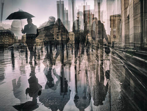
Thomas Vanoost, the photographer behind this piece, found most of his artistic inspiration from the study of philosophy. As evident throughout his work, Vanoost likes to base his art on the philosophical concept that the reality around us is chaotic and unstable. This is particularly clear within this piece, which depicts a cluttered, long-exposure shot of a city. Vanoost calls this piece...
The low angle shot combined with the leading lines makes the viewer feel as though they are there observing the city, yet simultaneously there is a sense of disconnect from the action. Notably, this piece has a predominantly greyscale colour scheme, setting a solemn tone for the work. Moreover, the use of heavy layering creates a variety of straight lines and rectangular shapes. Not only does this give the illusion of movement within the piece, but it also creates a sense of distortion. Interestingly, each of these shapes appear to be unique with no set pattern, reflecting the unpredictability and chaos of the city. Finally, Vanoost excludes texture and detail from this piece, placing more emphasis on the shapes and outlines. This could have been done dehumanise the people in the imagine, showing that they are seen as a collective rather than individuals.
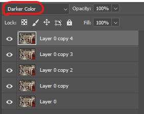
To reach this outcome, Vanoost has undertaken a clear process. One can assume that Vanoost has stayed in the same location, capturing a variety of shots from different angles. To create this effect, it is likely that the artist has not used a tripod as he would be aiming to capture a variety rather than trying to keep the camera still. To bring all these separate shots into one finished image, Vanoost would have likely used a digital editing software, such as Photoshop. Using this platform, Vanoost would have needed to layer each image on top of the other and experiment with blending modes and opacity.
One could describe the mood of this piece as chaotic due to the heavy layers which create a fast pace. Simultaneously, the work also feels melancholic due to the greyscale colour palette. These two moods combined demonstrate that whilst the location is bustling with people, it is not in a lively, vibrant way. Rather, this chaos is causing a sense of disconnect rather than a sense of community.
Alongside pursuing photography, Vanoost studied philosophy, which created the roots for much of his work. One branch of the subject that fascinated Vanoost most was the idea that the reality around us is chaotic and unstable. Through this piece, Vanoost could be trying to draw people's attention to this subject and restore balance into the world by expressing the process of chaos. His work is reflective of the modern day as in a society where technology is on the rise, it is no surprise that humans have become more disconnected.
Elements to take inspiration from
- Greyscale colour palette
- Lots of different layers
- Crowded area
- Low opacity
Contact sheets
Process
Step one - Firstly, I found a location and took multiple images in the same spot. Instead of focusing on keeping the camera in the same position, I instead aimed to show multiple angles and capture variety. I wanted to capture a wide range to create as much movement in the image as possible.
Step two - Following this, I opened one of these images on Photoshop and began layering the different shots on top of each other. To blend them together, I experimented with blending modes and lowered the opacity, allowing them to appear ghost-like and transparent.
Step three - Finally, I continued layering images until I was satisfied with the outcome.
Final edits
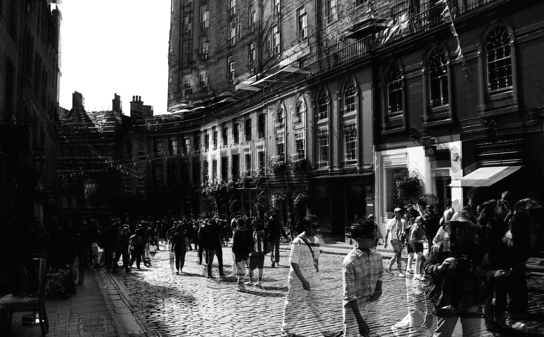
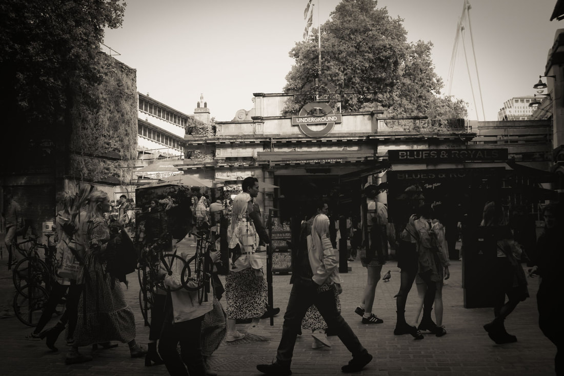
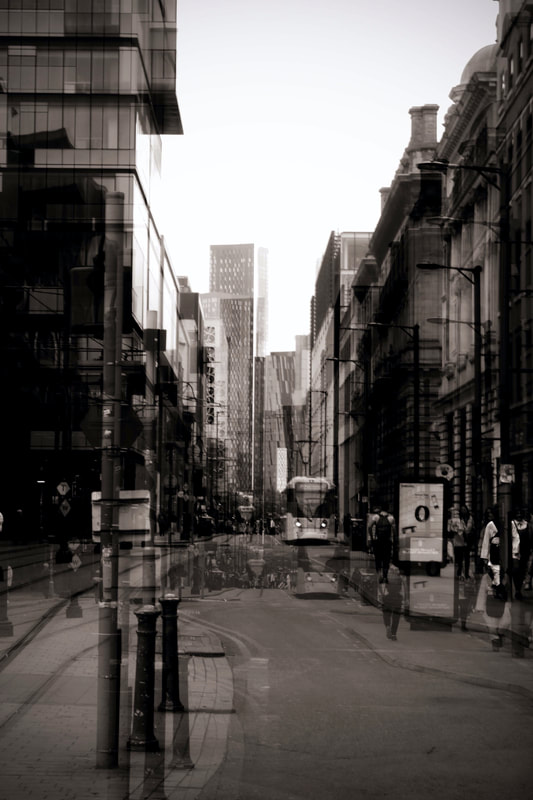
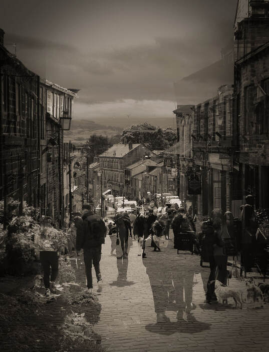
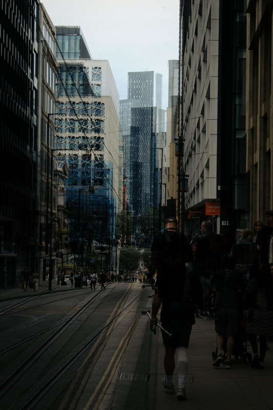
Meta data
Image one - 1/10 sec, f/3.5, ISO 400
Image two - 1/15 sec, f/14, ISO 400
Image three - 1/500 sec, f/4.5, ISO 100
Image four - 1/15 sec, f/29, ISO 100
Image five - 1/1300 sec, f/5.6, ISO 320
Image six - 1/2000 sec, f/5.6, ISO 800
Image seven - 1/85 sec, f/22, ISO 400
Hanging plan
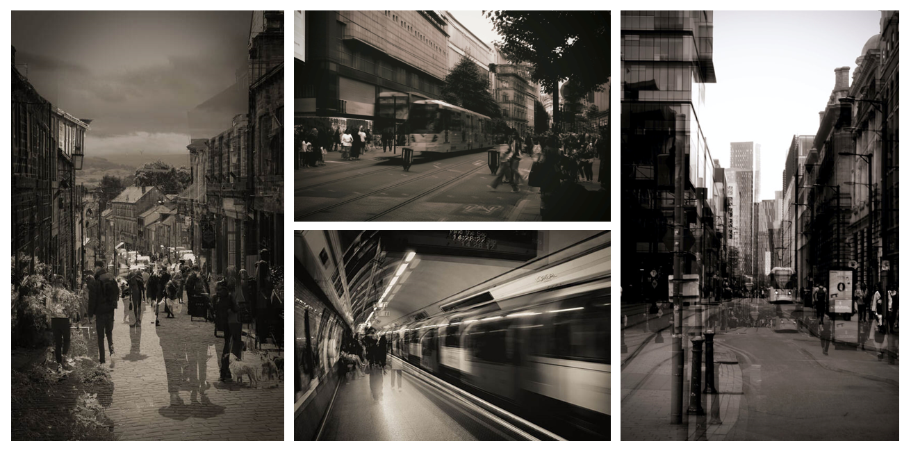
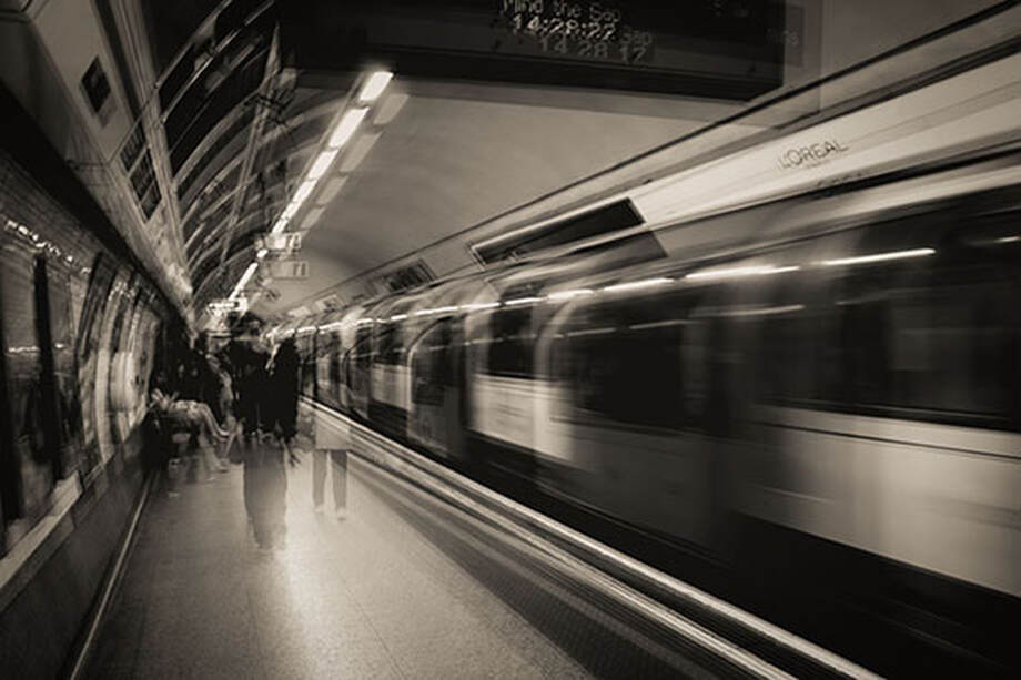
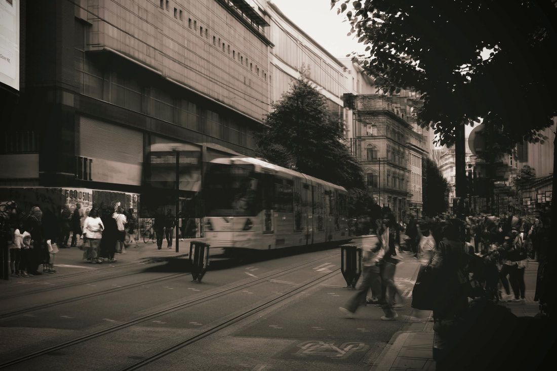
For this shoot, I took a mixture of portrait and landscape images. To display these, I selected two of each for balance and variety. I decided not to present all of the images as I felt that it could become repetitive, and I believe that the ones I displayed worked best. Although I was happy with the other ones, they had darker tones and the ghost-like effect wasn't as effective as the ones in the final layout. With the final images I chose, I placed the portrait ones on either side of the landscape ones, so that they didn't clash and to create a sense of balance. The portrait images focus more on the city environment and the landscape ones have the trains or trams as the main subject, which helps to add to the sense of balance.
Evaluation
In studying this artist, I have learned how to use multiple layers and experiment with blending modes to bring photographs to life and create a sense of movement. This process has taught me how to go beyond just photographing streets and instead adding the sense of chaos and conveying what it really feels like to be in a busy city. I have been able to gauge an understanding of how to strike the perfect balance with layering so that I don't add too many layers, making the piece become to dark or cluttered whilst simultaneously not using too little so that not enough is happening. Going forward after this, I will use layers and blending modes to bring movement and life into my work where it is necessary. If I was to do this differently, I would try bringing in some elements from Nicholas Goodenn. Since in his work I learned that colour plays a huge part in evoking emotion, and in Vanoost's work I have discovered that layering can play an equally important role, it would be interesting to combine the two and see how colour could change the tone of these pieces. To develop these images, I decided to see how they would look if there was real movement. To do this, I experimented with the use of 'GIFS' to really bring these images to life.
Development
All of my edits for this artist are still images of movement in cities. Whilst they create the illusion of movement, I wondered what it would look like if I brought this movement to life. To develop these images, I decided to make each of them into a GIF so that the image actually moves and comes to life.
Process
Step one: I opened all the images on Photoshop and layered them on to one document
Step two: To change the layout, I selected 'window' 'workspace' and then 'motion'
Step three: This opened up a new bar at the bottom, where I clicked 'create video timeline' and pressed the icon with three squares to set this out clearly
Step four: With the first frame, I set the time to 0.2 seconds and put it on a 'forever' loop. I then hid all of the layers apart from the first layer.
Step five: Once I was ready to move on to the next frame, I clicked the 'plus' button and unhid the next layer. I repeated this process until all the layers were unhid
Step six: I clicked the play button to sample my GIF, and once I was happy with this, I selected image size and set it to twenty centimetres
Step seven: Once everything was finished, to save, I selected 'file' 'export' and then 'save for web'
Edits
https://sarahcphotos.weebly.com/uploads/1/4/9/8/149870176/manchester-gif-two_orig.gif
https://sarahcphotos.weebly.com/uploads/1/4/9/8/149870176/hawarth-gif-one_orig.gif
https://sarahcphotos.weebly.com/uploads/1/4/9/8/149870176/subway-two_orig.gif
https://sarahcphotos.weebly.com/uploads/1/4/9/8/149870176/street-two_orig.gif
https://sarahcphotos.weebly.com/uploads/1/4/9/8/149870176/collage-one_orig.gif
Evaluation
Through this development, I learned how to make GIFs and add movement to an image. This will be useful going forward in my project, as it gives me a way to bring still images to life and show a sense of movement. Overall, although I was happy with the outcome, I would still prefer to stick to still images. This is because I like the idea of being able to create the illusion of movement rather than explicitly showing it, as this allows the viewers to make their own interpretations. I also like the challenge of trying to show movement in a still image. Despite all this, I still believe these GIFs turned out well, and I was happy with the way they started to tell a story.
SHOOT THREE
Christian Ruhm
Examples of artist
Artist analysis
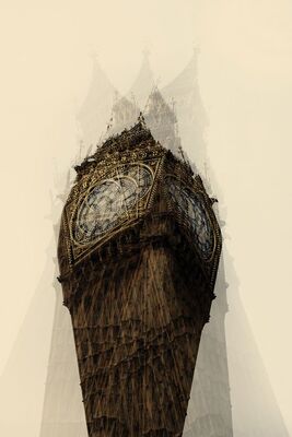
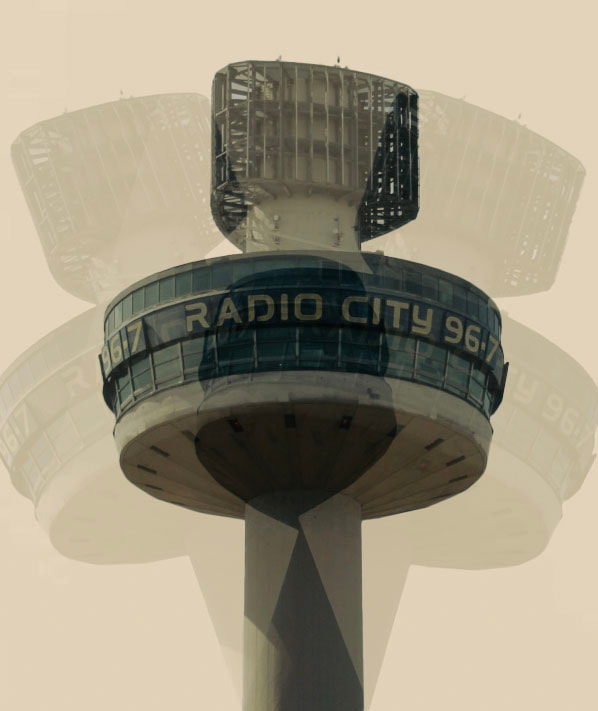
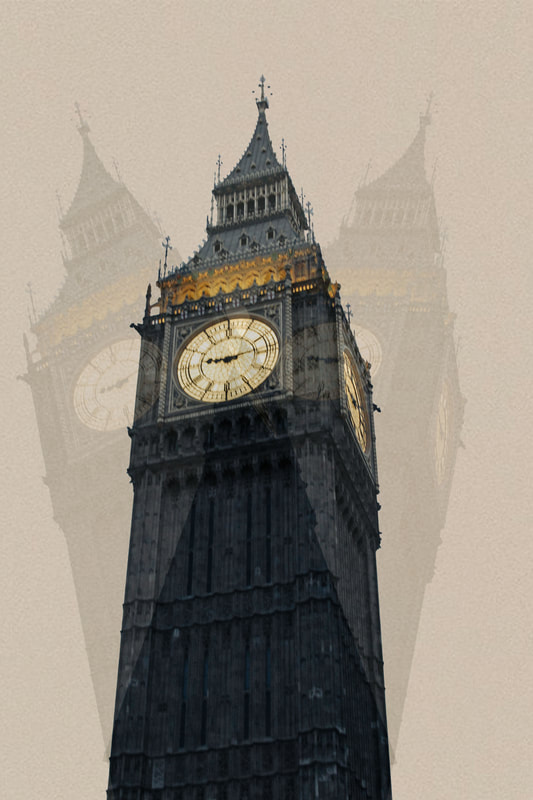
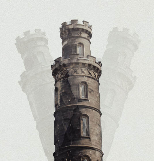
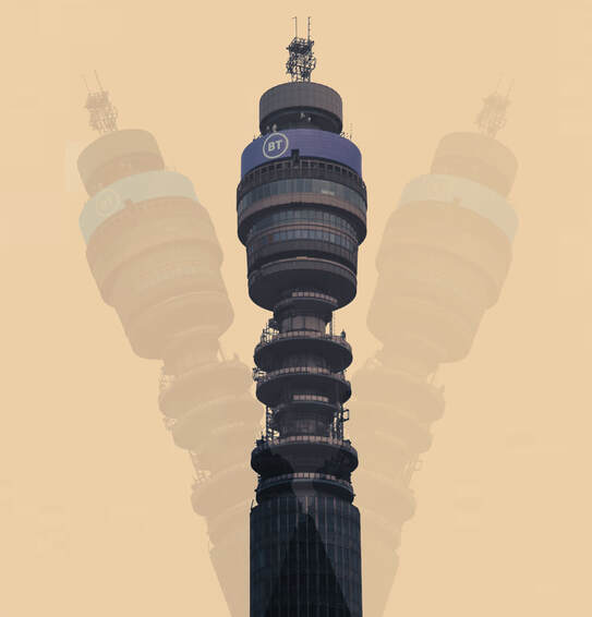
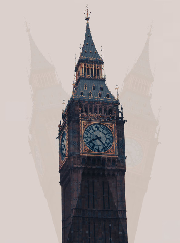
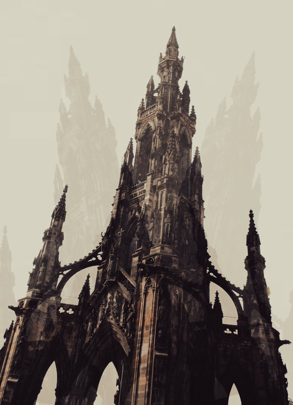
This piece, created by Christian Ruhm, is a multi-exposure photograph depicting the famous London landmark 'Big Ben.' This photograph comes from the set 'World Dis Order.' suggesting that the artist aims to look at the subject in an unconventional way. Ruhm works with the genre of architecture to explore this theme, using layering to create a fresh perspective on these buildings.
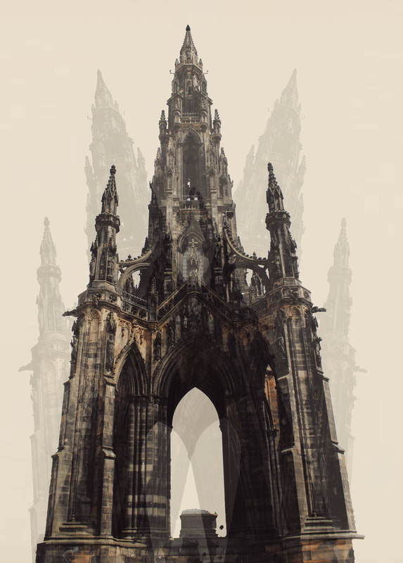
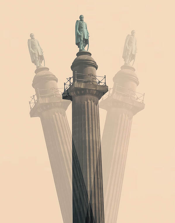
Ruhm has used a central composition alongside a plain background, effectively drawing the viewer's attention to the subject and ensuring that they cannot be distracted by anything else. The low angle shot means that not only is the viewer directed towards the subject, but it creates the sense that they are part of the action, and the building is towering over them. Other methods used to bring this building to life would be the texture seen in the structure alongside the strong tonal contrast. By creating this three-dimensional effect, the photograph becomes much more immersive and almost transports the viewer to this location. Although all the diagonal lines in this image are perfectly straight, the way in which they are organized alongside the distorted shapes creates a sense of abnormality. As there is no set pattern or repetition, this subverts the viewer's expectations as they are used to buildings being structured and well organized.
It is likely that this effect has been created using the editing software 'Photoshop.' To reach this outcome, one can assume that Ruhm has layered several images together and adjusted the placement of the subject slightly in each frame using the 'object selection' tool. Following this, he then would have lowered the opacity of certain layers to combine them together in this way. Additionally, the use of a tripod would have been effective to capture multiple shots of the same location.
One could describe the mood of this piece as chaotic due to the several layers. This use of layering creates a sense that a lot is happening all at once. Additionally, it contrasts to how people typically view buildings, creating a sense of unease. On the other hand, this piece could also evoke feelings of energy and excitement. This feeling once again comes from the different layers which create a sense of movement that is not usually replicated from photographs.
Through his work, Ruhm could be trying to replicate the energy of these structures using a photograph. For example, Big Ben makes noise which cannot be heard through art, and this would not be obvious through photographs where it appears stagnant and solid. This use of layering brings the energy and sound of the building to life for those who cannot make it to the location themselves. Ruhm could be trying to communicate that buildings do not need to be boring or stagnant but can have a lot of life to them. This work is like that of the modern age as since technology is growing, photographs no longer must be at face value. Instead, editing allows artists to be much more experimental and new ways can be found to interpret these classic structures.
Elements to take inspiration from
- Plain background
- Lowering the opacity
- Pictures of towers or tall structures
- Dull colours
Contact sheets
Process
Step one - To start with, I photographed tall structures, such as statues or towers.
Step two - After opening this on Photoshop, I selected the structure using the 'object selection' tool and made multiple layers of this.
Step three - With each new layer, I moved the structure to different positions to create a variety of different angles.
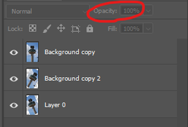
Step four - Following this, using only the new layers, I lowered the opacity slightly to make them appear ghost-like and create a sense of movement.
Step five - Finally, I removed the background and inserted a plain white backdrop to eliminate distracting background elements and place the focus on the building.
Final edits
Meta data
Image one - 1/400 sec, f/11, ISO 100
Image two - 1/1300 sec, f/5.6, ISO 400
Image three - 1/120 sec, f/10, ISO 100
Image four - 1/60 sec, f/5.0, ISO 800
Image five - 1/85 sec, f/20, ISO 125
Image six - 1/400 sec, f/5.6, ISO 100
Image seven - 1/100 sec, f/5.6, ISO 100
Image eight - 1/30 sec, f/20, ISO 100
Hanging plan
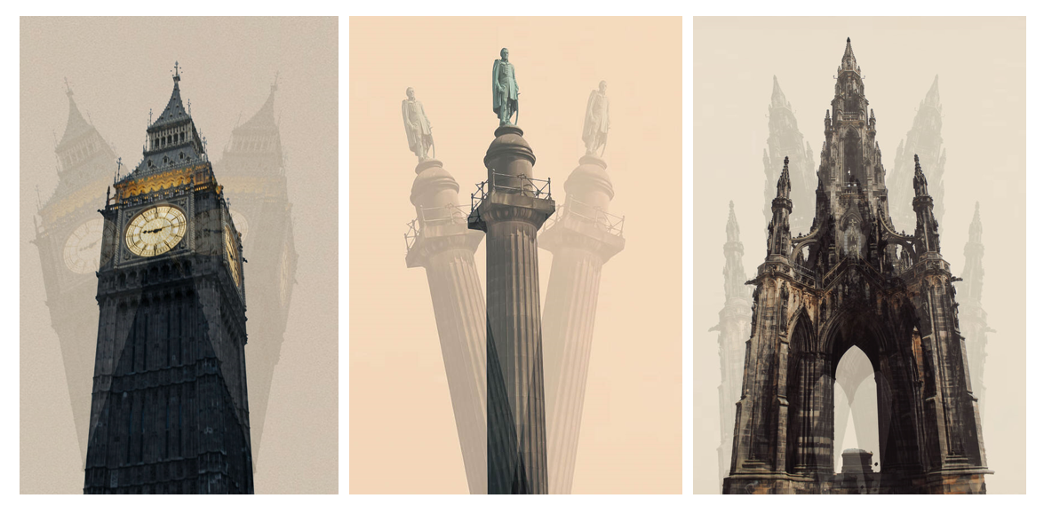
Although I was happy with the outcome of all of these images, I decided they would work best displayed as a triptych. This is because they all follow the same theme, and so it didn't feel necessary to display all of them. Since some are portrait and some are square, I decided to pick one shape and stick to it to present them neatly and create a sense of continuity. I chose these three out of the portrait ones as they are all vastly different structures, which adds variety and ensures that they don't clash. Another way I achieved this was by placing the one with a slightly different background colour in the centre. There were also some repeats of the same structures in my initial edits, and I decided not to display both of these to show more variety. Out of the two Big Bens, I concluded that the one I presented works better as the angle makes it feel less flat and more visually interesting. Additionally, with the Edinburgh structure, the one in the image works better as you can see more structural details.
Evaluation
Ruhm inspired me to create these images as the digital manipulation brings a sense of movement and energy to stagnant structures. The plain background and multi-exposure places an emphasis on these structures, allowing people to soak in the detail and see them from different angles and perspectives. This shoot communicates that there is so much more to the built environment than what meets the eye, and that so much artistic detail and human effort has gone into every structure, yet we often overlook it. Through this process, I have learned how to take something seemingly simple and make it appear visually interesting. This artist has taught me that sometimes not a lot needs to be going on in an image for it to be effective. Instead, you can take the most basic structures and remove everything else yet still have a successful outcome. Furthermore, I have learned how to play around with opacity to create the effect of three-dimensionality and have had to gauge an understanding of how different opacities can affect the outcome. For example, the opacity needs to be high enough so that the outlines are visible but not so high that the effect becomes lost. This will be useful to take forward with me as I will have a better understanding of how to use my own judgement to ensure that I strike that perfect balance. I will also be able to use opacity in the future depending on what effect I want to create, lowering it to make the piece feel more ghost-like or raising it to draw attention to certain areas. If I could repeat this process, I would use my knowledge from Nicholas Goodden to see what effect taking away the colour could have on these pieces. For example, having some shots in black and white could give the piece a dated effect or solemn tone. To develop this work, I had the idea of creating the shadows manually rather than digitally. I decided to create this by sketching out the shadow areas on paper rather than creating them on Photoshop.
Development
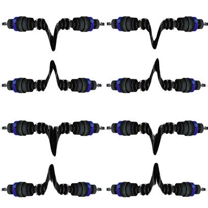
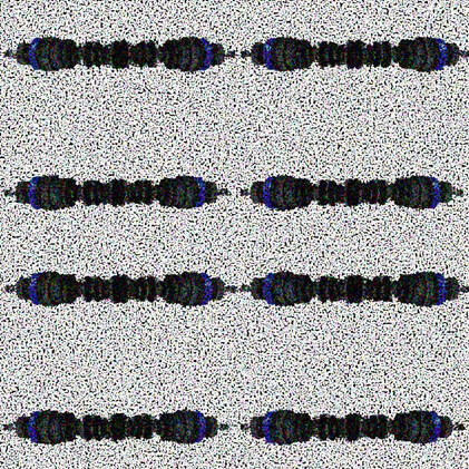
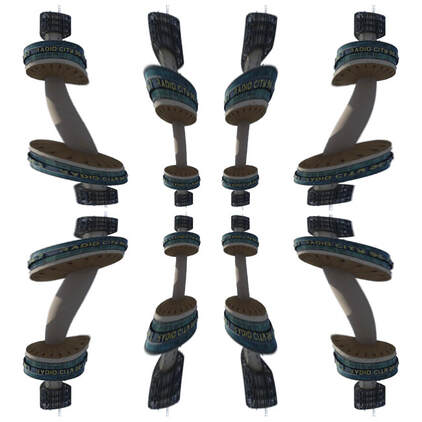
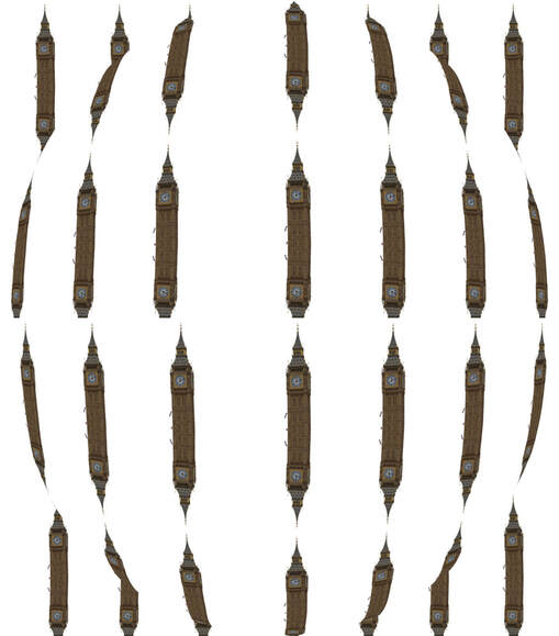
With this shoot, I learned how to duplicate buildings and lower the opacity to create a ghost-like effect. To develop this, I wanted to experiment with different ways of duplicating an image to create something completely abstract. To achieve this, I duplicated the image four times and flipped them until they were all facing each other. Once I had done this, I experimented with different modes of distortion such as pixelation and rasterising. Following this, I went one step further by repeating the process again with these new images to get an outcome even more abstract.
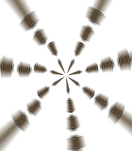
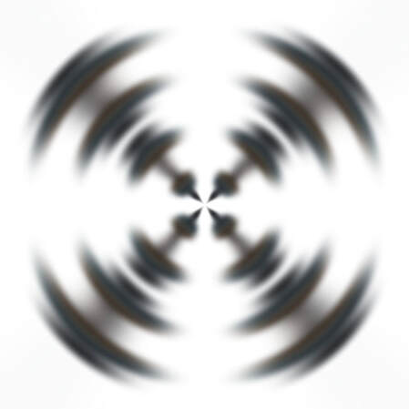
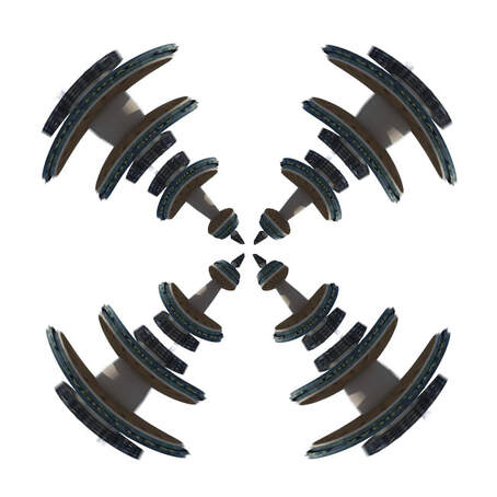
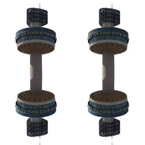
Evaluation
Through this development, I learned how to experiment with duplication and distortion to create abstract images. On a technical level, this has given me knowledge of the different types of distortion on Photoshop and what effect they have, which will be useful to know going forward in my project. In general, it has taught me to think outside the box and always push one step further to see what I can create. Overall, I was happy with these outcomes. I think what worked well was how unique each image was, allowing them to not become repetitive. However, I preferred the spiral images as I like how you can't initially tell that they are buildings unless you concentrate closely.
SHOOT FOUR
Shawn Clover
Examples of artist
Artist analysis
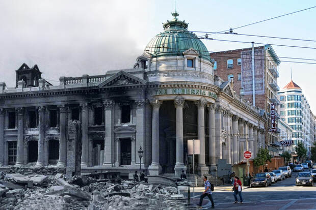
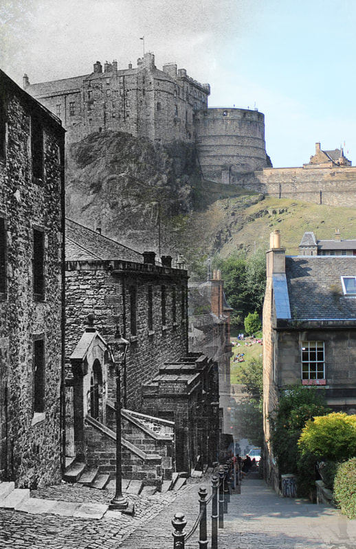
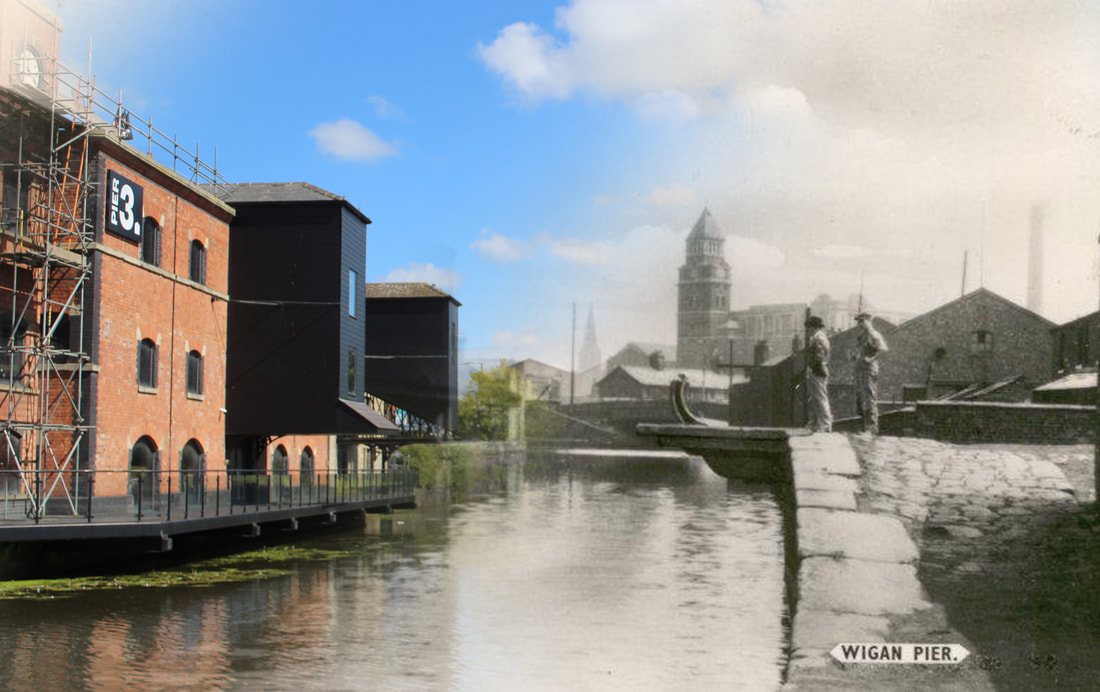
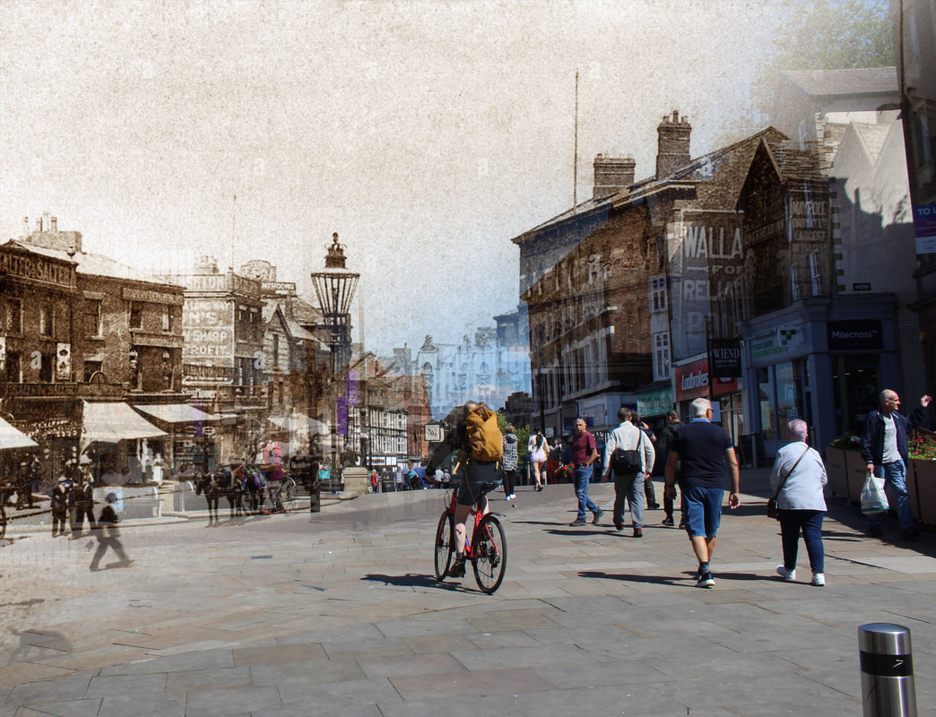
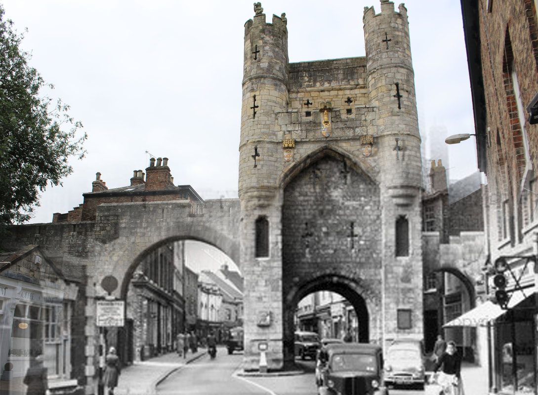
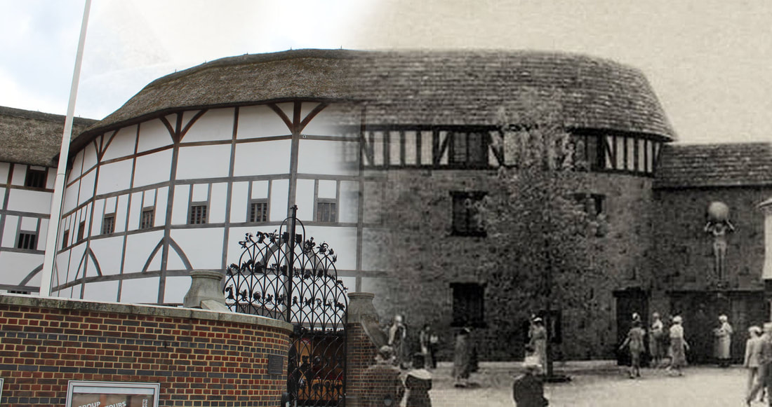
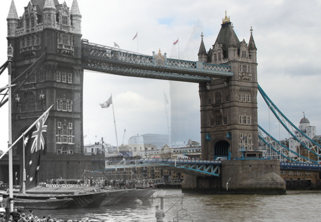
This piece, created by Shawn Clover, merges a historical image of a city with a contemporary one. This same technique is prevalent throughout Clover's work and is specifically used to explore the aftermath of natural disasters. This takes an interesting spin on architectural photography as it explores how a certain location has developed over time.
Clover uses a mix of both black and white tones alongside warm colour, with the image being equally divided between the two. This effectively displays the process of the city gaining back its colour and spark over time. This black and white section is dimly lit with a strong tonal contrast, adding to the feelings of emptiness and melancholy associated with this area. Additionally, the fact that there is no set pattern or repetition conveys the chaos of this and mirrors the unpredictability of the area. Furthermore, Clover uses positive space and includes minor details such as cars and people to capture the raw everyday nature of the place rather than an idealized version. The eye-level shot makes the viewer feel like they are observing this normality and are a part of the day-to-day life of the city. Finally, Clover uses a curved line that travels down the centre, highlighting that the transitions between the two versions were not linear or smooth sailing. This line has been created using a soft brush, making the transition feel seamless. This could suggest that the process was not completely noticeable and was a gradual change rather than having a set turning point.
To reach this result, Clover would have needed to find a historical image of a location and visit this place in person. It is likely that multiple shots have been taken to ensure that the images line up in the most effective way possible. Following this, Clover would have used Photoshop to combine the two together. This could have been achieved by layering the two images on top of each other and lowering the opacity to line them up perfectly. Clover would then have simply had to use a soft brush and the masking tool to seamlessly reveal certain areas.
One could describe the mood of this piece as melancholic. This has been achieved by the black and white tones and the dramatic contrast between the liveliness and emptiness in the contrasting halves of the image. However, the piece could also evoke feelings of hopefulness. This has been created by the warm colours in certain areas, highlighting that normality and colour can return over time.
Clover could be trying to display just how damaging and horrific these disasters are. However, he could also be trying to communicate the power and strength of humanity and provide a sense of hope. This is because no matter how devastating the impact has been, Clover shows that there is light at the end of the tunnel and humanity has bene able to recover and build itself back up again. Clover could also be trying to make people have more appreciation for what them is around, as we typically take the structures around us for granted and fail to realize how fortunate we are and how much work has gone into constructing them.
Elements to take inspiration from
- one part in colour, one part in black and white
- one part an old image, one part new
- transitions in various positions
- using a soft brush to make a seamless transition
Contact sheets
Gathering images
Process
Step one - Firstly, I searched the internet for dated images of different cities and landmarks.
Step two - After figuring out the approximate location of the shots, I visited these spots and tried to recreate the initial shot. I did this by trying to recreate the same angle as the initial image and capturing multiple shots for improved accuracy.
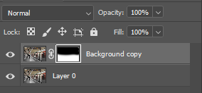
Step three - Following this, I was left with both a historical and contemporary image of the same location. Using Photoshop, I layered the two on top of each other and lowered the opacity to try and line them up as best as possible to establish the link between the two.
Step four - When I was satisfied with the placement, I used a soft brush and the masking tool to paint over parts of the image. This seamlessly revealed parts of the image beneath, creating a smooth, gradual transition mirroring the process of time.
Final edits
Meta data
Image one - 1/1300 sec, f/5.0, ISO 100
Image two - 1/400 sec, f/6.3, ISO 100
Image three - 1/1300 sec, f/5.6, ISO 400
Image four - 1/250 sec, f/10, ISO 100
Image five - 1/500 sec, f/4.5, ISO 100
Image six - 1/1300 sec, f/5.6, ISO 500
Image seven - 1/1000 sec, f/4.5, ISO 100
Hanging plan
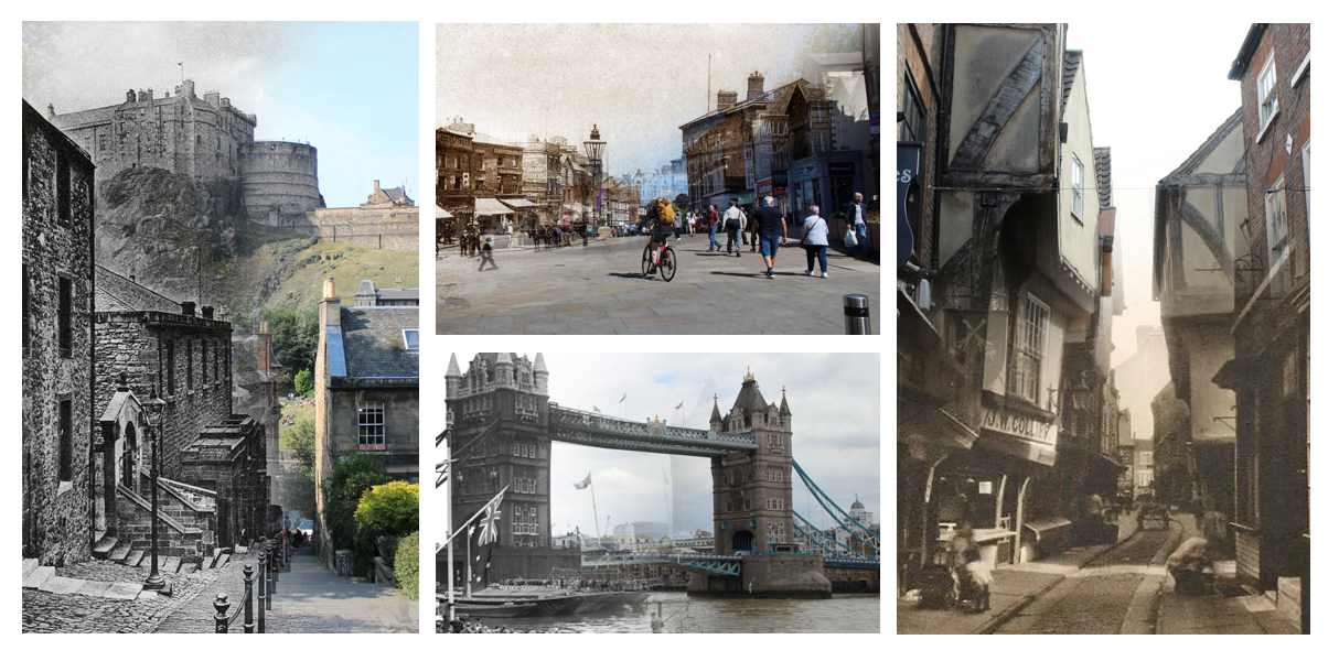
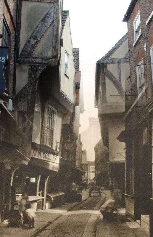
Throughout this shoot, I had a mixture of portrait and landscape images. To display these, I decided to select two of each to have a sense of balance. I placed the two portrait images on either side of the landscape images to create visual symmetry and assure that they don't clash. Although I was happy with all outcomes, I decided to select my favourite image from each location to get the most variety. That way, my final presentation celebrates all the different locations and ensures that one isn't valued over the other. Out of the London pieces, I preferred the image of the bridge as it has a more seamless transition than the globe theatre image. The same can be said about the York and Wigan images, as in both of the displayed images the transition feels less noticeable. I liked how the Wigan image in the presentation gives more of a glimpse into Wigan life as it incorporates people into the photograph.
Evaluation
Clover inspired me to combine historical and contemporary as I wanted to show how impactful the built environment is, as throughout all the time periods many of these iconic structures still stand and have served humanity for all of these years. Additionally, it shows the wonder of human creativity as after all of these years, we have been able to preserve these structures and expand on them to make them even more beautiful. My intentions with this shoot were to help people visually see this development over time, allowing to appreciate the world around them more. Through studying this artist, I have enhanced my practical skills by learning how to use masks to create a seamless transition between two photographs. However, I have also learned that photography does not need to be all about physically taking the photographs, but there is a lot of value of incorporating other photographs into your work. This is a useful skill to go forward with as it can broaden my horizons and open lots of different ways to experiment. For example. I could even use old photos from my own past to create unique experiments. This technique of creating transitions between two photographs will also be a useful skill to have as it opens doors for endless possibilities of combining images. To improve these outcomes, I would experiment with different ways of combining the two images, such as different blending modes. I could also incorporate my knowledge from Thomas Vanoost of how layers and movement can have a significant impact. It could be interesting to use this technique to make one side of the piece isolated and secluded in contrast to the other that is filled with movement. If I had the time to develop this work, I would incorporate some elements from Jack Lloyd into the piece, adding signs and texts that hold cultural significance.
Development
As I have previously mentioned, I liked how all of these images had a seamless transition. However, I wondered what the images would look like If I tried to make the transition more obvious. The way I decided to go about doing this was making GIFs. I had already used these in my Thomas Vanoost development to show a little snippet of a scene. I concluded that this same technique could also be useful in showing a gradual change overtime. GIFs would be a great way to visually depict the journey quickly, whilst also showing a gradual transition.
Edits
Evaluation
Ultimately, although I was pleased with how these GIFs turned out, I preferred the initial edits. I was happy with how smoothly the GIFs blended and how they create the effect of the built environment being 'uncovered.' However, they feel quite quick and immediate. Whilst this can work well, I think the still images work better for the message I was trying to convey. This is because the seamless transition makes the change feel more gradual and unnoticeable, which is what I was going for. On the other hand, the GIFs have a more obvious before and after. Although I do prefer the still images, this experiment was valuable as it has taught me different ways to show transitions and given me an insight into what my preferences are.
SHOOT FIVE
Jack Lloyd
Examples of artist
Artist analysis
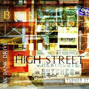
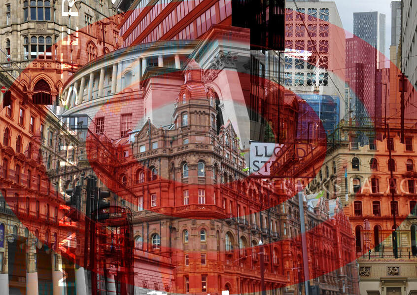
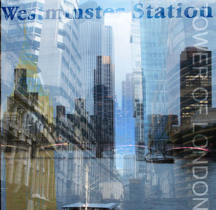
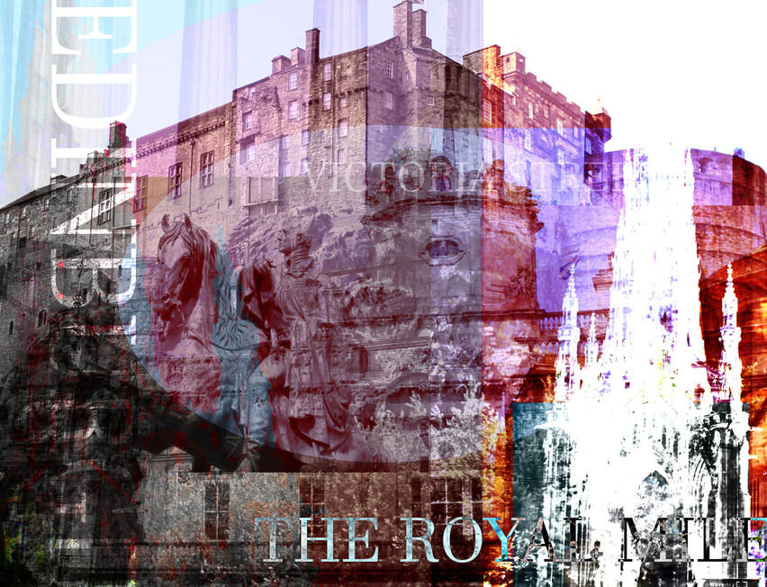
This image, captured by Jack Lloyd in 2009, depicts a butchers located in a city street. Although this image is heavily layered, there are many clues which give this away, including the street signs and the distinctive outline of a shop. Lloyd has named this work 'Bolli Butchers,' which slightly alters the way I perceive the image. This is because by distinguishing a name and not leaving it vague so it could be any shop, this shows that it could be a place he knows and possibly quite sentimental to him. Lloyd decided to depict this place using the style of experimental urban landscape.
It Is evident that Lloyd has used a variety of techniques and made several decisions to create the finished product. Firstly, it is clear that he has used a warm colour palette. This could be because he wants to celebrate this place and make it appear warm and welcoming. In contrast, making the image black and white could cause the image to feel dreary and lifeless, which is why colour can be an important element in this image. When looking closely at the image, it is clear to see texture and shadows, particularly in the bricks and pavement. One may believe Lloyd did this intentionally so that the building doesn't get lost in all the abstract shapes. Even though Lloyd wanted this image to be quite abstract, he still clearly wanted to showcase the shop. Therefore, the tone and texture in these areas ensures that the viewer won't forget what the image is depicting. Subsequently, Lloyd has used a variety of lines and shapes. Several lines going in many different directions along with many rectangular shapes layered on top of each other creates a cluttered look to the piece. This could have been done for several reasons. Firstly, perhaps Lloyd did this to show that city streets are busy, chaotic and not always as 'perfect' as they may seem but that is what makes them great. However, he could have also made this decision to add more interest to something that may appear quite mundane. Butchers are quite common and not the most eye-catching, but by adding all these shapes and lines he has created interest in something extremely simple. Similarly, Lloyd appears to have used no repetition, which could be to highlight that city streets aren't predictable and to convey their chaotic nature. Finally, Lloyd has used positive space to make sure that the building is the focus, and no distracting background elements take away from this.
One can assume that additional materials and tools have been used to complete this image, one of them being the editing software 'Photoshop'. It is evident that Lloyd has layered several images on top of each other using this app, which can be seen through different shapes not fitting perfectly together and certain elements being fainter than others. Additionally, one can assume that Lloyd has used a short shutter speed to make the photograph sharp and eliminate any motion blur.
This piece has a very chaotic yet vibrant and positive mood due to many decisions made in the composition. Firstly, the warm colour palette has connotations of energy and makes the image feel more upbeat and eye-catching. Additionally, the use of several shapes all layered over each other adds to the chaos as nothing is perfect and it is all intentionally messy to make the piece more interesting. Finally, Lloyd's use of positive space adds to this effect as it places the focus on the building and celebrates it.
Lloyd is trying to speak through his work and communicate a message. This message could be to celebrate mundane things that we come across every day. Even though this shop is most likely something completely ordinary to him, he has made it interesting with the different layers and techniques he has used. This image could be made for people who live in the city and often take structures and streets like this for granted. He could be trying to open their eyes to the beauty of things they often overlook. Furthermore, this photograph also relates to other artwork and context of the 2000s. Since this time is modern, there has been a clear development in technology and software. For example, new apps like Photoshop would have been on the rise, opening the doors to thousands of new techniques to experiment with. This means that around this time more people would be experimenting with this technology and moving away from more traditional photographs. This would explain why this piece is so experimental and not exactly 'perfect.'
Elements to take inspiration from
- Including signs and text
- Layering different shapes on top
- Lots of different layers of images
- Vibrant colours
Contact sheets
Process
Step one - I visited a specific area and took multiple shots in all kinds of different locations. It was important to look for variety, with interesting shapes ranging from signs to structures, to create a range in the image.
Step two - Subsequently, I selected one outcome and opened it on to Photoshop. One by one, I began layering images on top and merging them together. To do this, I experimented with different blending modes and opacities to see which outcome was most effective.
Step three - I continued to add more images until I felt as though the image was complete.
Step four - To finish off, I tried adding different shapes and little details to complete the image. For example, I used the 'shape'' tool to draw shapes over the top and changed the opacity to fade them into the background. This added the character of the location to the image and made it more personal to the given place. Additionally, when necessary, I used the 'text' tool to add significant names into the image and used blending modes to make this more subtle.
Final edits
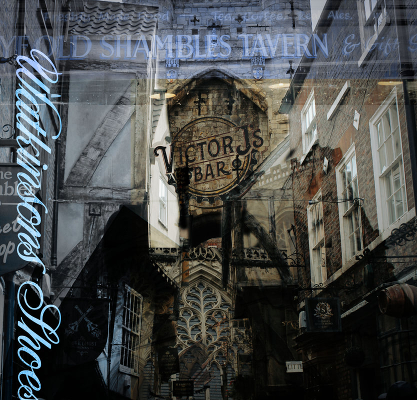
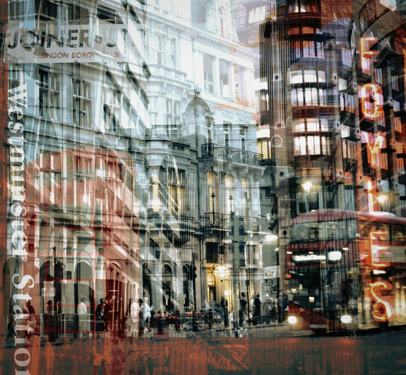
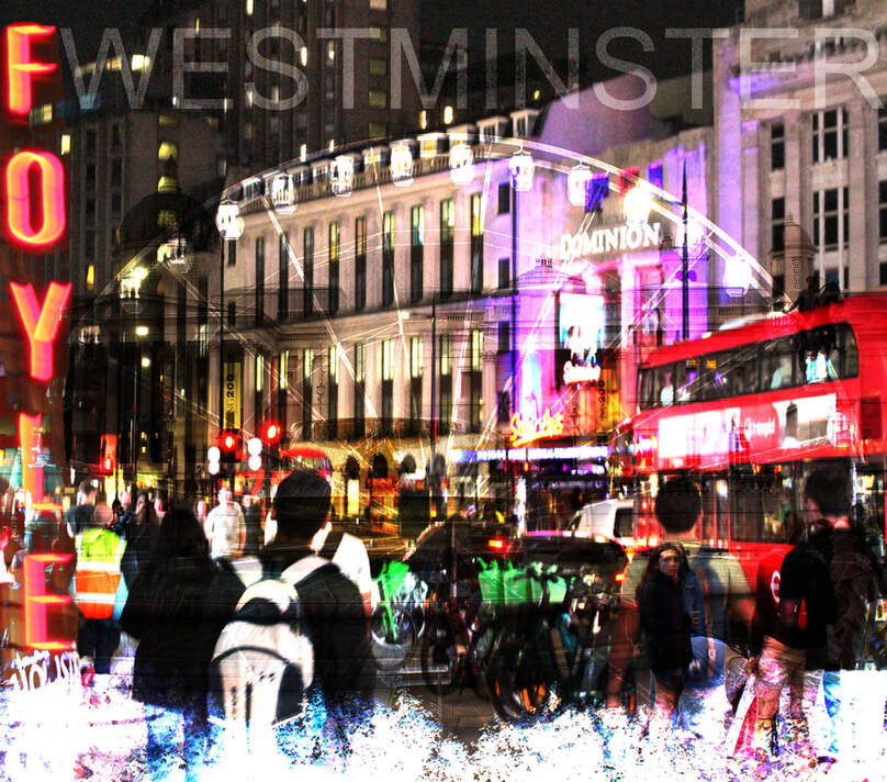
Meta data
Image one:
1/100 sec, f/22, ISO800 / 1/500 sec, f/5.6, ISO125 / 1/500 sec, f/5.6 ISO160 / 1/30 sec, f/22, ISO160 / 1/125 sec, f/5.6, ISO100 / 1/50 sec, f/22, ISO100 1/15 f/3.5, ISO160 / 1/85 sec, f/22, ISO320
Image two: 1/40 sec, f/22, ISO 100 / 1/160 sec, f/5,0, ISO 100 / 1/40 sec, f/5,0, ISO 3200 / 1/100 sec, f/5.6, ISO 1600 / 1/60 sec, f/22, ISO 100, 1/100 sec, f/5.6, ISO 100
Image three - 1/50 sec, f/22, ISO 125 / 1/500 sec, f/4.5, ISO 100 / 1/85 sec, f/22, ISO 160 / 1/100, f/20, ISO 100
Image four: 1/1300 sec, f/5.6, ISO 500 / 1/300 sec, f/5.6, ISO 1250 / 1/1300 sec, f/5.6, ISO 3200 / 1,400 sec, f/4.5, ISO 100 / 1/1300 sec, f/5.6, ISO 320 / 1/1300 sec, f/5.6, ISO 640 /
Image five - 1/40 sec, f/5.0, ISO 3200 / 1/85 sec, f/22, ISO 1600 / 1/25 sec, f/5.6, ISO 3200 / 1/30 sec, f/5.0, ISO 3200 / 1/160 sec, f/5.0, ISO 100
Image six - 1/25 sec, f/5.6, ISO 3200 / 1/50sec, f/5.0, ISO 3200 / 1/500 sec, f/11, ISO 100 / 1/250 sec, f/5.0, ISO 100
Hanging plan
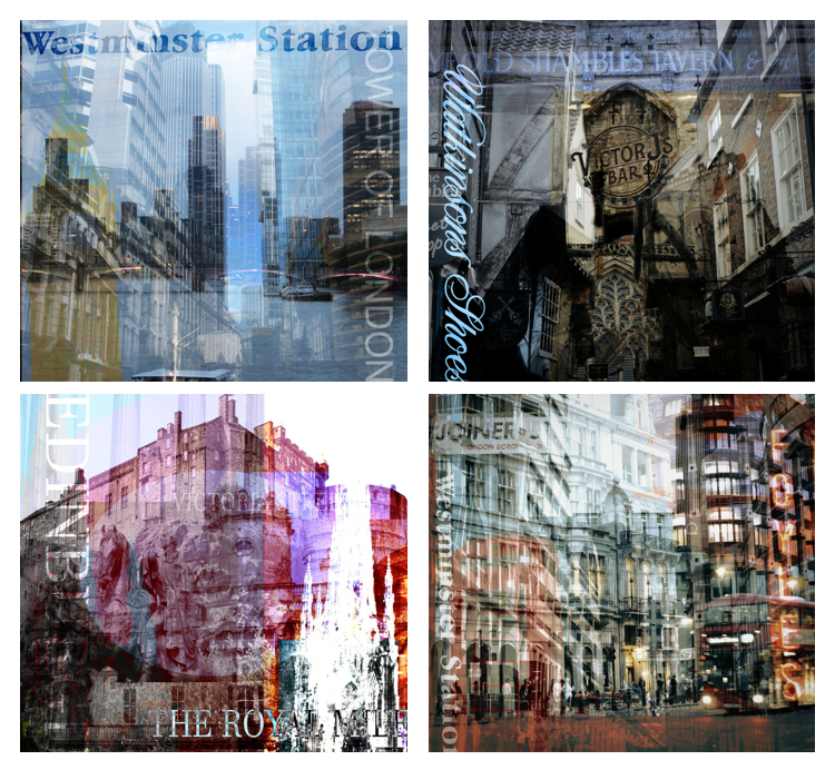
When displaying these images, I chose two images of historic cities and two of modern metropolitan cities and placed these horizontally so that they don't clash. This perfectly shows variety and prevents the images from becoming repetitive. I concluded that out of all the images I took, these ones worked the best. I was relatively happy with the outcome of the final image, however, I didn't think it worked as well as the others since it came out darker. Not only would the first image not fit into the set anyway due to being landscape, but I also wasn't as happy with the outcome. Since this one was my first experiment, I was still getting used to the technique and therefore it wasn't the most successful as the shapes overpowered the built environment.
Evaluation
These pieces, similarly, to Thomas Vanoost, use a variety of different layers to create a certain effect. However, Jack Lloyd's work takes this a step further, using lots of different elements of collage such as typography, masks, object selection and opacity. Through this process, I have learned the importance of all the little details in creating the bigger picture. Every single object and layer had to be meticulously placed in the right position and experimented with to create the outcome. This will be useful to take forward with me as it will teach me to pay attention to all the little details. Additionally, this artist has taught me how to translate the character of a location into my work. Rather than just photographing cities, I have learned how to bring to life the emotions and culture of the place. For example, I have discovered how using other elements other than just photographs such as texts and shapes can have a huge impact and add personality to the piece. This will also be useful in the future as I can try to incorporate more shapes and text into my image to evoke certain emotions. To improve this work, I would use more of these texts and shapes as I feel like I haven't included as much of it as the artist, and this could be interesting to play around with. Another interesting element to add would be more signs or graffiti to add to the character of the locations. If I had time to develop this piece, I would take it off the computer and add elements of collage by manually sticking things together.
DEVELOPMENTS
Explanation
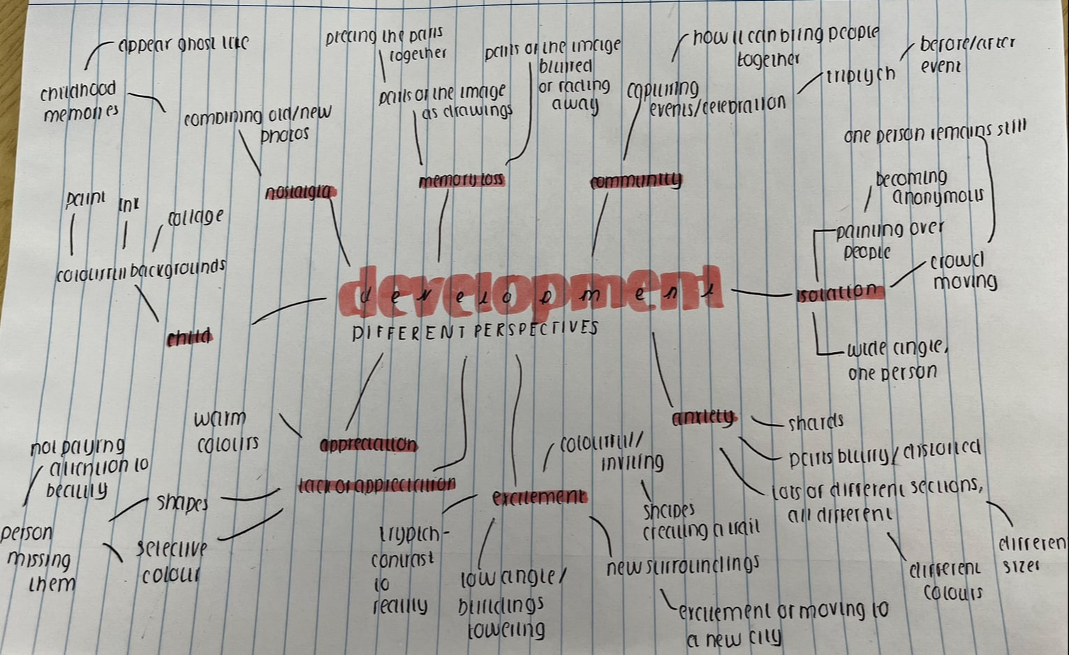
Every artist that I have previously explored have different ways of interpreting the built environment, with each different shoot evoking different emotions for different people. To lead on from this and develop my own ideas, I had the idea of stepping into different people's shoes and seeing how perspective can alter the built environment. I wish to step into different people's shoes and try and capture the built environment from different unique perspectives, as the meaning can vary from person to person. Rather than placing a focus on the location, I want to instead place emphasis on the different emotions that the built environment can create for different individuals and how this can translate into photography. As a way to showcase these diverse perspectives, I decided that I would like to aim towards a magazine or leaflet: anything that can be physically handled and read by people. This is because I would love for the work to help people feel seen or represented. With this in mind, I would aim to gather a wide range of different techniques and locations to create as much variety as possible for this medium.
DEVELOPMENT ONE
Nostalgia
Explanation
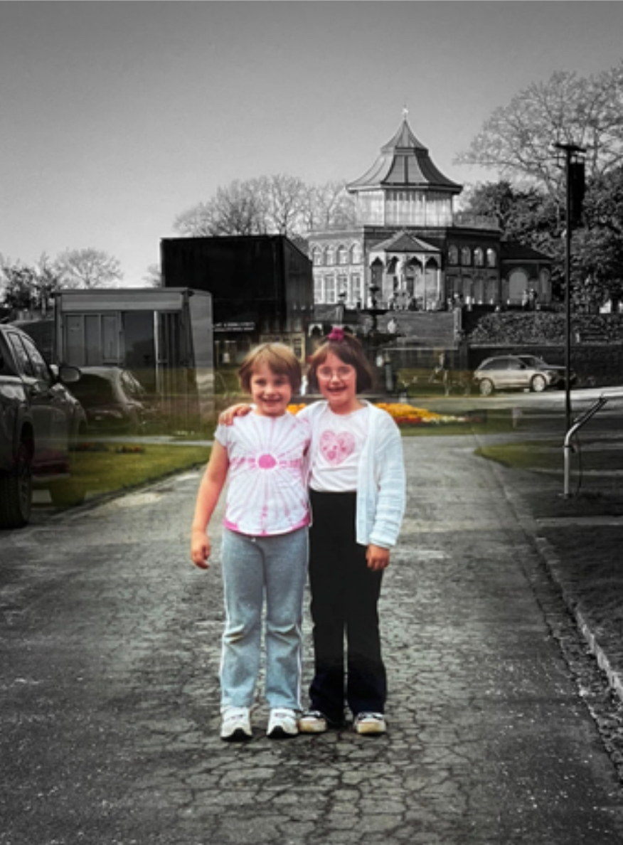
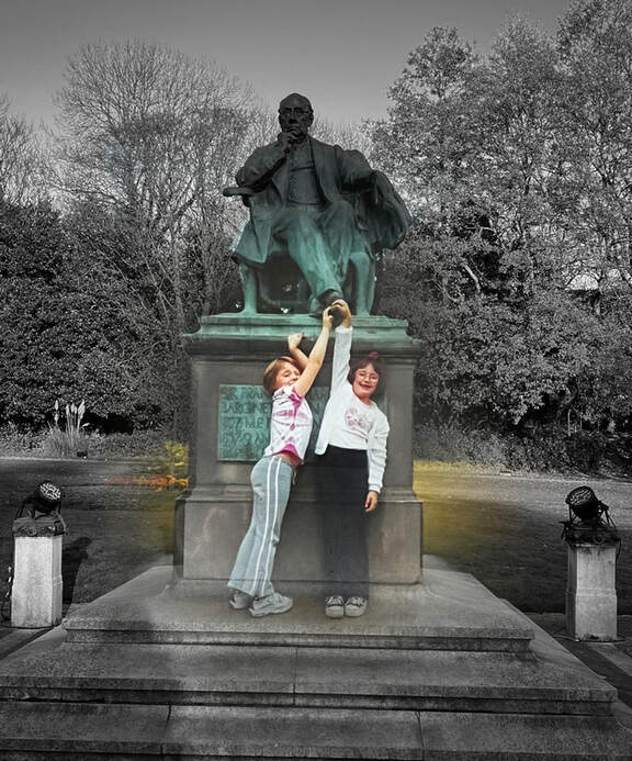
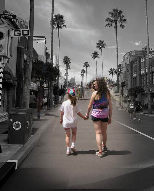
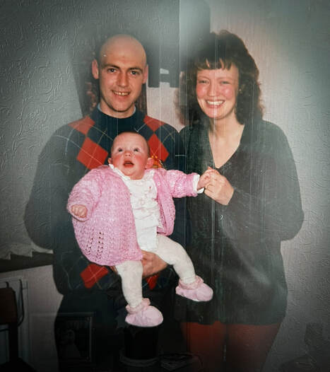
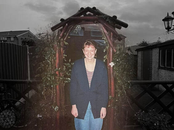
The built environment can not only just be a place for people to live or work, but it can also hold a lot of emotional significance. Certain buildings or areas can often be associated with memories, both fond and negative, creating the bittersweet feeling of nostalgia. For this shoot, I wanted to step into the shoes of someone who may be haunted or comforted by memories every time they step foot into a certain area. I wanted to capture the feeling of associating places with memories, and being reminded of those times every time you revisit. To try and recreate this feeling, I decided to look back into my own past and find old photographs from different built environments that have meant a lot to me in the past, hold significant childhood memories and have played a huge role in shaping who I am today. Using techniques that I learned from Shawn Clover, I want to create a transition between these two photographs. My aim is to make the old photograph appear ghost-like, to create the sense that the person is being haunted by their past. My idea for the shoot is to have the old photograph faded in the middle, and the recreation surrounding it.
What is nostalgia?
Most emotions we feel can be black and white. For example, It's easy to understand when we are feeling sad in contrast to feelings of happiness. But one of the most complex and difficult emotions to understand is, in fact, nostalgia? According to Hepper, Ritchie, Sedikdes, and Wildschut (2012, Emotion), nostalgia is a complex emotion that involves past-oriented cognition and a mixed affective signature. This emotion is often triggered by a familiar smell, sound, or keepsake, or even just by feeling quite lonely. This leads one to dwell on a past fond memory from childhood or a close relationship, causing strong emotions, such as happiness mixed with a sense of loss or longing. Other notable emotions include: comfort, regret, sadness and calm. But how is it possible to feel such strong, different emotions all at the same time? That is the beauty and complexity of nostalgia. This emotion can have numerous benefits, leading to increased self esteem and an overall sense of belonging. However, like most things, when taken to the extreme, it can be detrimental. Researchers found that nostalgia inducing behaviours increased in times of crisis, such as the COVID 19 epidemic. From this, we can conclude that nostalgia is a way of escaping from our current realities, and gaining control over a situation that is largely out of our hands.
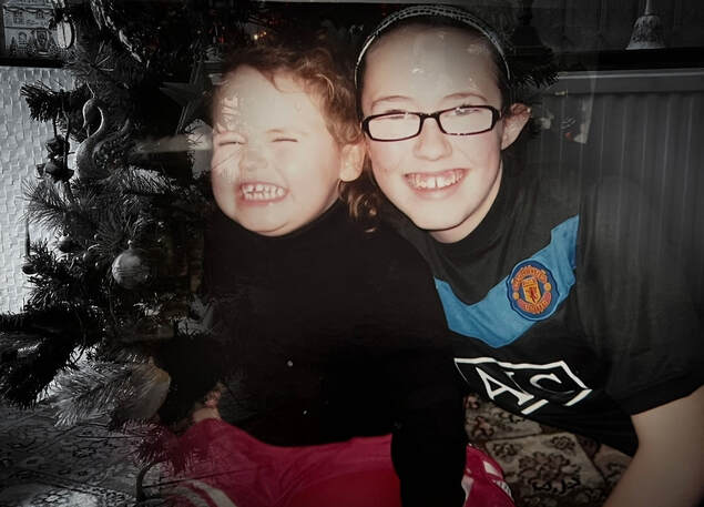
Gathering childhood photos
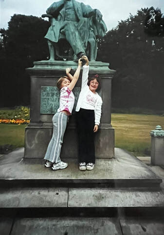
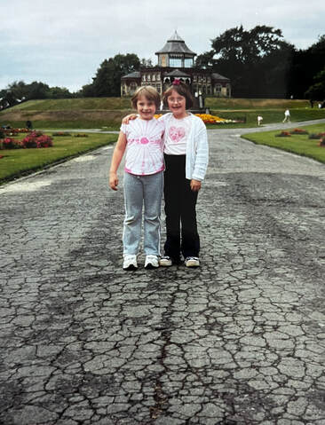
These photographs were taken somewhere very special in my hometown; Mesnes Park. Whilst it is not the most extravagant park you will ever encounter, it holds many cherished memories not only for me, but my family as a whole. Not only did I grow up spending a huge part of my childhood here, but so did my sister and generations before her. From playing and letting my imagination run wild as a child to growing into adolescence and spending time here with my friends, this park has really grown with me. Without this built environment, me and my family would not have many memories that we cherish to this day.
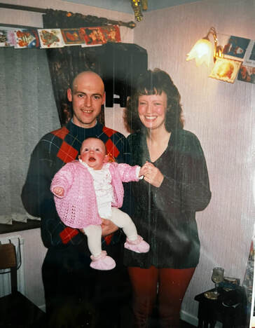
This image was taken somewhere much closer, simply in my own house. However, a house is not always just a building, but a place for families to grow together and make memories. This photograph effectively captures how built environments are much for than just locations but can instead bring people together.
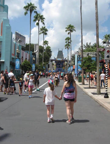
This photograph was taken somewhere far from home yet extremely close to my heart: Universal Studios in Florida. As a child, this built environment was the closest I ever felt to experiencing magic. As I have grown up, not only have I made more core memories here, but I have grown to appreciate the art of bringing the magic of films to life. I am endlessly grateful to this place and for the memories I have made here, and I am glad that it continues to create magic for generations to come.
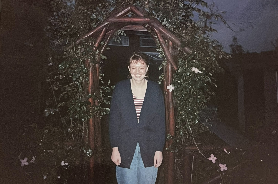
This photograph is another that has been captured in my own built environment. Whilst my home has always been familiar, there was once a time when this location was exciting and new. This image captures the beginning of calling a new environment home and the excitement that comes alongside this.
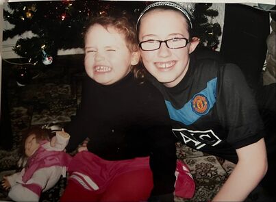
Sometimes important built environments can be far away, but the most special location for me would be my home. To me, this photograph embodies how special this environment is to me. It is not taken anywhere extravagant, but simply in front of the Christmas tree in my house. However, for me, it is way more than just a house; but a reminder of happy memories of Christmases spent with my sister. It would be hard to imagine this time of year without my home.
Process
Step one: Firstly, I searched through old photo albums to find photos of people in built environments that I recognised and could access.
Step two: I then travelled to the given locations and tried to recreate the same shot, however, this time I made sure to exclude the people.
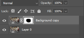
Step three: I opened these two images in Photoshop and layered them on top of each other, making the older image the top layer and turning it black and white to add to the dated effect.
Step four: With this top layer, I lowered the opacity a touch and moved it around so that the people match up with the appropriate place.
Step five: Once I was happy with the positioning, I used a soft brush alongside the masking tool to seamlessly reveal just the people.
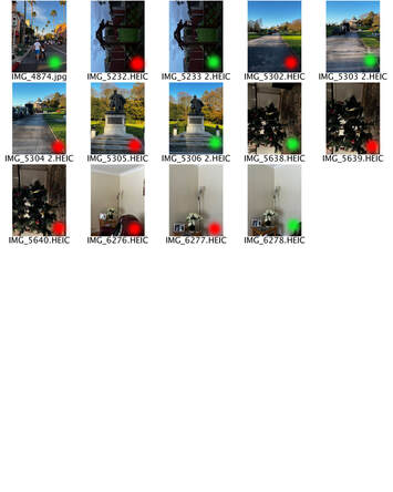
Contact sheets
Final edits
Meta Data
Image one: 1/1250sec, f/1.6, ISO 50 - 20th Nov 2024 at 14:34:36 - 53'0, 2'0
Image two: 1/900sec, f/1.6, ISO 50 - 20th Nov 2024 at 14:35:09 - 53'0, 2'0
Image three: 1/30sec, f/1.6, ISO 800 - 17th Nov 2024 at 16:34:38 - 53'0, 2'0
Image five: 1/25sec, f/1.6, ISO 800 - 1st December 2024 at 17:20:27 - 53'0. 2'0
Image six: 1/60sec, f/1.6, IS0 500 - 8th Jan 2025 at 14:54:00 -53'0, 2'0
Hanging plan
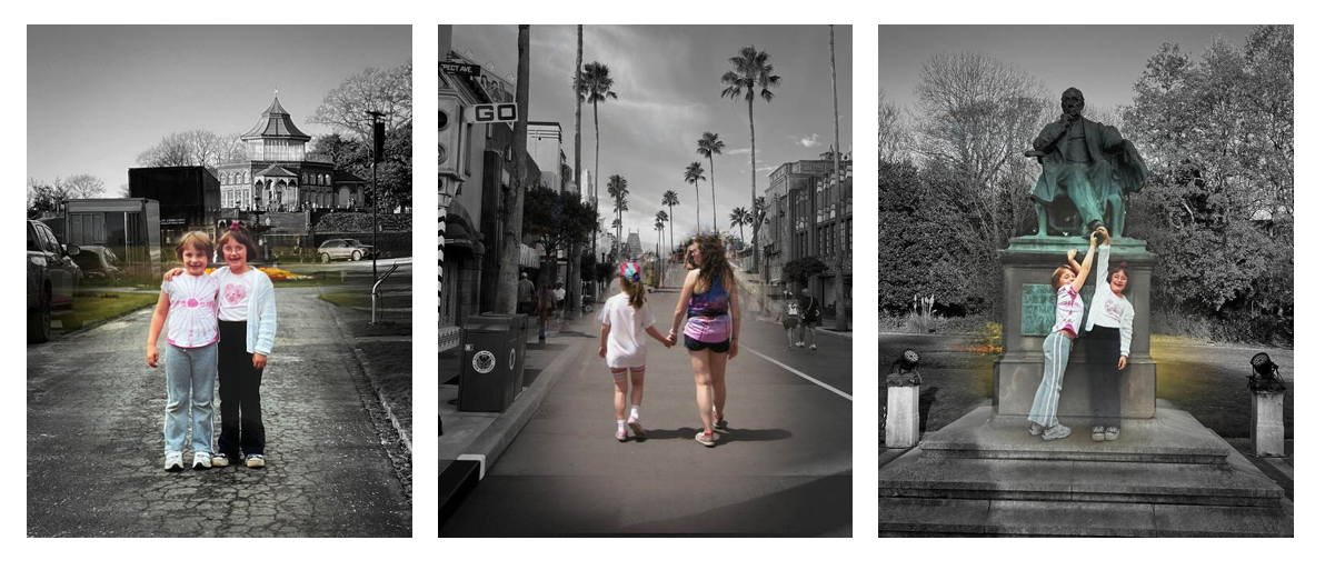
When displaying my images, I decided to present them as a triptych of three portrait images. I chose these three images as out of all the edits, these seemed to explore the built environment the best. In some of the others, the people take up most of the space, whereas in these they are only a small part of it and the rest of the space is filled with the built environment. Not only this, but I believe these work well together since they are all portrait. To stop the images from clashing and create variety, I placed the two images of the people facing forward on either side, and the one facing the other way in the middle. I also placed them this way since the ones on either side have the same subject whereas the one in the middle contains different people.
Evaluation
Overall, I am pleased with how these images turned out. I am particularly happy with the contrast between colour and black and white, which creates a poignant expression of nostalgia. I am also pleased with how well the images lined up together and created a seamless transition. However, If I was to repeat this process, I would wish to gather a wider range of locations and perhaps experiment with making some edits off the computer. For example, tearing bits of paper to combine the pictures manually. This process allowed me to use the techniques I learned from Shawn Clover, such as using masks to combine old and new. However, I managed to place my own spin on this and give it a personal touch using my own past.
Development
Whilst I was satisfied with the outcome of my images, I concluded that they placed too much focus on the people and not enough on the built environment. I decided to develop this shoot to place more of a focus on the surroundings. To do this, I picked certain locations that are significant to either me personally or the people in the images, or even ones that hold specific memories. Following this, I decided to layer pictures of the people on top, lowering the opacity. I thought that this faded effect would evoke the bittersweet feelings of nostalgia and memory fading away. Simultaneously, this would also place more focus on the buildings as the people aren't in clear view.
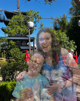
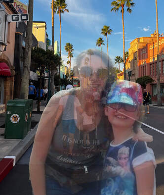
The built environments seen in these images hold a very special place in both mine and my sister's hearts. They were both taken in Orlando, Florida, a place where we have many cherished memories as children. Upon returning, we realised that for the most part, the buildings hadn't change, but we had. And yet, it always remained a special place to us and a place where we continued to make cherished memories.
Evaluation
In conclusion, I wasn't as satisfied with the outcome of these images. My intention was to take the focus away from the people and place it on the built environment. I thought that lowering the opacity would have this effect, however, the piece still seemed to be centred around the people and not their environment. That being said, I liked how the low opacity created a ghost-like effect which communicated the feelings of nostalgia well. However, I felt like the initial edits worked better for what I wanted to achieve with this shoot.
Further development
Since this development still placed an emphasis on the people, I tried to think of other ways I could shift the focus to the built environment. I concluded that a good way to do this would be by completely covering up the people. To achieve this, I selected the people on Photoshop drew over them with a soft white brush. I thought this may work better as it still evokes feelings of loss and nostalgia and acknowledges the people whilst having the main focus be on the environment around them.
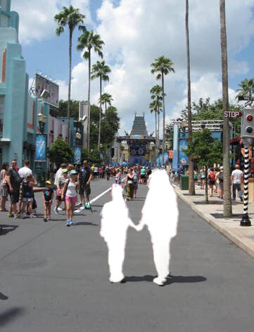
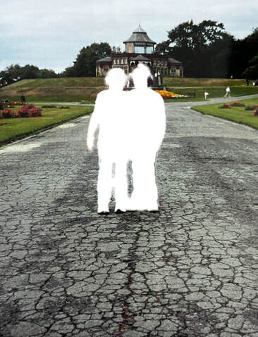
Trying manually
Since all my edits so far had been done digitally, I tried to think of a way to recreate this effect manually. I came up with the idea of painting over the people rather than doing this on Photoshop. I concluded that this would have all the same benefits as the previous images, however, the paint could work better for the theme of 'nostalgia' as it has connotations of childhood and creativity. This could also symbolise the past being 'covered up' or 'hidden.'
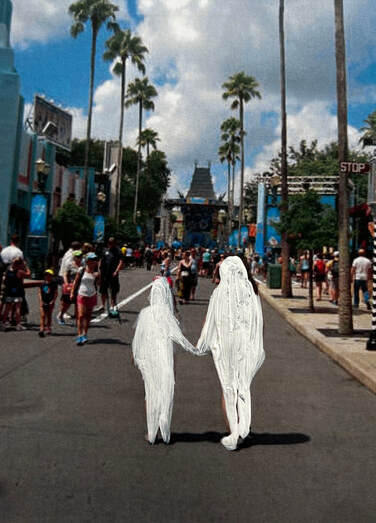
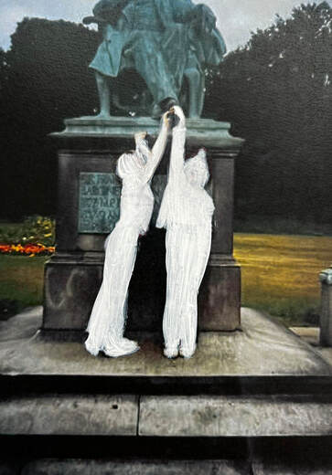
Through this shoot, I have learned to experiment with techniques on and off the computer to see which will work best. Out of all these images, I am happy with how the painted pieces turned out. I believe that these ones strike the perfect balance between the theme of nostalgia and placing focus on the built environment. I like how by simply adding paint, the images became poignant and evocative, as it has connotations of something being 'missing.' However, if I were to improve, I would not have the paint as thick to achieve even more of a ghost-like effect.
DEVELOPMENT TWO
Childlike
Explanation
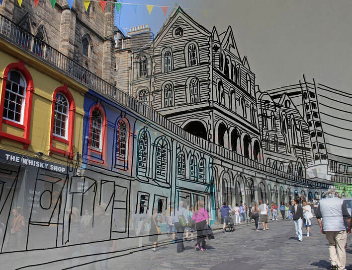
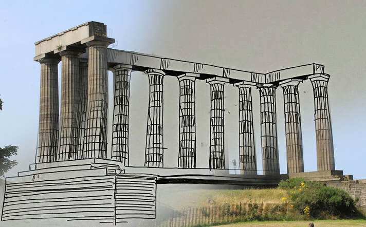
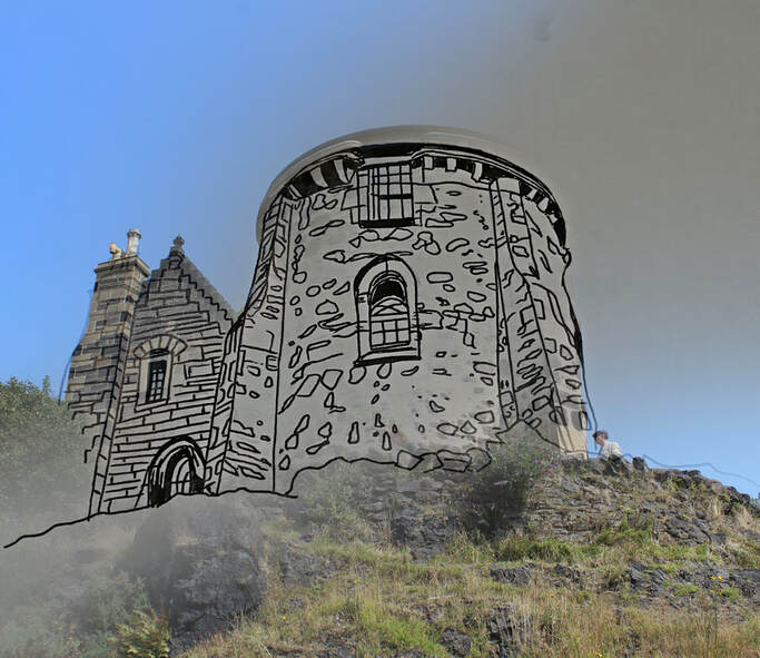
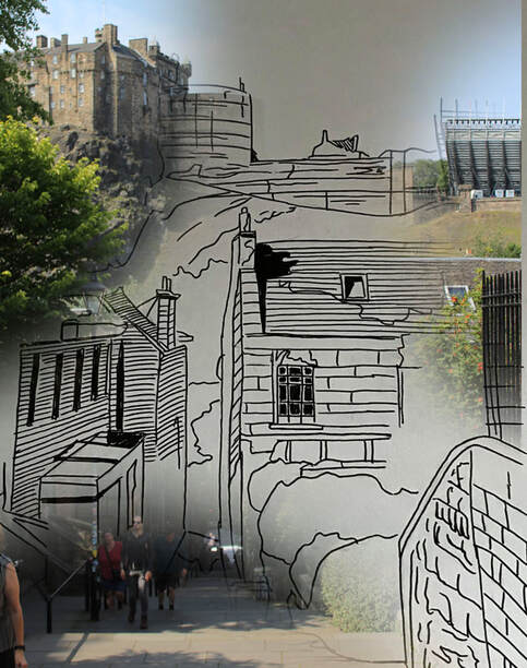
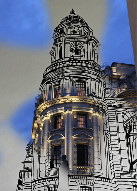
For this development, I decided to explore the built environment from the perspective of a child. Children have an incredibly unique view of the world as they can often see it through a fantastical lens. Since they do not have a full understanding on the reality of the world, they may tend to live in daydreams and see everything around them as magical and exciting. To create this dream-like effect, I have decided to experiment with different mediums such as paint, ink, and collage to create different vibrant backgrounds. For example, in the place of the sky I could use paint or different patterns to portray the built environment as mystical and fun.
How children see the world
I think most people look back on their childhood with a sense of fondness, and can recall seeing the world through a more imaginative and optimistic lens. But this merely relies on our memory, and since we don't have a time machine, it's hard to tell if this was true. Do children really see the world differently, and is there science to back this? According to Scientists at UCL (University College London), children younger than twelve do not combine different sensory information to make sense of the world as adults do. They found that to perceive the world around us, adults rely on various types of information, allowing us to determine what is out there more accurately. Adults also have the ability to perceive different depths. Dr Marko Nardini, UCL Institute of Ophthalmology, and lead author said, "The same is true for different kinds of information within a single sense. Within vision there are several ways to perceive depth. In a normal film, depth is apparent from perspective, for example in an image of a long corridor. This kind of depth can be seen even with one eye shut. In a 3D film, and in real life, there is also binocular depth information given by differences between the two eyes." For a child, on the other hand, the ability to combine the two kinds of depth information together does not come until around the age of twelve. What we can conclude from this, is that children and adults don't just see the world differently based on their experiences. However, scientifically, the two groups of people physically see the world differently.
Contact sheets
Process
Step one: Firstly, I chose my desired images and printed them out.
Step two: I traced this image on to a separate piece of paper to ensure that the two line up perfectly.
Step three: Once I had this rough outline, I could then bring it to life using watercolour paints. Following this, I added the details using a fine liner pen.
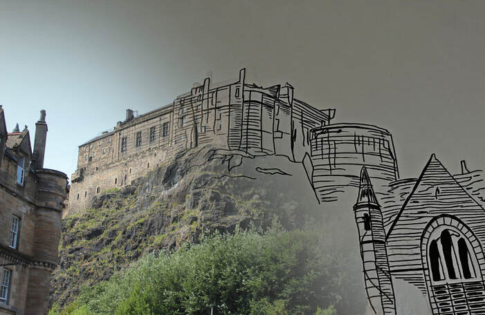
Step four: When I was satisfied with this, I tore away parts of the printed photo and stuck them on to the drawing, revealing parts of the drawing and parts of the photograph.
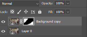
Step five: To experiment with how this would look digitally, I photographed my drawing and repeated the same process but using the masking tool on Photoshop to reveal certain areas instead.
Edits
Meta Data
Image one: 1/40 sec, f/4,5, ISO 3200
Image two: 1/500 sec, f/4.5, ISO 100
Image three: 1/200 sec, f/10, ISO 100
Image four: 1/60 sec, f/20, ISO 125
Image five: 1/800 sec, f/4.5, ISO 100
Image six: 1/500 sec, f/4.5, ISO 100
Hanging plan
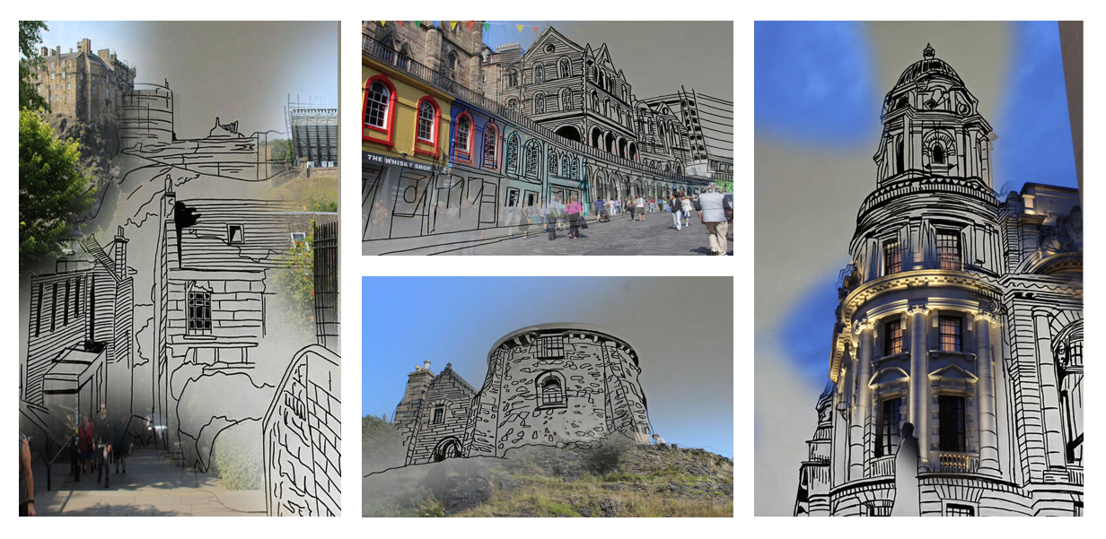
This shoot contained a mixture of portrait and landscape images, and I decided to select two from each of these to create a sense of balance and ensure that it didn't become repetitive. I placed these portrait images on either side of the landscape images to ensure that they didn't clash. Out of all the images, I believe that these ones worked best as they had the smoothest transition and the most detail in the line drawings. The one of Edinburgh castle, for example, didn't blend as smoothly and the colour of the paper turned out darker. The other Edinburgh structure that wasn't included blended fine, but the drawing didn't have the same intricate details as the others.
Evaluation
Overall. I am happy with how these edits turned out. I am particularly pleased with how well the drawing and the photograph blend together and align perfectly. However, if I were to repeat this process again, I would try to experiment with different mediums, such as watercolour or detailed sketches to see what different effects they could create. This process has allowed me to use techniques from different artist shoots, such as masking, However, I have taken my own spin on this by using this technique to combine my passion for art and photography.
Development
Since these images depict how a child would see the world, I decided to try and experiment with how I could make them more colourful and abstract. I thought that this would help to mirror the imagination and playfulness of a child. To do this, I decided to change the colours of the drawings and make them vibrant. To achieve this, I extracted the lines using 'colour lookup' and used the colour bucket tool to change the colour of this area.
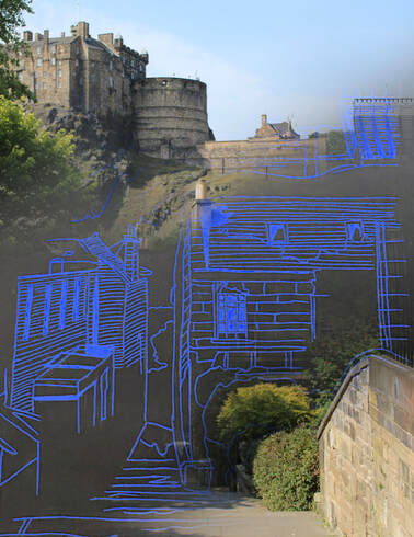
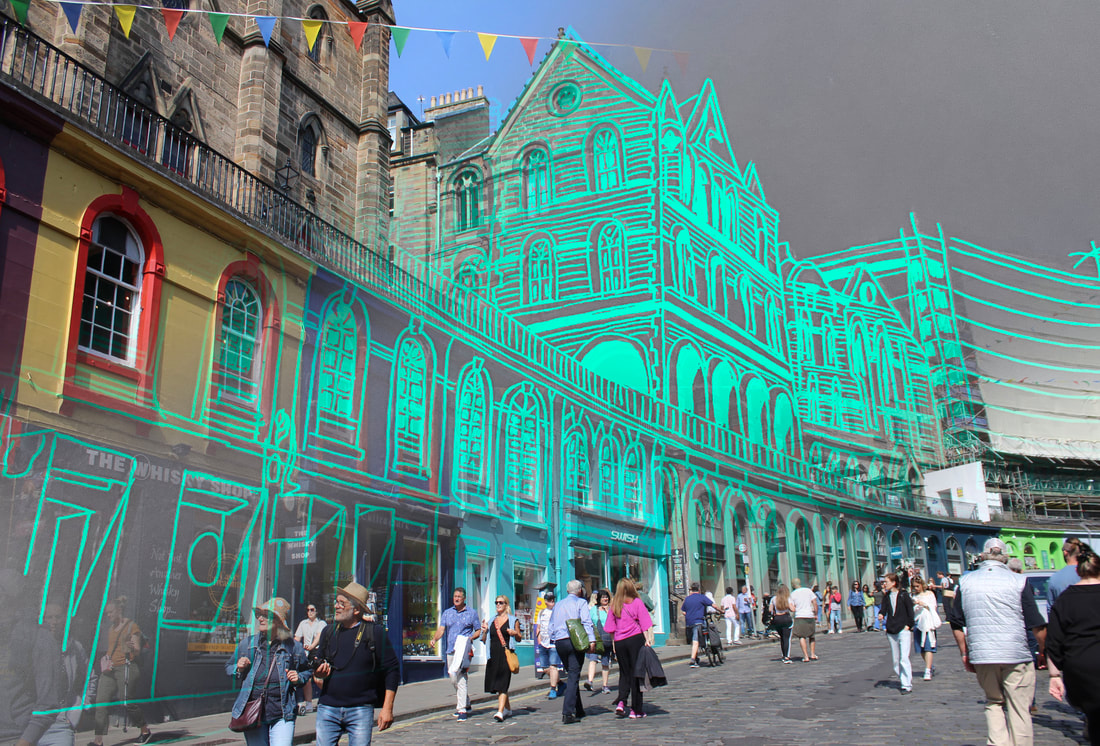
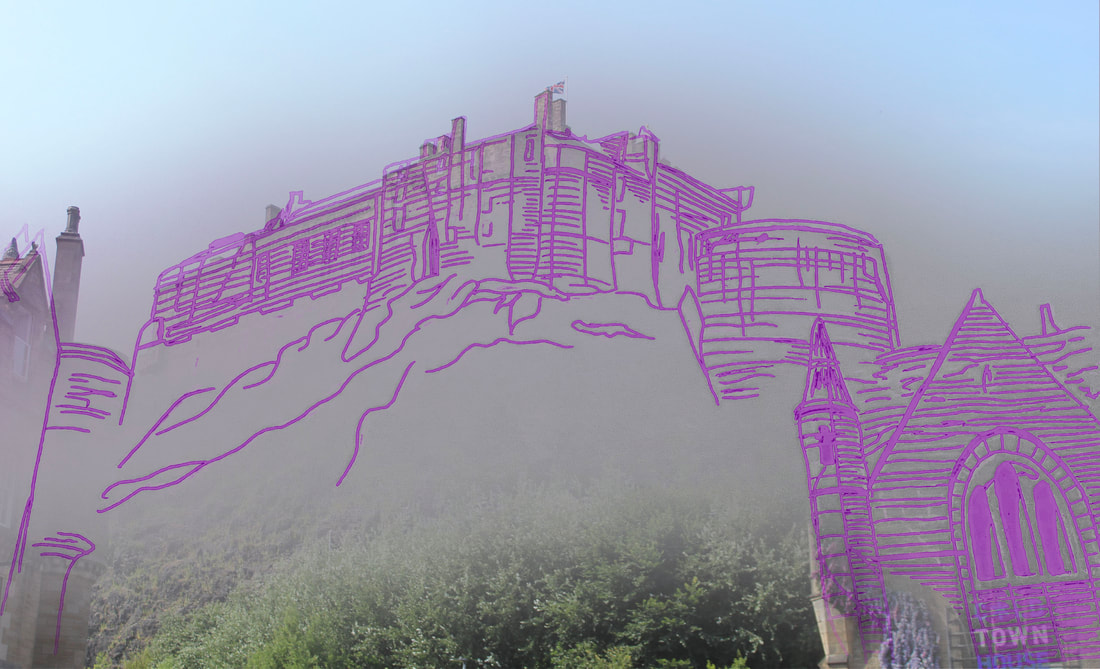
Evaluation
I liked the bright, vibrant colours in these images, as I thought that they effectively mirrored the playfulness and imagination of a child. That being said, I still preferred the initial edits. Although these ones were more colourful and playful, the first ones blended more seamlessly. Since the colour was such a contrast to the initial image, it was hard to create a smooth transition and it instead turned out more abstract than I would have liked. This experiment taught me how much colour can impact the overall mood of an image, which is something that I can carry forward in my project.
DEVELOPMENT THREE
Rose-tinted glasses
Explanation of idea
For this development, I wanted to explore what the built environment could look like through the eyes of someone who may have an unrealistic or romanticised view of a place. For example, they could be visiting a city for the first time and become so overwhelmed with excitement that they overlook certain details or draw their own conclusions. Additionally, they could have never seen the place before and be imagining what it might be like, but creating their own narrative and painting it out to be better than it is in reality To create this effect, I have decided to take a photograph of a specific place, however, tear apart certain parts and instead have them as watercolour paintings. I want to do this to create the illusion that this person is drawing their own conclusions and imagining a narrative that is not rooted in reality.
What is romantisizing?
For as long as time, humans have taken interest in the romantic. But no, this does not inherently mean the romantic love that first comes to mind. 'Romanticising' is a term that simply means to deal with or describe in an idealised or unrealistic fashion; making something seem more appealing than it really is. This is not just a modern term, but it actually arose all the way back in the eighteenth century, following the Romantic movement. As a response to the Industrial Revolution taking the world by storm, the Romantic movement was an artistic movement that combated this by placing emphasis on human emotion and the idealisation of nature. This was the period of 'feeling' and was typically characterised by artists pouring their hearts on to canvases and poets having spontaneous bursts of emotion. Many of these ideas come from the philosopher Edmund Burke, who states in his book that there are two aestethic theories. One of these is 'the sublime' which is characterised by large-scale manifestations that inspire awe. On the other hand, you have 'the beautiful' which is evoked by a simple order in the natural world which brings about pleasure. Burke argues that both of these principles exist readily in nature. These two principles come together to sum up the heart of 'romanticisation.' This is something that has developed and is heavily prevalent in the modern day. Since the dawn of social media, we especially see this in people snapping photos of small moments in their life, such as cups of coffee or sunsets. This was particularly prevalent in the COVID 19 epidemic, when romanticisation became not only an artistic movement but a means of survival. Since people were stuck at home, they had to find ways to find the beauty in the mundane everyday. Be it poetry in the eighteenth century or beautiful pictures on social media, romanticisation remains a concept that has stood the test of time and allows people to find joy in the everyday.
Planning
For this shoot, rather than capturing big city scenes, I wanted to focus on singular structures. For example, I wanted to try and find as many statues or small monuments as possible. I thought this would be effective for the shoot because, as a child, you rarely focus on the big things but instead feel awe-stuck by the smaller intricate details.
Contact sheets
Process
Step one: Firstly, I downloaded an app called 'Ibis Paint.'
Step two: Using this software, I created a background with the lightest colour.
Step three: Following this, I created another layer and used the soft brush with a slightly lowered opacity to add several different colours and blend them together.
Step four: To create a more seamless transition, I selected the 'Gaussion Blur' filter.
Step five: Once I was happy with this, I saved the image and opened it up into Photoshop with my chosen photograph.
Step six: I layered the two on top of each other, with my chosen photograph on top. I then used the 'select' tool to select the sky and the mask brush to paint over this area and reveal the colour underneath.
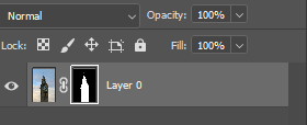
Final edits
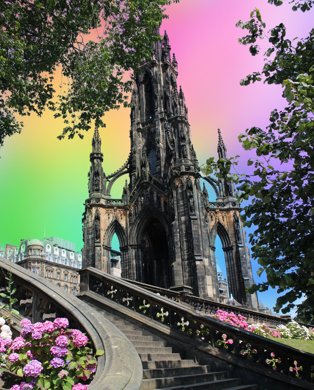
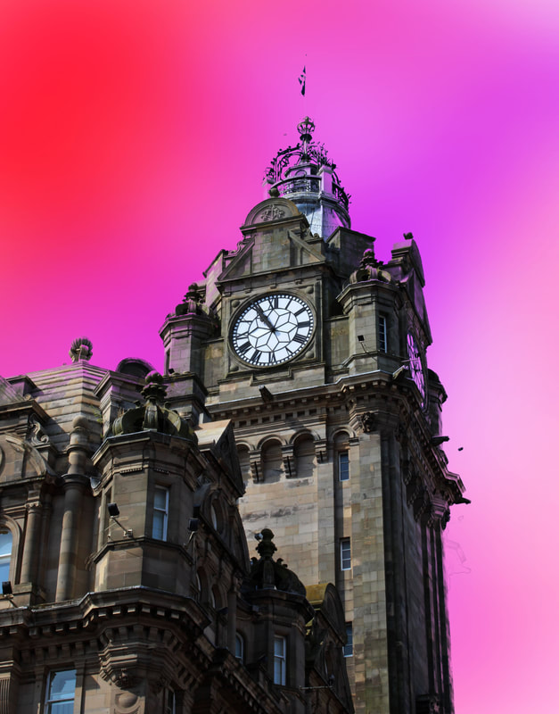
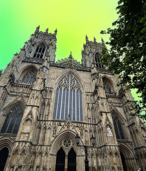
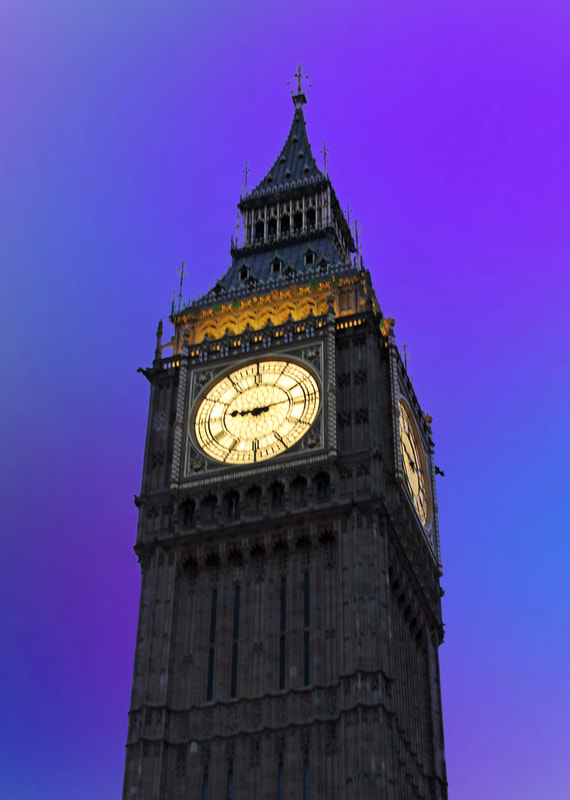
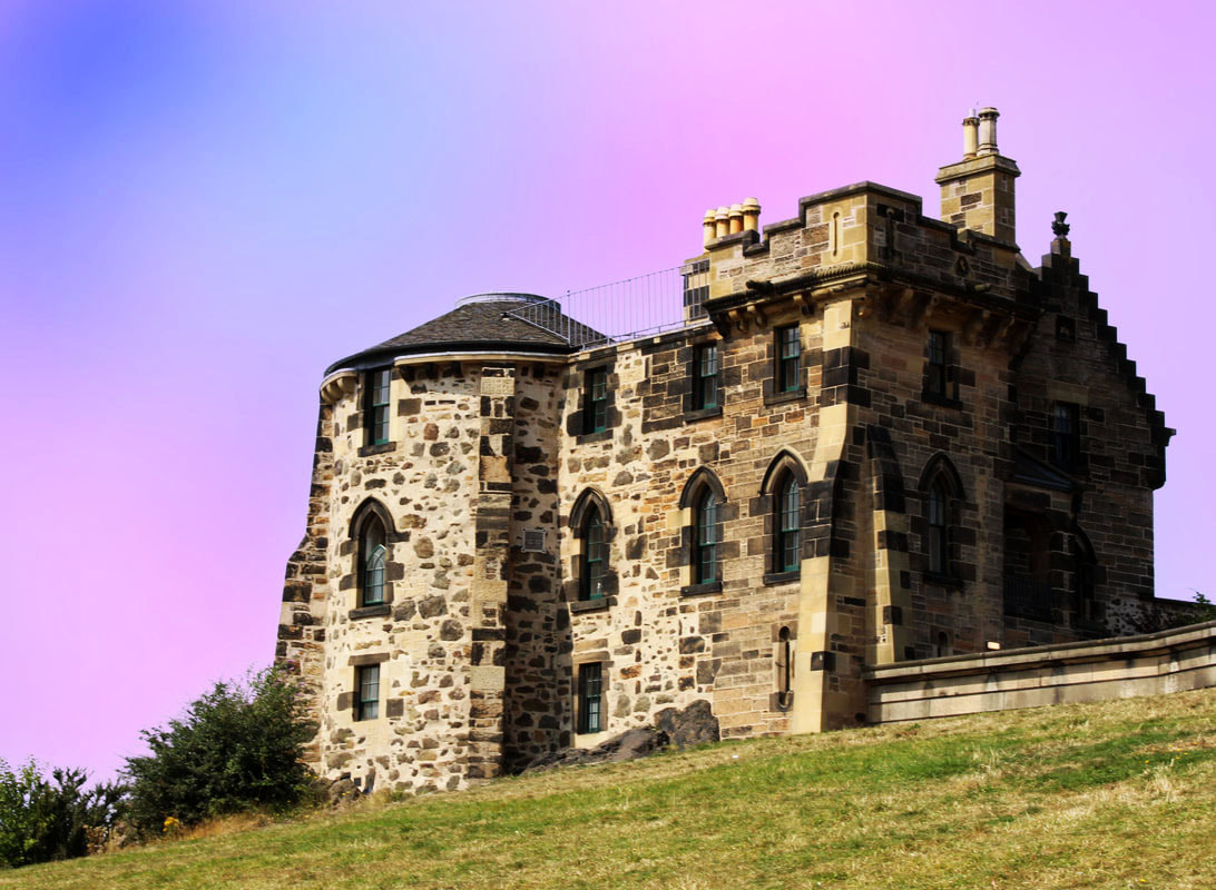
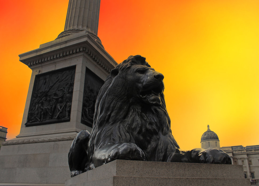
Meta Data
Image one: 1/1300 sec, f/5.6, ISO 320
Image two: 1/250 sec, f/5.0, ISO 100
Image three: 1/85 sec, f/20, ISO 100
Image four: 1/60 sec, f/20, ISO 125
Image five: 1/340 sec, f/2.4/ ISO 32 - 17th Aug 2024 at 10:21:58 - 53*0, 1*0
Image six: 1/60 sec, f/5.0, ISO 800
Hanging Plan
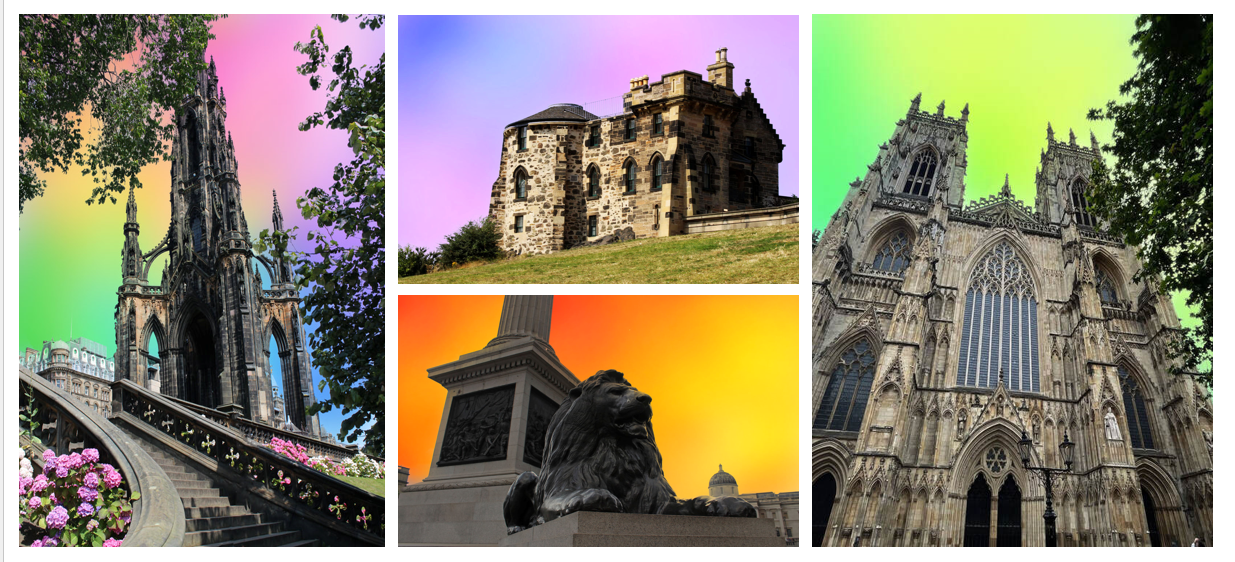
This shoot contained a mixture of portrait and landscape images, and I decided to select two from each of these to create a sense of balance and ensure that it didn't become repetitive. I placed these portrait images on either side of the landscape images to ensure that they didn't clash. Another way I stopped them from clashing was by placing similar colours near each other. For example, the pink and blue colours appear in the left corner, whereas the green, yellows and oranges appear in the opposite corner. Additionally, I ensured that the trees in the two portrait images were facing each other to create symmetry. I decided that these images were the most successful as they seemed to match the background the best. For example, in the two portrait images, the colour peeks in through the trees which I thought worked well. However, in the Big Ben image that I didn't include, the actual structure appeared quite flat and was overpowered by the background. Whilst there was nothing wrong with the other image not included, I felt like it didn't match as well with the set.
Evaluation
Overall, I am pleased with the finished result. I am particularly happy with how the vibrant colours complement the architecture and effectively create a dreamlike effect. However, If I were to repeat this process I would experiment with diverse backgrounds. For example, I could have tried some work off the computer, using mediums such as ink or watercolour to see what effect this could create. This process allowed me to experiment with colour, as I did with Nicholas Gooden, but instead use it to evoke a different kind of emotion.
Development
Since these images had been created digitally, I decided to experiment and see if I could create this same effect manually. I concluded that the best way to do this would be by using paint, as this is an effective way to incorporate colour into the piece. However, I decided that just using paint might be too similar and that making a physical collage with this paint could be more visually interesting. Not only did I use paint, but I also used pieces of card and newspaper. This cluttered background could mirror their brain trying to piece together a narrative of this location. The newsprint could also symbolise the fake news that they may be being fed about it which could skew their perception. This is a great way to use my knowledge of combining fine art and photography from previous shoots.
Physical collages
Edits
To achieve these final outcomes, I made the collages by hand and then scanned them on to a computer. I then layered the images of the buildings on top of these on Photoshop and removed the background to let the collage underneath show through.
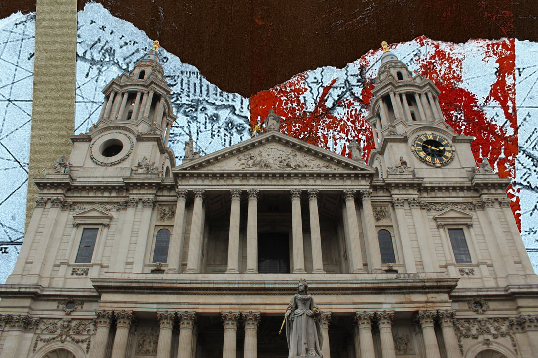
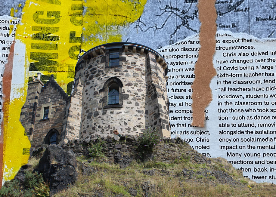
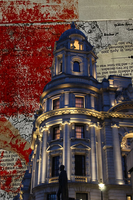
Evaluation
I was pleased with the outcome of these images. Despite the background and the subject being so vastly different, I was surprised at how well they worked together. I liked that the collage added more visual interest and texture. However, for the purpose of this shoot, I felt like the initial edits worked better in portraying a more 'romantic' view. I believe that both work well for different reasons, but the first ones seem to have more positive connotations. Through this development, I've expanded my ability to incorporate fine art into my work as now that I have done it a few times, I am able to be more experimental and combine different textures and materials, which is something that will be useful to take forward.
DEVELOPMENT FOUR
Forgetting
Explanation of idea
The built environment can mean a lot to different individuals and various places can spark memories. However, for some individuals these memories may be starting to fade, and they may struggle to fully see a place for how it is. To try and replicate this feeling of losing memories, I decided to paint over certain areas of the photograph to try and replicate the feeling of memories fading away.
Human memory and forgetting
The human life is long and filled with both grand moments and small, insignificant ones. Given this, it makes natural sense that we can't recall every little detail. In fact, research found that approximately 56% of information is forgotten within an hour, 66% after a day, and 75% after six days. Forgetting is the loss or change in information that was was previously stored in short-term or long-term memory. It can occur suddenly or it can occur gradually as old memories are lost. But how does the human mind work? How do we remember some things and not others? Studies show that memory loss and forgetting can be a result of four main factors: decay, interference, failure to store and motivated forgetting. Memory decay can be characterised by when information slips from your head and no matter how hard you try, you can't seem to find it. This is caused by a memory trace that is created every time a new memory is formed. Decay theory suggests that over time, these memory traces start to disappear and fade, and if the information is not rehearsed often, it will begin to disappear. Interference occurs when information is stored that was very similar to other information recently stored in memory. There are two main types of this: proactive interface, when an old memory makes It difficult to remember a new memory, and retroactive interference, when new information interferes with the ability to remember previously learned information. Sometimes, however, memory loss isn't caused by forgetting but merely because it was never turned into long term information in the first place. This is called failure to store, and occurs when encoding failures prevent memories from entering long term memory. Finally, we have motivated forgetting, when humans actively work to purposefully forget memories, typically ones associated with trauma or pain.
Planning
Similarly to the childhood photoshoot, I wanted to try and capture singular structures. I thought this would work well, as these smaller structures could hold emotional significance and be symbolic of specific memories, evoking an emotional response.
Contact sheets
Process
Step one: Firstly, I opened up my image on Photoshop and made a new adjustment layer with 'hue/saturation', where I lowered the saturation to zero.
Step two: Using the 'gradient' tool alongside the 'mask' tool, I created a soft transition between the two.
Step three: Following this, I flattened the image.
Step four: With this new image, I duplicated the layer again, blurring the top image.
Step five: Using the mask and gradient tools again, I made another transition between the two,
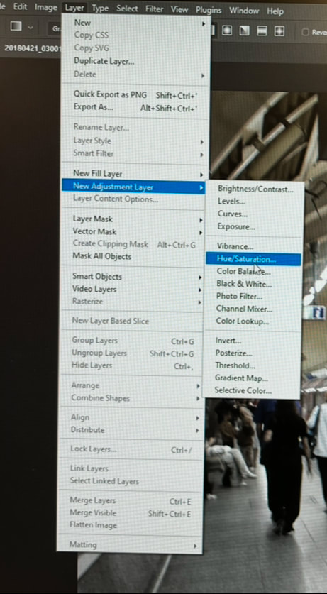
Experimentation
My initial idea was to paint over parts of the image with acrylic paint to replicate the feeling of someone forgetting details. However, upon careful consideration, I realised that this was not the most effective way to portray my message. The finished outcome did not have the effect I was aiming for, with the acrylic paint not being smooth or bright enough. I decided that memory loss would be more of a gradual process, and my images presented it as harsh and sudden. To better replicate this, I decided it would be better to show the buildings slowly fading away, either with water colour paint or a blur tool on 'Photoshop.'
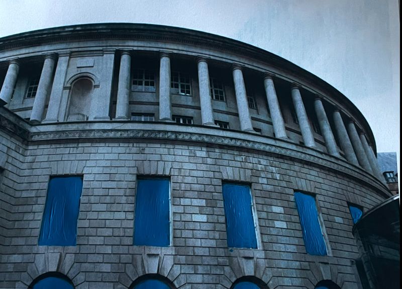
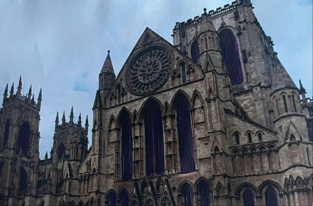
Final edits
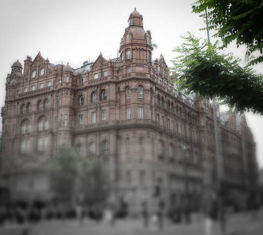
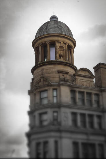
Meta Data
Image one: 1/125 sec, f/5.6, ISO 125
Image two: 1/500 sec, f/6.3, ISO 100
Image three: 1/320 sec, f/8, ISO 100
Image four: 1/40 sec, f/22, ISO 320
Image five: 1/10sec, f/4.5, ISO 100
Image six: 1/85 sec, f/22, ISO 250
Hanging plan
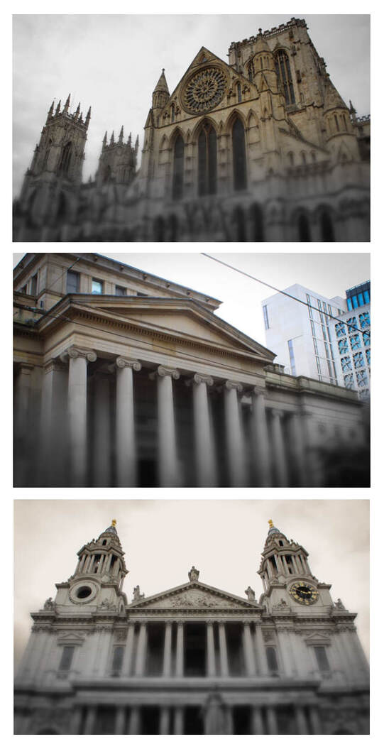
Despite being happy with all of these images, I decided to display them as a set of three. Since all of these images are landscape, they appear even and work well together as a set. I excluded the square and portrait images from this as they wouldn't work as well as a set. I also found that a lot of the images were similar, and therefore it did not feel necessary to include all of them. Instead, I decided to pick images that worked best together and also showed the most variety. I believe this selection does just that, as each of the images are vastly different structures from different locations, yet they still work together seamlessly.
Evaluation
Overall, I am pleased with how these images turned out. I am particularly happy with how smoothly and gradually the image fades out, highlighting that forgetting is a slow process that happens over time. However, if I were to repeat this process, I would try to experiment with more techniques off the computer to create this same effect. This process allowed me to use skills I have learned from several artists, such as masking and layering. However, I also picked up some new skills along the way such as learning how to use the 'gradient' tool.
Development
Each of these images displayed a smooth and seamless transition, which I really liked. However, the only draw back was that they became quite repetitive. To combat this, I decided to develop these images by experimenting with different ways I could show this transition in Photoshop. This could be anything from blurring in different directions to experimenting with different distortions. I decided to not just fade out using colour and blur, but by using fragmentation and pixelation.
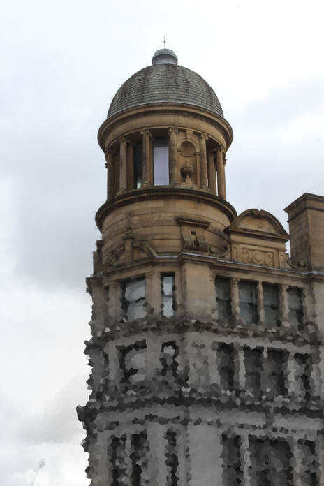
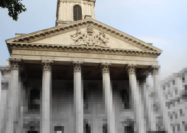
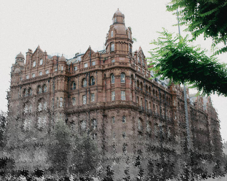
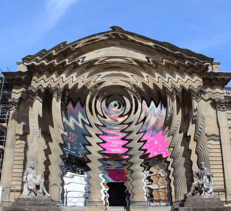
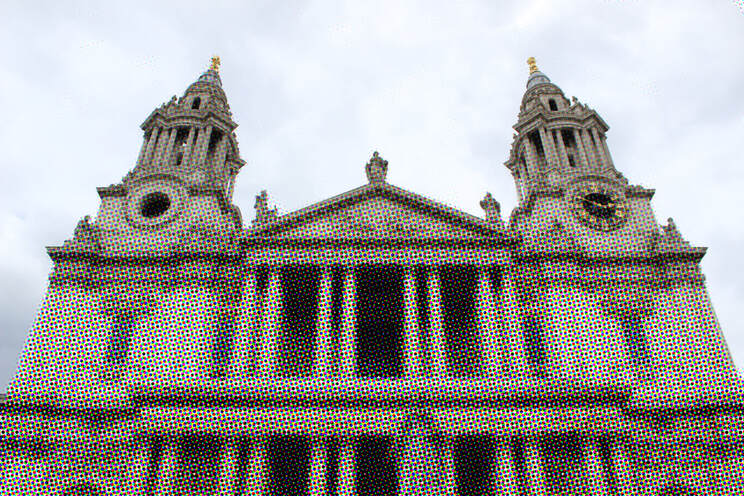
Development two
To develop this further, I wanted to come up with a way to show the buildings 'fading away' manually. To achieve this, I decided to use paint and burning the edges of the images. I thought that the burning would create a more dramatic outcome, showing the buildings decaying. On the other hand, the paint could create a more melancholic effect, showing them slowly fading away.
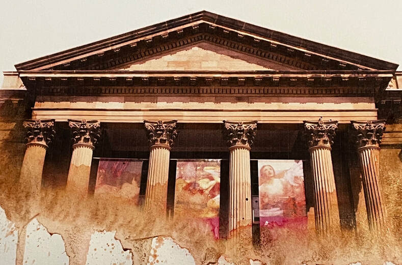
Evaluation
Overall, I am pleased with how these developmental images turned out. This process has taught me that an image is never really 'complete' and that there are always unique ways of experimentation. On a technical level, I've learned how to combine elements of fine art and photography, which will be useful going forward as it broadens my horizons. Moreover, I've learned how to experiment with different distortions on Photoshop and how placing these in specific areas can create different outcomes. Throughout these experiments, I am pleased with how every image feels unique and fresh whilst still communicating the same message. Out of all the images, I am most happy with the fragmentation images, as they still have this seamless transition whilst having more visual interest. I wasn't as satisfied with the outcome of the spherized image as it felt a bit too abstract for what I was trying to achieve.
DEVELOPMENT FIVE
Isolation
Explanation of idea
Whilst the built environment can create a sense of belonging and community, unfortunately for many people their surroundings can evoke feelings of loneliness and isolation. For example, when moving to big cities people can often feel like another face in the big crowd and as though there are no familiar faces. However, it could even be in an environment that they have known their whole life, and yet they feel like everyone else is part of a community into which they do not fit. To recreate this feeling, I decided to photograph people in the built environment, but using techniques such as empty space to try and show just how lonely the environment can be.
Human loneliness
Loneliness can often be described as a feeling we get when our need for social contact isn't met. However, it's crucial to understand the difference between loneliness and being alone. We typically connote lonely people with people who live alone and have little contact with other people. However, someone who has this lifestyle may be physically alone, but not feel lonely at all and instead be content with their life. On the contrary, somebody surrounded by people could report to struggle the most with loneliness. In fact, a study conducted by the World Economic Forum found that cities, the places notorious for being 'social', actually increase loneliness by 38%. Social inclusivity, on the other hand, means being selective about the people around you and ensuring they share your values. The studies show that this was associated with a 21% decrease in loneliness, meaning that it is about quality of relationships over quantity. Cities however, with their dense population and bustling crowds, tend to lean towards quantity, which can be what leads to such overwhelming loneliness.
Planning
For this shoot, I decided the most effective location would be a place that is typically deemed as 'social.' To achieve this, I went to Manchester to get most of these photos as this is a busy, vibrant city where one wouldn't typically expect to be lonely: showcasing just how extreme this emotion can be. Contrastingly, I also wanted to capture some locations that can easily be deemed as isolating. In the city, I want to find secluded locations that can surface these emotions, such as empty train stations.
Contact sheets
Final edits
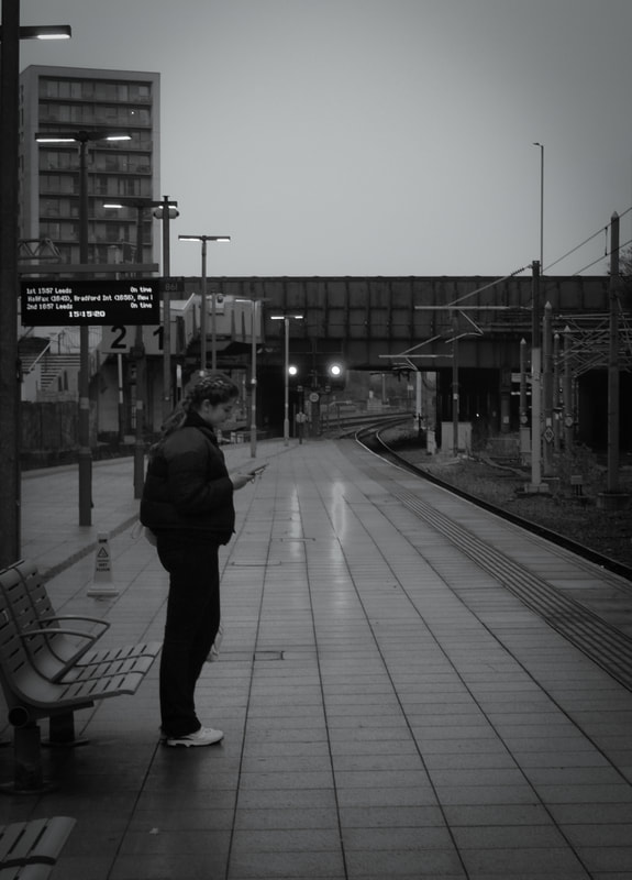
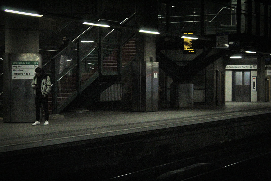
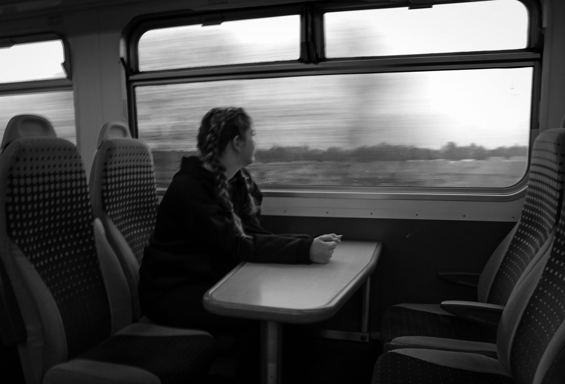
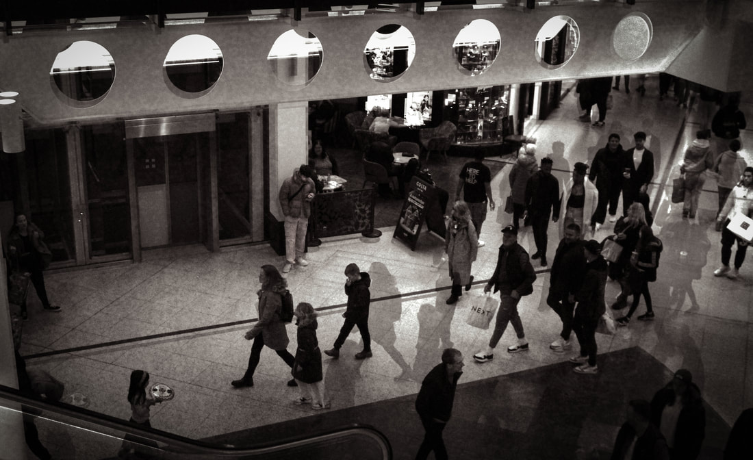
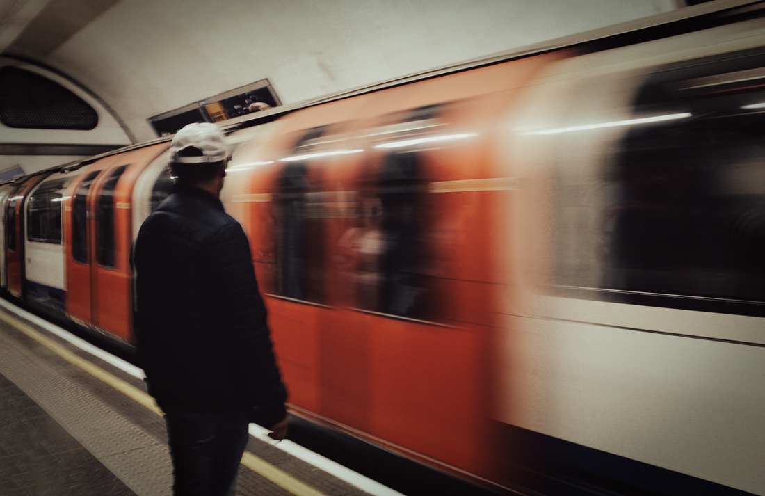
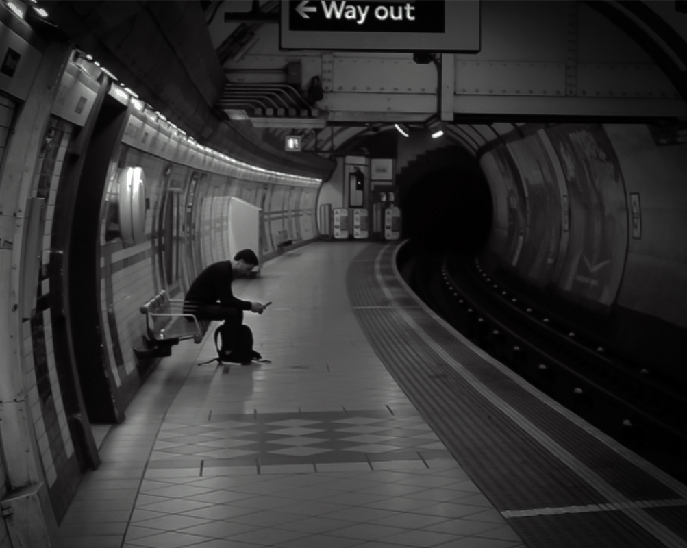
Meta Data
Image one: 1/20 sec, f/3.5, ISO 250
Image two: 1/10 sec, f/3.5, ISO 200
Image three: 1/640 sec, f/5.6, ISO 3200
Image four: 1/6 sec, f/7.1, ISO 100
Image five: 1/60 sec, f/5.0, ISO 400
Image six: 1/640 sec, f/5.6, ISO 3200
Hanging Plan
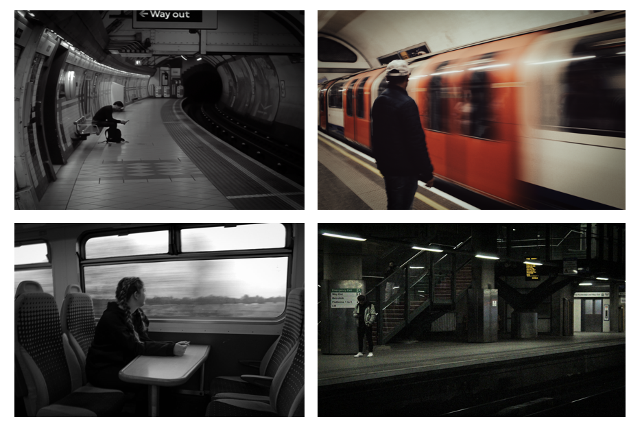
When displaying my images, I felt like these four worked best as a set. I decided to exclude the portrait image as it felt like an 'odd one out' amongst the other landscape images. Moreover, I excluded the one with lots of other people in it as this also didn't match, since the rest of the images only had one person in each. Notably, two of these images have the subject looking out, whereas the other two show the subject looking down. Additionally, two depict the actual journey, showing the movement of a train. However, the other two show a period of 'waiting' and depict an empty station. Since these images are so different, I decided to place them horizontally to each other to stop them from clashing and create variety.
Evaluation
Overall. I am pleased with how this shoot turned out. I am particularly happy with how the lack of colour and negative space effectively replicate the feeling of loneliness and isolation. However, if I were to repeat this process, I would try and incorporate some more techniques from different artists I studied such as selective colour from Nichollas Goodden. That being said, some artist techniques did come in useful in this process. For example, using layers like Thomas Vanoost to create that busy, fast-paced effect in one of the images.
Development
Whilst I was satisified with these outcomes, I wanted to come up with an alternate way of looking at isolation. Each of these images explicitly show isolation, by having a given subject be stood on their own surrounded by empty space. However, I wanted to show a more implied meaning. To do this, I decided to draw over the subjects using chalk. This takes a different approach, as it could symbolise the feelings of being 'invisible' and 'not fully seen' by those around you. I opted for chalk since this isn't as thick and could create more of a ghost-like effect.
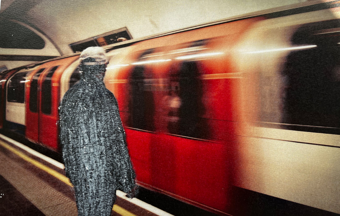
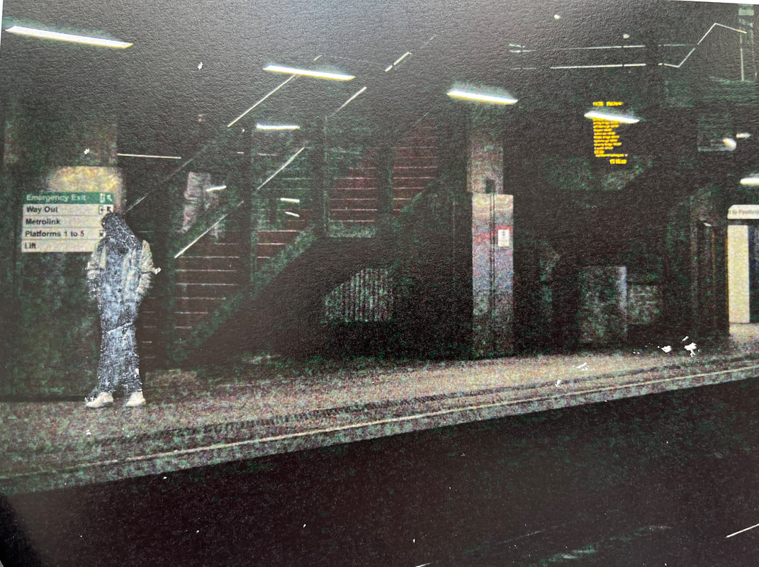
Upon consideration, I wasn't happy with how the chalk turned out. Even though I wanted it to be thin, it was perhaps too thin to the point where it was difficult to see. Additionally, the chalk marks appeared too messy and I wasn't happy with how they looked. I decided to experiment with paint instead, as this would achieve more coverage.
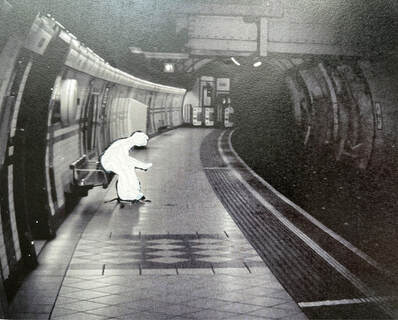
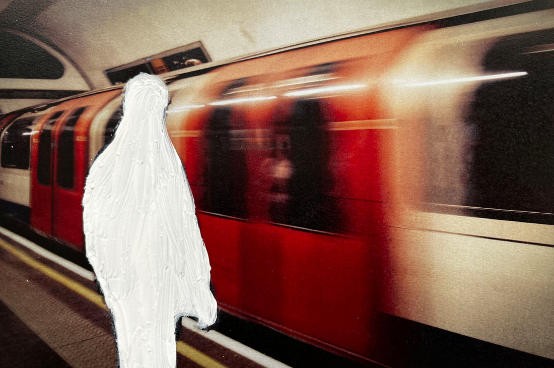
Evaluation
I am happy with how these images turned out as I feel like the paint creates a melancholic effect and could mirror the feelings of isolation and not being fully seen. I also like how you can see the individual brush strokes as this emphasises the effects. However, although I was happy with this development, I still preferred the initial images. I am glad that I experimented, but in the end I concluded that the images were poignant enough on their own and didn't need any extra techniques to convey the message.
FINAL PIECE
Idea Explanation
Throughout this project, I have explored the built environment from a variety of unique perspectives. By using several techniques, taking inspiration from numerous artists, and travelling to a diverse range of locations; I have highlighted the importance of the built environment and the emotions it can evoke. When considering how this work could be brought together, a magazine was the first medium that came to mind. However, upon reflection, I realised that within this market, built environments are only ever depicted as glossy and perfect. Rather than trying to capture the true nature and character of a given location, the focus of these magazines is placed on attracting tourists. In using this marketing strategy, the world is only seen through one lens and the raw truth can go unseen. When producing my own magazine, my aim was to subvert this narrative and instead show the true reality of these locations through many perspectives. To portray this effectively, my vision was to have one page being a celebration of the positive aspects of a given place, with the subsequent page showing an alternative viewpoint that is not as idealised. This is not to shame a location or draw people away from it, but rather to recognise that no place is perfect and yet that is what makes it beautiful.
Research
What is a travel magazine?
A travel magazine, in summary, is a guide that combines travel tales, useful information and advice. Common features of this format can include: unconventional destinations, remote locations and authentic experiences.
What is the purpose of a travel magazine?
Travel magazines: when the thought first comes to mind, you may have preconceived judgements. Photos and rambles about holidays, how could that be of any importance? Well, contrary to widespread belief, this outlet holds a vital role in the media industry. Not only are these magazines flashy and fun, but they provide a way to explore any given location before even stepping foot there. In a world where travel has not only become increasingly expensive, but also alarmingly unsafe, this has become more useful than ever. Going to a new place without doing the relevant research can be overwhelming, unsuccessful and, in many cases, dangerous. Yet, when scavenging Google for information, it is easy to feel bombarded by various sources and not know who to trust. Luckily, travel magazines are an accessible solution to this. Each page is packed full of inside information and travel advice, sourced from experts with real life experience. Not only this, but they provide recommendations for hotels and activities with relevant links, events happening in the area and vital tips, all in one place! The world is packed with diverse cultures and diverse ways of life, meaning being prepared is necessary if you want to set yourself up for success. Even if planning a trip is not on your radar, travel magazines should not be off the cards. Not only do they allow you to experience the wonders of the world right from the comfort of your own home, but they are an effective way to keep up with the current news from your favourite locations.
An example - National Geographic
When discussing this type of media, it would be impossible not to mention 'National Geographic.' This remarkable company, founded in 1888, has gone on to win several prestigious awards and inspire over thirty-five million people worldwide. The stunning photographs they produce are not just images, but ways to spark curiosity, empower exploration and inspire change. This is an inspirational example of how the art of photography can be used to make a positive impact in the world. Not only does this company provide endless information about landscapes, history, and travel across the globe, but it educates people on some of the most pressing issues facing our natural world. At the heart of their work, National Geographic aims to use storytelling and lens-based media to illuminate and protect the natural wonders of the world.
Gathering Inspiration
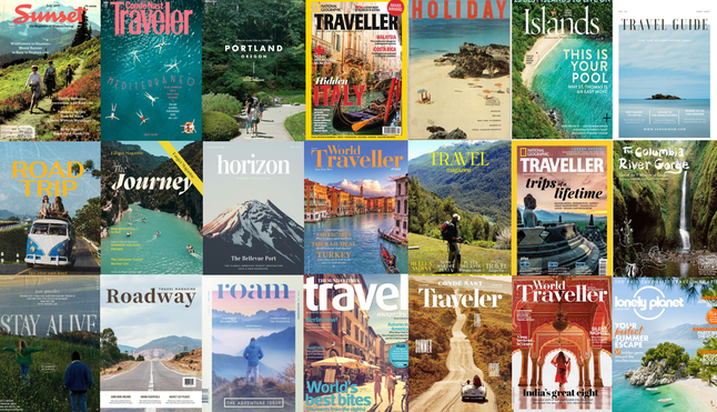
Layout Inspiration
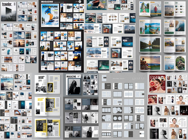
Experimenting with different styles
My Magazine
When designing a magazine, there were several elements that needed to be considered. These include target audience, colour scheme and design, content, and genre. All these elements come together to make an effective magazine.
Genre
When choosing a genre for my magazine, this was clear from the beginning. A travel magazine would not only be the ideal way to display my images, but also to use them for a real purpose. I believe my images fit perfectly into this genre as they provide a way for people to explore places they have not and provide vital information.
Target Audience
After careful consideration, I concluded that the target audience for my magazine should be teenagers and young adults. Studies have shown that young brains are the most impressionable, but alarmingly, this age range is the most active on social media. Unfortunately, this runs the risk of these individuals being influenced negatively and exposed to misinformation. Especially since this demographic are the ones finding their way in the world and making decisions about where they want to call home, access to reliable information is key.
Colour Scheme and Design
Given the young target audience, I decided to opt for a fun, eye-catching design. Due to an increase in digital and social media, it is more difficult than ever to capture people's short attention spans. To combat this, I decided to make my magazine as fun and engaging as possible. This could be achieved by using unique fonts, interesting collages, and soft, pastel colours.
Content
Despite many travel magazines focusing on travel tips and stories, I wanted to home in on the theme of exploration. The focus of my work would be to provide a way for people to travel around the UK and see it through different perspectives, all the while never leaving the comfort of their own home.
Final Piece
Digital Copy of Magazine
Evaluation
Overall, I am pleased with the outcome of my final piece. I believe it is an effective way to bring my work together and use it for a real purpose. I am most satisfied with how it organises the photos into sections according to their links and ties them together. Additionally, I am happy with the fun and eye-catching design which adds an uplifting tone to the work. If given the opportunity to improve, it would be interesting to include more locations, or even add more pages that explore specific themes in depth. Additionally, it would be intriguing to explore different stories from real people and capture these through photographs.
Final Evaluation
This project started out as capturing images of built environments, yet across these few months, it has developed into something much more meaningful. Through my photographs, I have not only been able to celebrate locations close to home and further afield, but also tell the important stories of others. My work has become a way to capture the emotions that a built environment can evoke and provide a voice for those in society who may go unheard. Out of everything I have explored in this project, I am most happy with my experimentation of different digital and manual techniques. For example, I used masking, GIFs, collaging, drawing and much more to bring various locations to life and tell stories. Above all, I am proud of how much I have pushed out of my comfort zone and tried a variety of digital techniques from different artists, even carrying some of these forward into my developmental work. Out of all my experiments, I am most pleased with the outcome of the Jack Lloyd inspired shoot, as this was the longest process which took great patience to perfect. To reach the final outcomes, I had to undergo hours of experimentation, testing various layouts and collages to see which works best. However, there is always room for improvement. Each of my developments explores a unique perspective or emotion. If I had more time, I would aim to develop these ideas further and explore separate ways of representing each emotion. Additionally, it would be interesting to explore more manual techniques. Throughout the process, there has been a predominance of digital techniques, so the project could benefit from replicating these ideas without digital editing software. But beyond just learning the techniques and software, I have discovered a lot about myself as a person along the way. This process has opened my eyes to the endless possibilities of combining my passion for both fine art and photography. But most importantly, I have learned that I do not just want to use photography as a creative outlet, but to help others and inspire change. I believe that this is what I have already been able to achieve and would love to expand on this further if I had the time. My ultimate aspiration for this project would be for my magazine to be published on a regular basis, having monthly issues that each explore a different country or location. Moreover, it would be interesting to interview locals and gauge an understanding of their real-life experience and stories. This would allow me to make authentic photographs and translate true stories into art so that these individuals can have a voice. In doing this, I would be able to grow this project into something bigger and be able to help uncover the stories of places across the globe.