UNIT TWO
TRANSFORMATION OF THE MIND
INTRODUCTION
When we think of change, we often think of a grand spectacle that you can physically see. Be it a caterpillar turning into a butterfly, or an 'ugly duckling' to an elegant swan: humans are drawn towards transformations that can be quantified. But what if the most profound evolutions can't be seen by the human eye? What if the biggest change happens within the mind? For my project, I wish to explore the mental journey from a negative to positive world view. I wanted to document the journey of going from a pessimistic headspace to slowly finding beauty in the world. Rather than photographing how this change may manifest physically, I aim to explore how this would look on the inside. Instead of the viewer looking in from afar, they are instead stepping into their mind and taking the journey with them. In a society that places so much emphasis on physical appearances, people rarely receive validation for their transformations unless they can be seen externally or measured. Through my work, I wanted to reassure anyone who has come out the other side of this journey that they have achieved more than they may believe. Additionally, I want this project to act as a message of hope to anyone out there struggling, to prove that there is light at the end of the tunnel. Through seeing my images, I hope that they are able to reflect on their own lives and start to notice the beauty.
MOOD BOARD
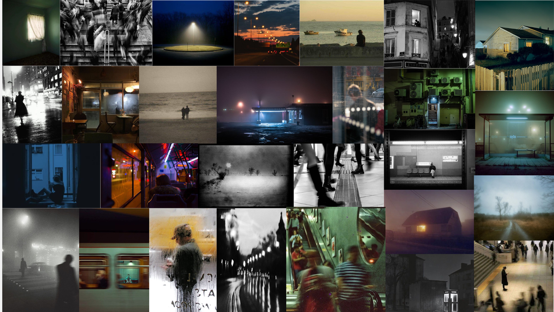
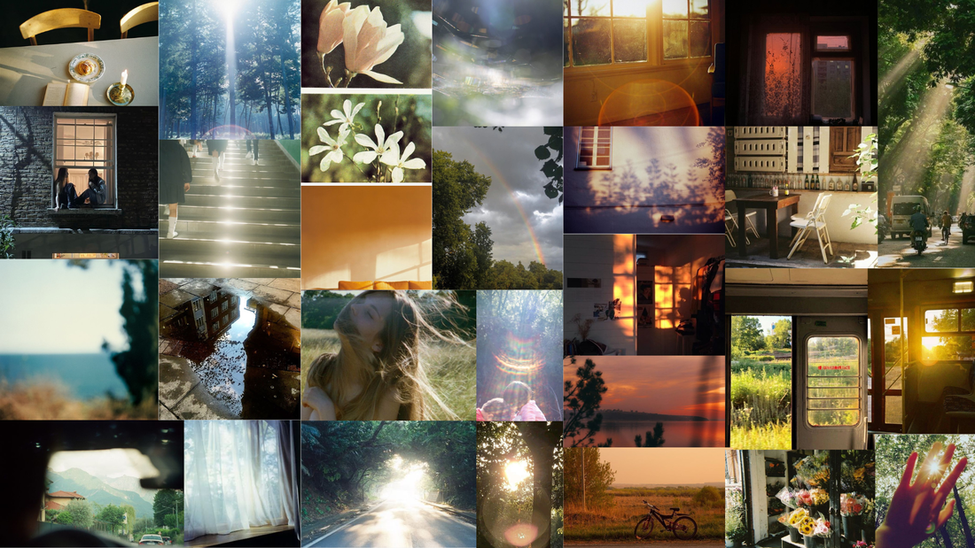
GATHERING IDEAS
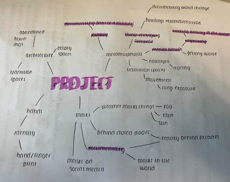
When trying to show this transition between a positive and negative mindset, I decided to use the theme of architecture and urban landscape. I believed this would be effective, since these areas are usually filled with people, who all interpret them differently and have their own unique perceptions. Rather than photographing the people in question, I thought it would instead be interesting to step into their shoes and photograph these buildings through different lenses.
ARTIST ONE - SAUL LEITER
Elements to take inspiration from:
- Selective colour
- Photographing from behind different surfaces or textures
- Dark monotones
- Dramatic tonal contrasts
- Blurring parts of the image
- Negative space
ANALYSIS
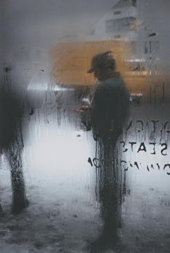
This shot was captured by Saul Leiter, one of the most iconic photographers and artists of the mid-twentieth century. As a teenager in Pittsburgh, he quickly became enchanted by both of these visual art forms. However, it was only after relocating to New York City that his spirit for exploration and creative eye flourished. This imagination is evident in this piece, which Leiter himself called 'Snow.' Upon first hearing this word, you may think of something simple and mundane. Yet, that is exactly what the piece portrays, showing a man simply looking down at his phone in the snow. However, similar to much of his other work, Leiter takes these mundane subjects and transforms them into deep, introspective pieces that evoke an emotional response.
Although Leiter's early work was predominantly black and white, in his later career he began to gradually incorporate colour. This piece, taken in 1970, was one of those experimentations. Most of the frame is filled with dark monotones with a strong tonal contrast. Interestingly, these areas are blurred by the texture of rain on a window. Through these techniques, Leiter is creating a sense of mystery and intrigue, as the lack of clarity causes the viewer to question and draw their own conclusions. Notably, there is one small section of the image where muted colours peak through. This fragment appears to be an uneven shape that creates the illusion of the steam being wiped away. Interestingly, this area is slightly more in focus than the rest, causing the viewer's attention to initially be directed there. Leiter could have used this composition to create a sense of unveiling and discovering more about people. This sense of intrigue is further emphasized by the composition, as Leiter uses a dark silhouette rather than showing the subject clearly. Additionally, Leiter positions this subject using the rule of thirds and captures them looking down. This creates a sense of distance between the viewer and the subject, adding to the mystery.
Based on several clues in the image, one can assume that Leiter created this piece in one of two ways. The first possibility would be taking the photo behind a steamed up glass window. Leiter could have manipulated this physical object to create his desired outcome, such as wiping parts away and writing letters. However, an equally feasible way would be the use of a masking tool on Photoshop. This could be used to create enhanced precision, as Leiter would have been able to uncover specific areas with a soft brush. Although the latter seems more accessible, given that Leiter created this piece in the 1970s, it can be assumed that the first technique was used.
One could describe the mood of this piece as dark and introspective since it illuminates human loneliness. Leiter has achieved this mood through his use of dark monotones which set a serious and reflective tone. Additionally, Leiter's decision to capture the subject looking down and using negative space creates a sense of isolation, evoking an emotional response from the viewer.
Given that Leiter was a New York street photographer, one could argue that he is trying to paint a realistic picture of the city. New York is typically renowned for being bustling and vibrant, but Leiter could be trying to draw attention to the parts of the city that go unseen. Since this is such a densely populated location, it can be easy for people's individuality to become lost. Leiter could be trying to communicate the importance of noticing, and treating everyone as an individual. This work could be made to make those people who feel like their suffering goes unnoticed in the hustle of the big city feel seen. Additionally, since the subject is looking down, this could mirror how in the world we have become so tied to our phones that we don't notice the world around us. Leiter could be trying to communicate the importance of looking up and experiencing life. This differs from typical street photography of the time as it focuses on the small, everyday moments rather than grand spectacles. Since Leiter grew up in a small American town, it is likely that noticing the small moments comes more naturally to him, allowing his creative work to stand out.
ARTIST TWO - TODD HIDO
Elements to take inspiration from:
- Empty space
- Dark monotones
- Wide angle shots
- Photographing the mundane, simple things
- Dimly lit shots
ANALYSIS
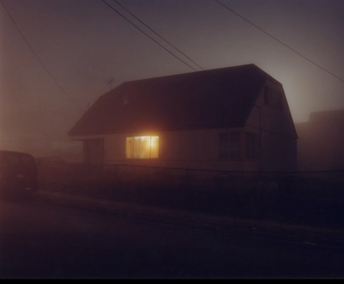
This image was captured by Todd Hido, a famous San Franciso based artist who illustrates memories in photography. His poignant images of Suburban America have appeared in major publications such as The New York Times and Wired Magazine. This piece is reflective of his usual artistic style, transporting the viewer into the world of contemporary America by capturing a mundane Suburban house at night.
In this piece, Hido creates a dreary atmosphere by using a dull, grey colour scheme. One could argue Hido was trying to capture the raw reality, rather than using vibrant colours to manipulate the viewer's perception. Perhaps, Hido made this decision to highlight that locations don't need to be grand or beautiful to be appreciated. Notably, much of this image is dark and dimly lit, meaning that the intricate details of the structures are missed. Instead, we are left with merely the silhouette and shape of the house, suggesting that sometimes it isn't about the actual structures but the concept of home. That being said, there is one glimpse of warm colour coming from the well-lit window, creating a stark contrast. This decision could have been made to represent how it isn't always the places that make life special, but the family life and what goes on within. Interestingly, Hido places the structure centrally, leaving empty space all around. This effectively diverts the viewer's attention to the house, setting the intention for the piece.
To take these images, Hido opted for medium format cameras, due to the detailed gradations of light that they capture. This is essential for his night portraits, as most of them relies on light to convey messages. In terms of post-processing, it is likely that Hido used Photoshop to enhance these areas of light and bring more attention to them.
The mood of this piece depends on one's perspective and world view. On one hand, the mood could be described as gloomy and melancholic. This is due to the dull colour scheme combined with the dim lighting, which take the sense of warmth and life away from the image. Additionally, the empty space adds to this effect since it evokes feelings of isolation. However, to some individuals, this piece could have a hopeful mood, created by the small spec of warm colour coming from the window. Depending on how one chooses to view it, this could represent a shred of hope in the darkness and be a source of comfort.
Through this piece, Hido could be trying to capture the raw nature of everyday life in America. Arguably the biggest trend in contemporary photography is to make places appear more beautiful than they are. Be it capturing sharp and ultra-high-quality shots or manipulating the colours to be warm and inviting, we like to make life appear spectacular. Hido, on the other hand, could be trying to communicate that there is beauty in the mundane and ordinary. The house may not be a grand spectacle, but it is the reality for many people. This piece could be aimed at those who never manage to see this side of America, providing a glimpse into this different reality.
ARTIST THREE - RINKO KAWAUCHI
Elements to take inspiration from:
- Blurring parts of the image slightly
- Central composition
- Dreamy colours
- Well lit, golden lighting
ANALYSIS
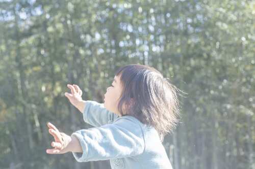
This image was taken by Rinko Kawauchi, a Japanese photographer whose work is characterized by its serene and poetic style. Kawauchi uses photography as a means to capture the ordinary moments in life that are typically taken for granted. This piece is just one of these many mundane moments that she has captured, depicting a child playing in the forest.
Barth cleverly composed this image, adding a soft blur to the background to place focus on the subject. Although placing the child centrally, much of their body is excluded from the shot, with the remainder of the frame being filled with empty space. This composition mirrors how vast and expansive the world feels through the eyes of a child. Additionally, although the background is out of focus, the child appears to be looking up at it in wonder. Barth could have done this to show that a child can find magic and wonder anywhere, without needing grand surroundings. This blur also means that the viewer can't see the texture of the trees, which mirrors the lack of understanding that the child has of the world around them. The beauty is, they don't need this understanding in order to fully appreciate life. Instead, Barth places emphasis on the soft, pastel colours that evoke a serene ambience and mirror the playfulness of childhood. In addition to this, Barth uses bright lighting that reflects on the child's hair, which could be symbolic of the light and joy that comes with childhood.
In her creative process, Kawauchi has likely used a fast shutter speed to freeze the motion and capture a fleeting moment in time. One can assume this as even though the child appears to be moving, there is no hint of motion blur and they remain completely still down to the strands of hair. Following this, Kawauchi has likely used Photoshop to add a soft blur to the background and manipulate the colours to appear dream-like and whimsical, since this is something that is rarely visible to the human eye alone.
One could describe the mood of this piece as hopeful, due to its pastel colour scheme alongside a soft blur. This creates a serene and whimsical atmosphere that mirrors the playfulness and wonder of childhood, which could make many people feel comforted and hopeful. However, for some people, this could have a nostalgic and melancholic feel as it captures an essence of childhood that many people yearn for.
Kawauchi states that these images emerged in her mind in the haze of drifting off to sleep. What she discovered was that these visual memories had unconsciously become part of her. Indeed, through her work, Kawauchi could be trying to communicate this idea that it is not the big fleeting moments that make life so special, but the small everyday joys. Kawauchi could be trying to show that when we look back on our lives, what really sticks out to us are those small, simple moments that we take for granted. Additionally, this work could have been created for anyone who has lost their childhood spark and imagination. This could act as a piece of hope, to show that it is possible to see the world through rose tinted glasses again if only you stop to notice. This idea was not coined by Kawauchi, but she instead took inspiration from the aesthetic principles of wabi-sabi. This concept encourages finding beauty in the imperfections and the mundane, which is exactly what Kawauchi does in her work.
ARTIST FOUR - UTA BARTH
Elements to take inspiration from:
- Blurring the entire image
- Warm colours
- Empty space
- Capturing mundane, simple subjects
ANALYSIS
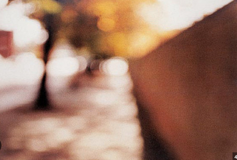
This image was captured by Uta Barth, an artist who uses photography to investigate human vision and peripheral sight. After her work emerged in the late 1980s to 90s, she became successful for inventing the notion of using foreground and background to direct the viewer's attention. Indeed, this image does just that, depicting an out of focus autumnal street.
Notably, Barth uses strong blur throughout the image, meaning that no texture is evident. Instead, there is an emphasis placed on the shapes, outlines and colours of the piece. Despite not being able to fully see the landscape, the warm colours and light pouring in from the background adds so much beauty. Barth may have done this to take the focus away from the landscape itself, and place it on the feeling of being there. Ironically, by blurring the image, Barth makes people notice more than they normally would, such as the colours of the seasons and how they interact. Moreover, Barth fills the entire frame with this landscape and uses leading lines to create the effect that the viewer is experiencing this first hand. This encourages reflection from the viewer as it encourages them to notice things about nature as if they are really there.
Barth could have reached this outcome by simply taking the photo out of focus or covering the lens. However, one can assume that post-processing techniques have likely been used. For example, Photoshop has a selection of blur options which are all customizable. This would give Barth full control and allow her to experiment to determine which would help to communicate her message. Since Photoshop was introduced in the 1990s, the same time her photography emerged, this makes most logical sense as she was the founder of this technique.
One could describe the mood of this piece as inviting and introspective. Barth created this effect by her warm colour scheme which evokes feelings of coziness and ease. Due to the simple subject matter, there is a sense of familiarity that many people may reason with and find comforting. Barth's use of blur adds to this as it means this image could have been taken anywhere. Instead, this places a focus on the colours, which are associated with universal emotions.
Through her work, Barth could be encouraging her viewers to reevaluate their relationship to sight and visual information. Her use of blur could mirror how we typically see our surroundings, with a lack of sight and appreciation. Her techniques draw attention to all parts of the image, even the edges of our visual field that we typically ignore. Barth could be trying to communicate the importance of taking notice of the world around us as there is so much beauty that we miss on a daily basis. This concept could be a protest against the hustle culture in the modern world that encourages people to rush through life. Barth could be trying to counteract this and encourage people to stop and really take in their surroundings and live at a slower pace.
EXPERIMENTING WITH COLOUR
Since my project is centred around emotion and evoking feelings, colour is arguably the most important part of the images. After some experimentation, I discovered how slightly altering the colours can drastically alter the overall mood of the image. One obvious example of this would be the disparity between warm colours that create energy and cooler colours which evoke feelings of melancholy. Using different colour grading on Photoshop, I decided to explore these cooler colours in depth to create the perfect outcome. As seen in each of the images below, some have a bleak, dull feel, whereas the ones with a blue tint feel more melancholic. I concluded that although these generate different feelings, they would both be useful for my project. The duller colours could be effective in demonstrating a bleak world view, whereas the cooler colours could be useful for evoking an emotional response.
SHOOT ONE - TODD HIDO INSPIRED
Todd Hido's images are an effective way to explore feelings of loneliness and isolation through photography. Interestingly, Hido uses a mundane subject that most people encounter on a daily basis. This is effective as it takes the focus away from action or an extravagant subject matter and puts the emphasis on the emotions created. Additionally, since this is such an ordinary scene, it creates a sense of relatability as it depicts the dissatisfaction with everyday living that many people can connect to. Not only would all of this be useful for my project, but it would also be a great way to put my experimentation with colour to the test. Since most of these houses on their own do not seem very melancholic or lonely, through colour and composition, I need to try and generate these feelings.
PROCESS
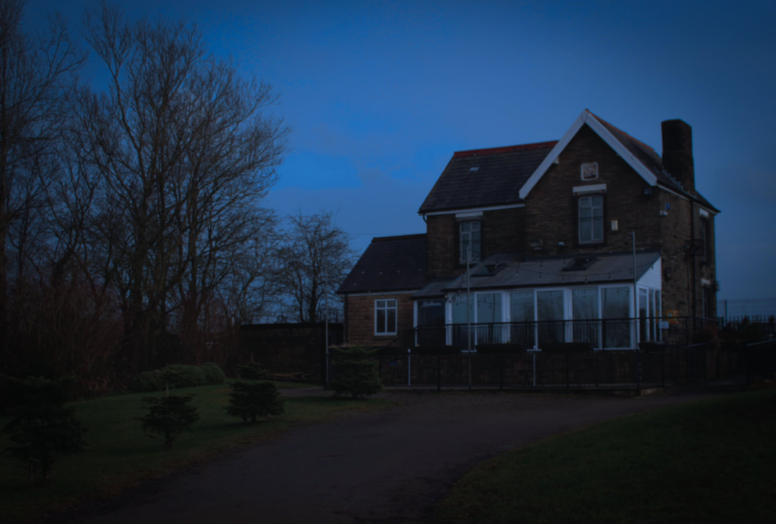
Step one: I looked around my local area to try and find quiet or slightly rural houses, as seen in Hido's images.
Step two: Once I found the location, I had to carefully compose the shot. I figured that stepping far away from the house and leaving lots of empty space would be most effective. It was also important to consider the time of day, as a darker sky would create a 'moodier' image.
Step three: Once I had images that I liked, I opened them onto 'Photoshop' to make edits and adjustments. To achieve the moody and lifeless look Hido creates, I adjusted the colours to make them either cooler or bleaker. Furthermore, I added a vignette to draw attention to the houses and make them the focus of the image.
CONTACT SHEETS
FINAL EDITS
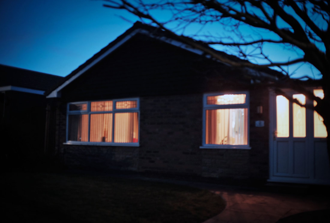
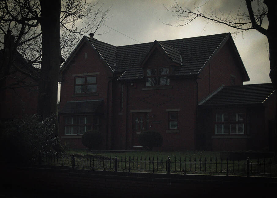
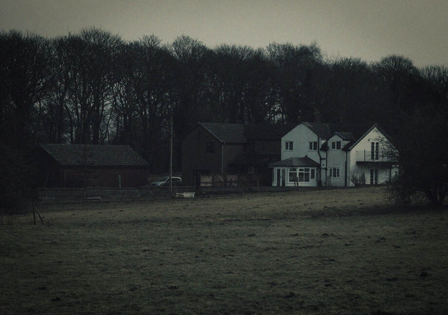
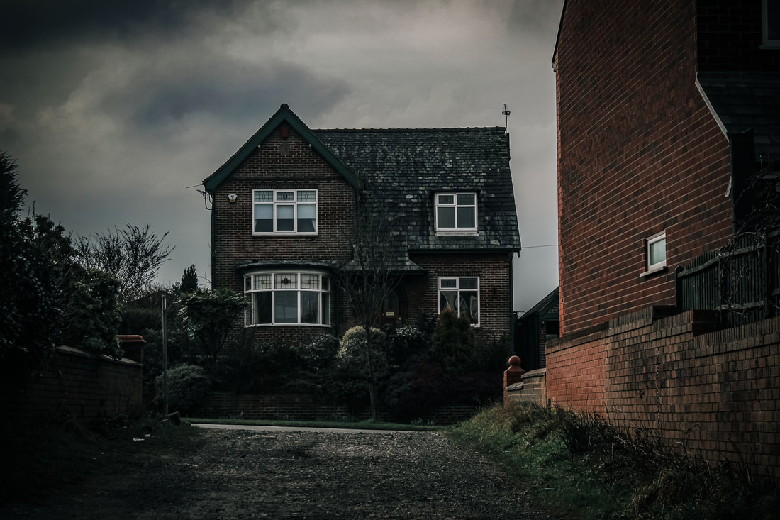
META DATA
Image one - 1/500sec, f/ 4.5, ISO 100
Image two - 1/800sec, f/ 5.6, ISO 100
Image three - 1/1000sec, f/5.6, ISO 100
Image four - 1/1300sec, f/5.0, ISO 100
Image five - 1/1600sec, f/ 4.0, ISO 100
HANGING PLAN
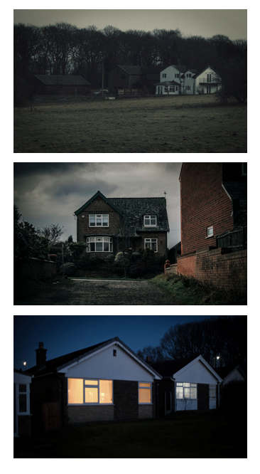
Out of all the images in this shoot, I decided to include only three in my hanging plan. I believed that out of all the photographs, these three stood out due to their composition and colours. Some of the others, however, were very similar, yet weren't as effective. Including these could have become repetitive, and I thought that the ones I chose told more of a story and presented a clear transition. For example, the top image starts off distant, but as the images progress, the houses slowly become closer to the camera. Additionally, as the images go down, the atmosphere shifts and the sky gets darker. Moreover, the final image has a light on, which, depending on interpretation, could symbolise a sense of hope.
EVALUATION
Studying this artist has allowed me to expand my skills and develop my project in various ways. Throughout the process, I have been able to gauge a better understanding of how colour, composition and lighting can drastically shift an image. The entire mood of the piece can be shifted based on just the time of day or the lighting, which is why it is crucial to be intentional with shooting and find the right moment. This same thing can be said for the colours, as this artist helped me to understand how experimenting with these can completely shift the atmosphere. Playing around with all these elements has greatly expanded my understanding and shown me what things I like best going forward in my project. Overall, I was more satisfied with some images than others. I was pleased with how every image seemed to capture a dark, atmospheric feeling. However, I discovered that I preferred the look of the images shot at night rather than in the day. The look of the dark, moody sky in contrast to the bright light coming from the houses was a look that I think captured the spooky atmosphere best. Going forward in my project, if I wish to attain this dark, moody feel, I know that shooting just towards night time is the way to attain the most effective outcome.
MINI DEVELOPMENT
Hido uses the subject of rural houses to achieve these feelings of moodiness and isolation. To develop this, I decided to see if I could achieve the same effect using an alternate subject. This would help to progress my project as I could take the skills I have learned from Hido and apply them to any subject or scenario.
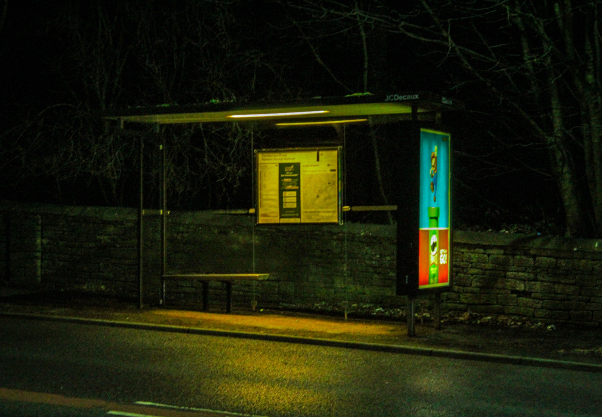
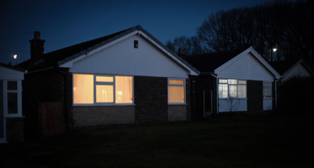
I was happy with how this image turned out, as I liked the contrast between the light and the dark. I felt like it was the perfect combination of 'bleak', but also the light created a sense of hope. Now that I know I can apply Hido's techniques to other subjects, this will be useful throughout my project as I can use this bleak effect to mirror a negative mindset.
META DATA
1/20sec, f/5.6, ISO 3200
SHOOT TWO - UTA BARTH INSPIRED
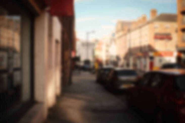
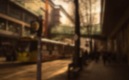
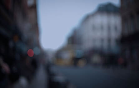
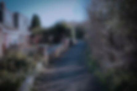
Another artist who uses photographic techniques to evoke emotion is Uta Barth, who achieves this by blurring her images. This could be interpreted as someone not fully seeing the world around them or having a warped view of it. I concluded that this would work perfectly for my project as it represents this idea of someone struggling to see the beauty in the world. However, similarly to Hido, this is a great way for me to experiment with colour. Since the image itself is blurred, the entire focus of the image relies on the colours to paint the scene. I decided that I would use the same images, but experiment with warm and cool colours to demonstrate the importance of perception.
PROCESS
Step one: Firstly, I went around cities and my neighbourhood to take photographs of the streets. With some of these images, I intentionally made my camera out of focus to automatically achieve a blurry image. However, I took some of these in full focus and decided to add this effect in post-processing.
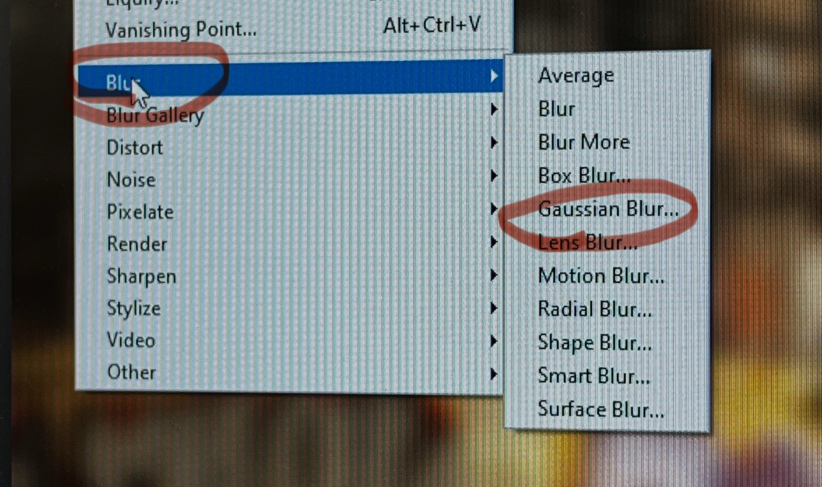
Step two: Once I was happy with these images, I opened them in Photoshop. I could leave the out-of-focus images as they were, but for the ones that were in focus, I simply went to the effects panel and added 'Gaussian Blur.' I adjusted the amount so that the viewer can still make out the scene, but not the details.
Step three: Now that all of my images were blurred in some way, the next step was to change the colours. Using the adjustments panel, I increased the warmth to achieve the positive images. For the negative ones, I did the opposite and desaturated them, whilst instead using cool colours.
CONTACT SHEETS
FINAL IMAGES
META DATA
Image one - 1/640sec, f/>640, ISO 100
Image two - 1/800sec, f/>1024, ISO 200
Image three - 1/4000sec, f/>1024, ISO 400
Image four - 1/3200sec, f/>1024, ISO 400
Image five - 1/1300sec, f/>1024, ISO 400
Image six - 1/280sec, f/> 1024, ISO 100
HANGING PLAN
I was happy with the outcome of every image in this shoot, however, I decided that these images work best as a set of three. In doing so, I can demonstrate a smooth, simplistic transition that effectively tells a story. For example, the first image starts off showing a city scene with cool colours and a melancholic atmosphere. The second image remains a city scene, but the colours shift to slightly warmer. Finally, the last image keeps this warmth, but moves to a quieter, serene scene. Notably, this still includes buildings, but has elements of green spaces and nature showing through. Out of all the images, I carefully selected these three as I believed they showcased this gradual journey best.

EVALUATION
Studying this artist allowed me to expand my knowledge of colour greatly. Since the images were blurred, the piece relied completely on this colour to shape the mood and tell the story of the image. This was an interesting challenge, as to create a strong contrast, I had to drastically alter the colours without it becoming too abstract. This will be useful going forward in my project as I now know exactly how to shift the mood of a piece, entirely based on colour. Moreover, this allowed me to better understand how different amounts of blur can alter the image. In this process, I experimented with different levels of blur and also different blurring modes. Interestingly, these all had a very different impact, with small amounts having a soft look and large amounts being more dramatic and abstract. This would also be useful for my project as I can use this blur to mirror an emotion. Overall, I was pleased with the outcome of these images. I was satisfied with the warm, nostalgic feel of some of the images and the cool, melancholic feel of the others. However, moving forward in my project, I realised that the blur done in camera works better. For example, the final image was taken out of focus on the camera, and I liked the spots of blur that it created that the others don't have. Going forward, I would wish to experiment more with camera settings rather than relying on post-processing techniques.
DEVELOPMENT FROM THIS SHOOT
Rather than having the warm and cool colours as completely separate images, I decided to experiment with how this would look if I blended the two using a mask and a soft brush tool on Photoshop. I wanted to experiment with how I could represent this journey in one single frame.
PROCESS
Step one: Firstly, I opened the 'positive' and 'negative' images in Photoshop and layered them on top of each other on the same document.
Step two: Using the masking tool and a soft brush, I gently painted over the top to reveal the image underneath. I adjusted this to create a smooth transition between the two.

EVALUATION
Overall, I think some of these images worked better than others. The first two images, for example, whilst still having a subtle blend, seem to have a clearer 'before' and 'after.' This can be difficult to notice in some of the later images, which could represent that change isn't always obvious. However, I still preferred the overall look of the first two. Throughout all the images, I was pleased with how seamless and smooth the transition was. However, if I were to improve, I would try enhancing some of the colours further. Whilst I think these images work well, I ultimately decided that this was not the direction I wanted to take for my project. Rather than showing a transition in one image, I wanted it to be throughout a series of images. These images also display a simple 'before' and 'after,' but I realised I want my piece to be more complex than that and show a complete journey.
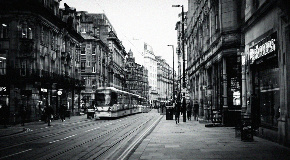
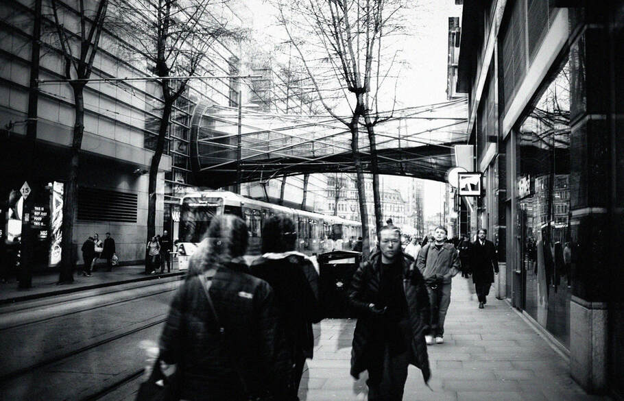
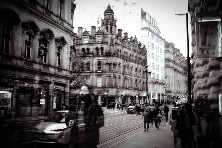
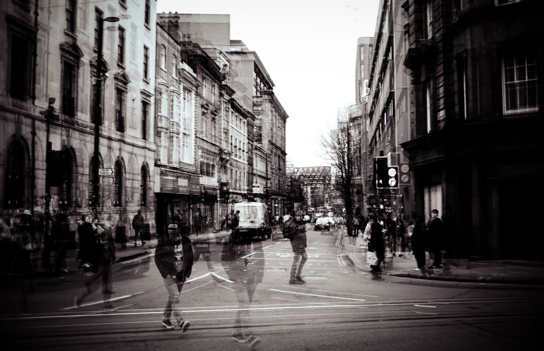
SHOOT THREE - LONG EXPOSURE
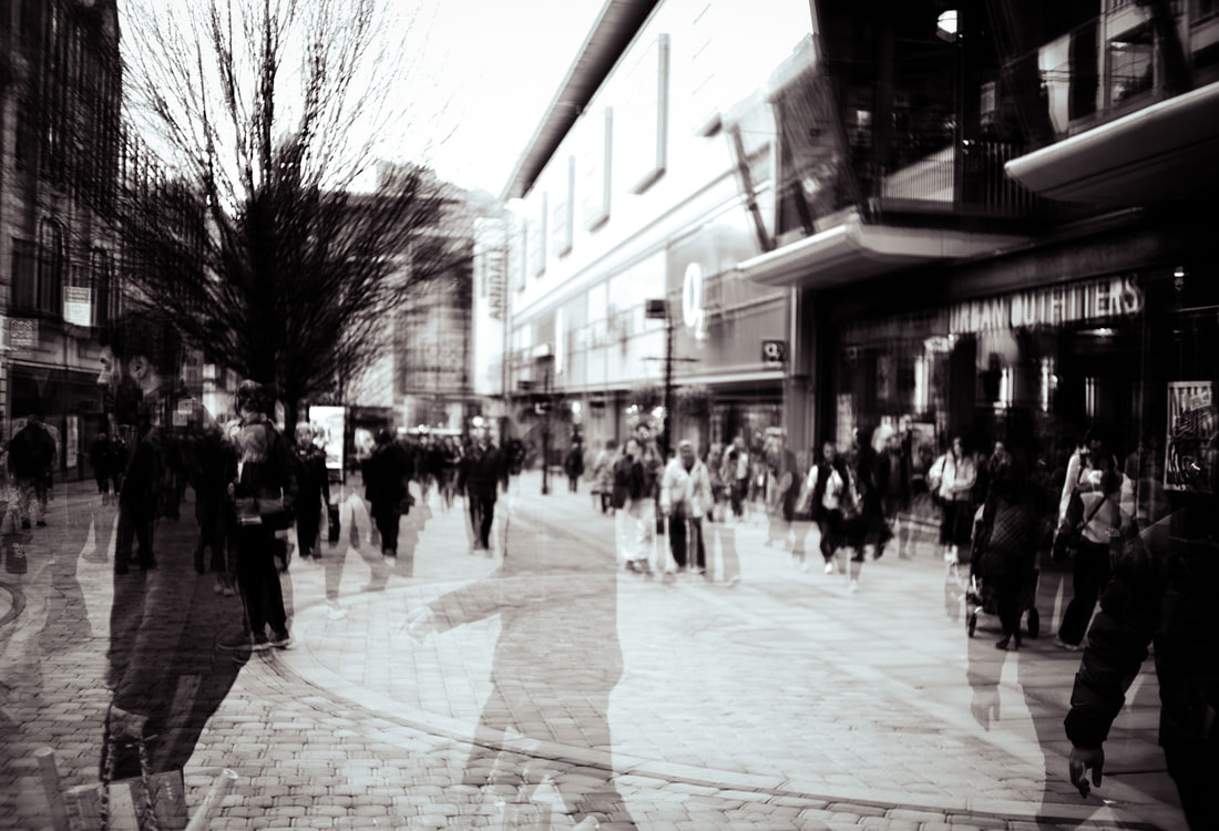
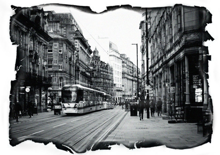
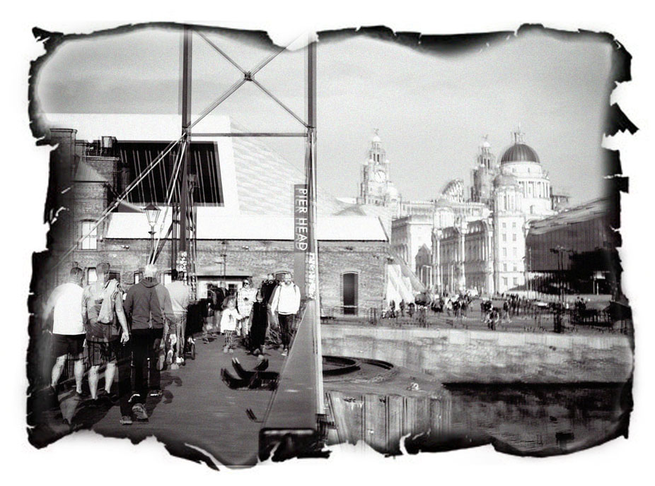
As seen in Barth's work, blur is a great way to show a warped worldview. However, I wanted to experiment with alternate techniques that could represent this skewed perception and demonstrate someone not seeing the world as it is. I decided that long-exposure would be a perfect way to demonstrate this, since it could symbolise someone being so overwhelmed by the fast-pace nature of life that they struggle to be fully present and see the beauty.
PROCESS
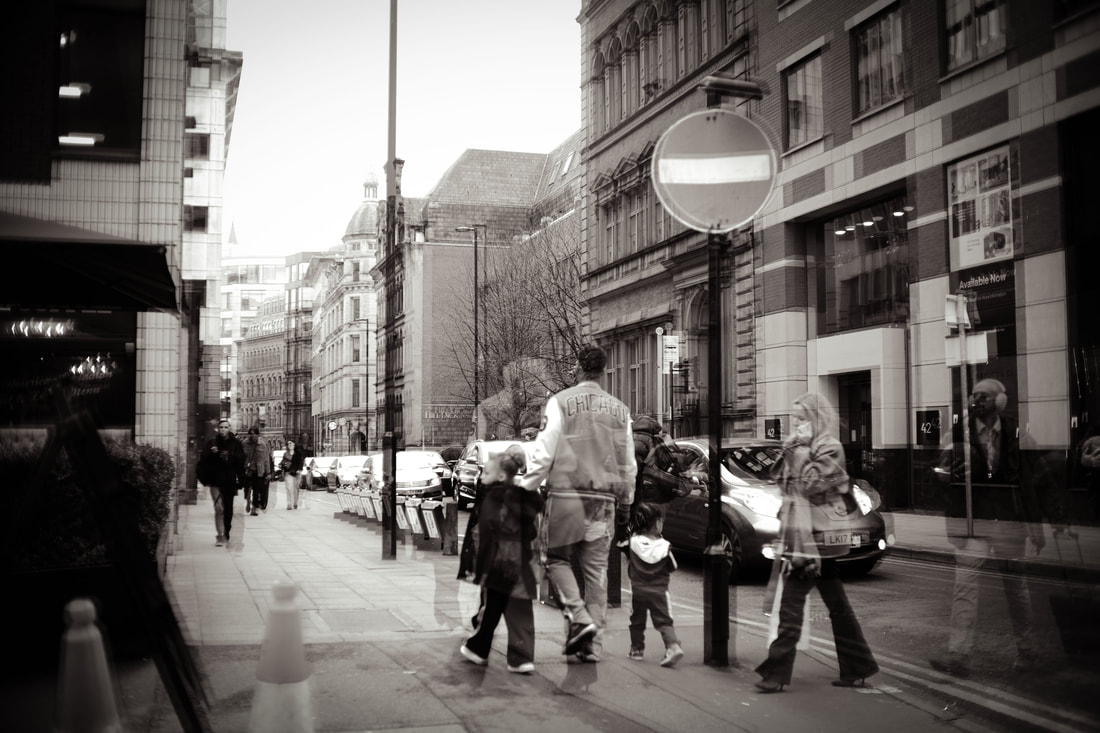
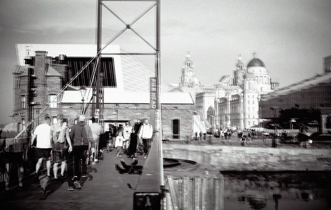
Step one: Firstly, I travelled to cities and found very busy streets. Once I found the perfect bustling area, I kept my camera still in one position and took several photographs.
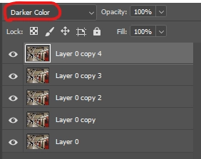
Step two: Following this, I opened all these different photographs in Photoshop and layered them on top of one another. I then changed the blending mode and lowered the opacity until I reached my desired outcome.
Step three: Once I was happy with how this looked, I flattened the image and then converted it to black and white to achieve the dated, moody effect.
CONTACT SHEETS
FINAL EDITS
META DATA
Image one - 1/170sec, f/1024, ISO 100
Image two - 1/70sec, f/ 1024, ISO 100
Image three - 1/55sec, f/1024, ISO 100
Image four - 1/20sec, f/ 1024, ISO 100
Image five - 1/45sec, f/1024, ISO 100
Image six - 1/4000sec, f/1024, ISO 200
EVALUATION
After seeing how Barth used blur to create a sense of distortion, I decided to explore this in an alternate way using long exposure. This process taught me a variety of valuable skills. After various failed attempts, I was able to understand the power of composition and find areas that worked best for this kind of work. I was also able to experiment with different blending modes and see which ones complemented each piece best. In contrast to the work I have done so far, I decided to completely exclude colour and keep the images in black and white. Unlike the cool colours that I had previously used, this creates more of a nostalgic and lifeless feel. This posed interesting questions for my project, as it made me question whether I should include colour to show a negative mindset or exclude it completely. However, I concluded that although these images work effectively, I would still use colour as this is the best way to represent a mood. Overall, I was happy with the final images I produced. In particular, I was pleased with the sense of movement and hustle I captured, but also the nostalgic and moody feel that the black and white created. However, going forward, I could improve by branching out and experimenting with different angles.
HANGING PLAN
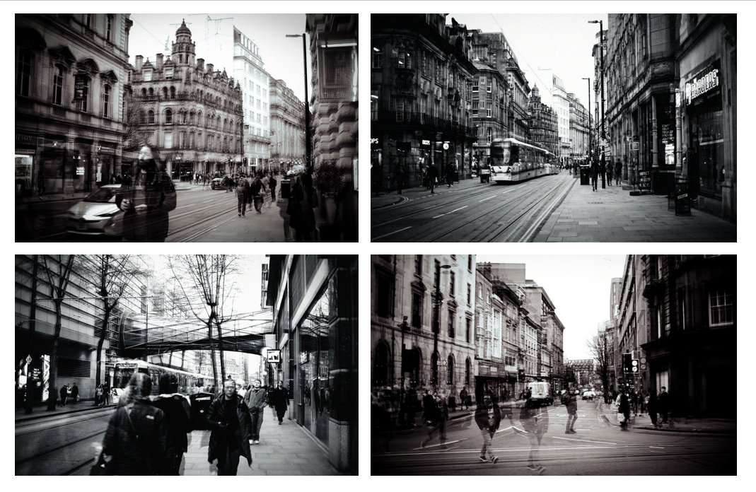
Throughout these images, it is evident that they have two slightly different moods based on tweaking the black and whites. Some are darker, with harsh tonal contrasts, and others have a slightly muted, nostalgic feel. I was pleased with how both of these turned out, and I believe they created different moods effectively. When displaying the images, I decided to select two of each to create balance and display them horizontally. I excluded the other two images as they were very similar, yet I believed that these four were the most effective. I especially made sure to exclude the last image, as this was taken in a different city with an entirely different feel, therefore, it didn't work as well as a set.
DEVELOPMENT
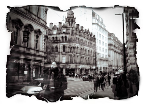
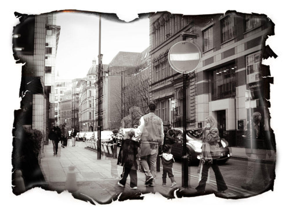
Because of the black and white, these images appear dated. I wanted to experiment with how I could enhance this effect further and make the images feel old and neglected. I concluded that an interesting way to do this would be by burning the edges. Not only does this make them appear dated, but it also replicates a negative world view since it could symbolise the person's hope 'decaying.' However, instead of physically burning them, which could have been dangerous, I decided to replicate this effect using Photoshop.
PROCESS
Step one: I found a template online of a burnt piece of paper.
Step two: I then opened this up on Photoshop along with my original image, and layered them on to the same document. I placed the piece of paper on top and lowered the opacity to align them, until they were perfectly in place.
Step three: Following this, I created a 'mask' and painted over the inside of the paper in black to reveal the image underneath.
Step four: Finally, I changed the blending mode to 'exclusion' to achieve a more seamless transition.
EVALUATION
Overall, I was happy with how these images turned out. I wasn't sure how the burnt edges would look with my images, but I was pleasantly surprised by how well they matched the overall mood of the piece and enhanced the 'dated' look. This process taught me how to add other textures to my work to enhance the mood, which is something I can consider doing in the rest of my project.
SHOOT FOUR - LIGHT
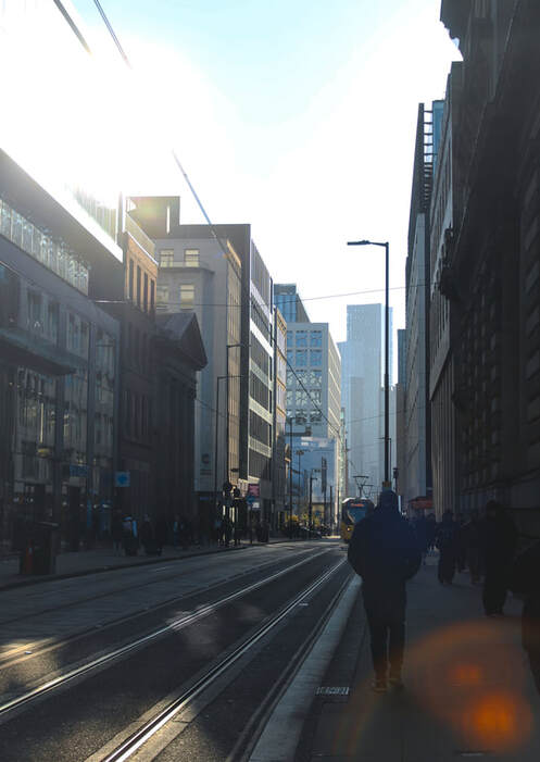
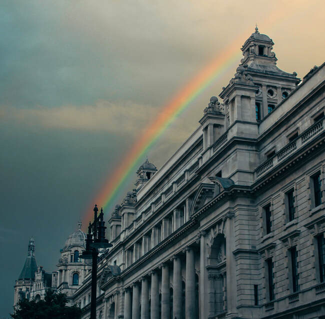
Both blur and long exposure are effective ways to evoke emotion and represent one's worldview. However, rather than using post-processing techniques, I decided to use natural light reflections. Much of my work so far had been focused on showing a negative mindset, so I decided to dedicate this shoot to positive images. Creating this naturally rather than heavily editing aids with this as it represents how positivity comes 'naturally' and is found in noticing the natural world. To reflect these emotions, I decided to use various ways that light is seen in the world around us, to symbolise a 'light in the darkness' and represent hope.
PROCESS
Step one: I travelled to cities on a sunny day and looked for areas where light was reflecting. For some of these images, I took them directly facing the sun to achieve the intentional glare. For others, I faced the other way and focused more on how the sun was reflecting on buildings.
Step two: Once I was happy with these images, I opened them up on Photoshop and increased the contrast to bring out these reflections and shadows even more.
CONTACT SHEETS
FINAL EDITS
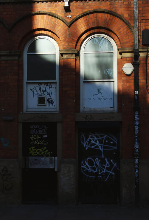
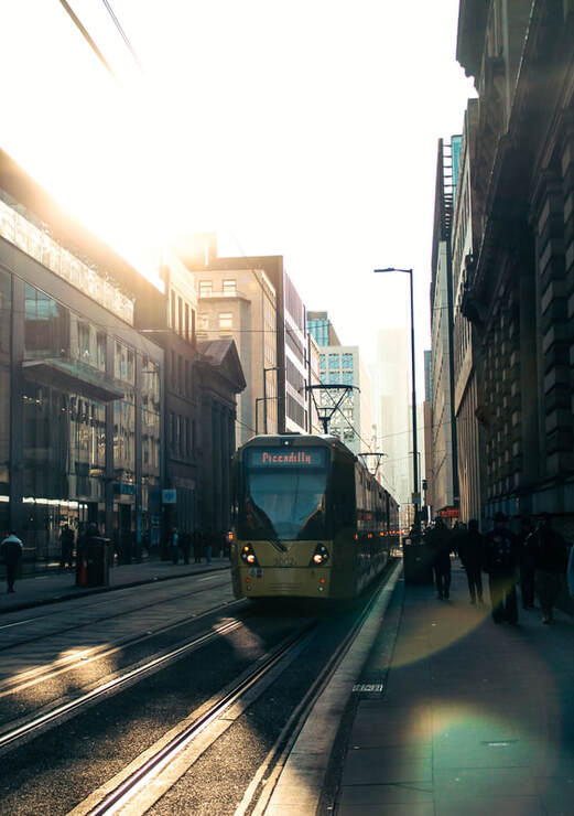
META DATA
Image one: 1/400sec, f/4.5, ISO 100
image two: 1/85, f/5.0, ISO 100
Image three: 1/400sec, f/5.0, ISO 100
Image four: 1/400sec, f/4.5, ISO 100
HANGING PLAN
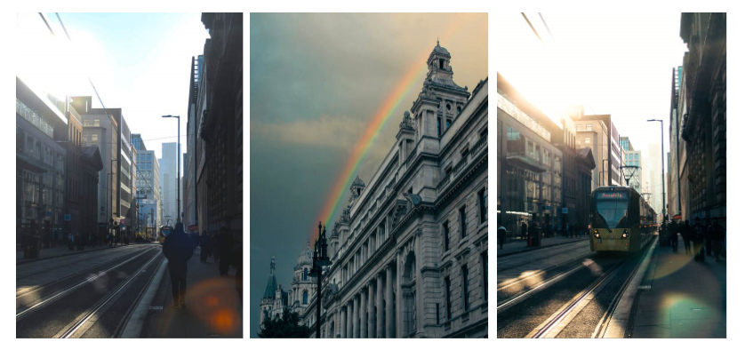
When displaying these images, I decided to have them as a triptych set. I excluded the image of the light reflecting on the building, as even though I was happy with the outcome, I concluded that it didn't fit as well into the set and felt more like an odd one out. I thought that the three I included work well together due to their dreamy and optimistic mood. I intentionally placed the two images of the Manchester street on either side, with the rainbow in the middle to create a strong contrast and draw attention to the rainbow, the symbol of hope. Additionally, I placed the image where the tram comes into full view on the right to show a journey and create a sense of movement from one state to another.
EVALUATION
Overall, I was satisfied with the outcome of these images. I liked the variety in this shoot, as I discovered through this process just how colourful light from the rainbow vastly differs from the subtle reflections on a building, but they both represent this sense of hope. This shoot taught me just how much weather and the time of day can change the mood of a photograph, and how to use this to my advantage, which is something I will continue to consider moving forward in my project. I was especially pleased with the interesting contrast that the light reflections made in these images. However, if I were to improve, I would explore reflections more and find creative possibilities in a variety of places.
SHOOT FIVE - TRIPTYCH
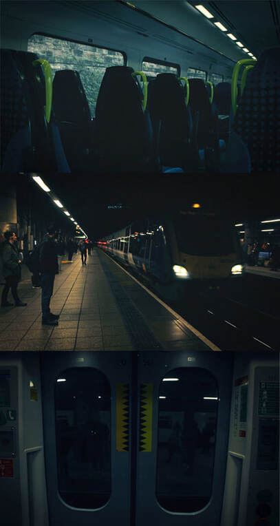
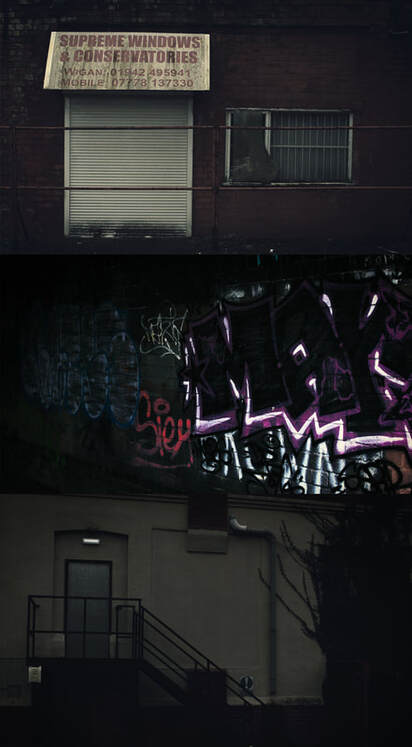
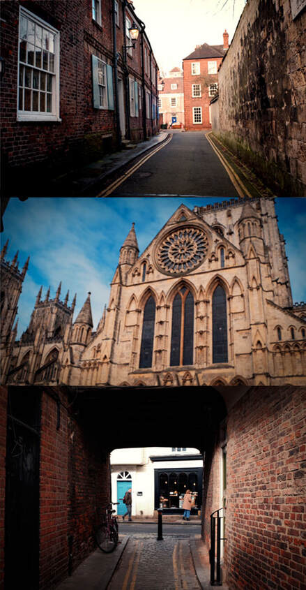
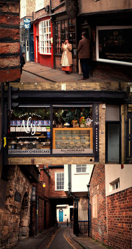
For this shoot, I decided not to distort the photographs in any way, but just use the raw images and see how much emotion they can evoke on their own. I wanted to experiment with how different colours and areas have connotations of safety or danger. To achieve this, I decided to use triptych photography. As I travelled around, I aimed to capture mundane moments and combine them as sets using this technique. I decided to create two different outcomes for this shoot, ones that show a positive world view and ones that show the opposite. I wish to achieve this not only by using colour, but also by being intentional about what I photograph. I want to be mindful of the things that people who are in a negative headspace tend to notice as opposed to positive.
PROCESS
Step one: I travelled to different cities or local areas near my house and searched for different patterns or areas that may link well together.
Step two: I organised these images into groups of three, selecting the ones that worked best as a set.
Step three: Once I had this figured out, I layered these onto the same Photoshop document and rearranged them so that they were on top of each other in a horizontal row.
CONTACT SHEETS
FINAL EDITS
NEGATIVE
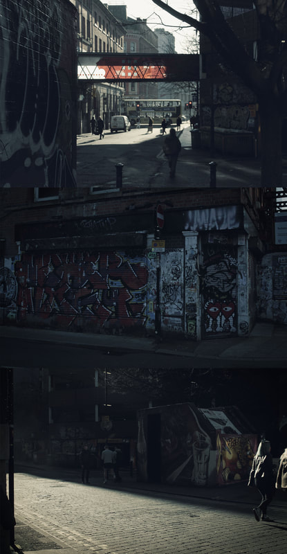
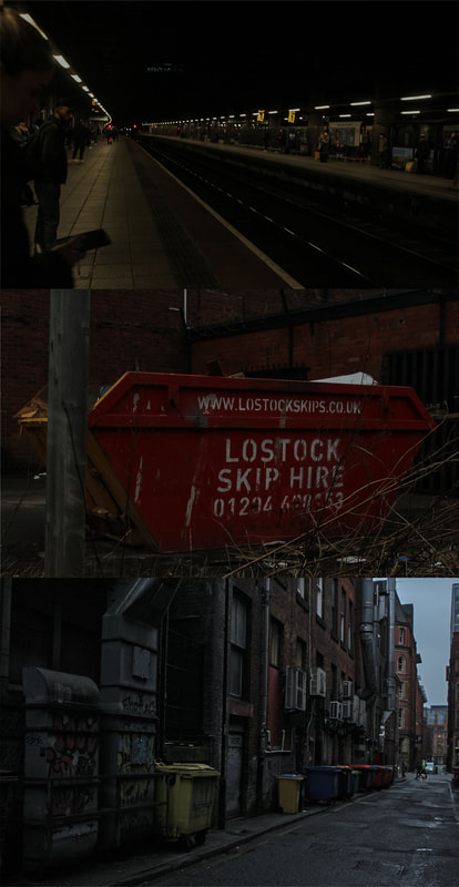
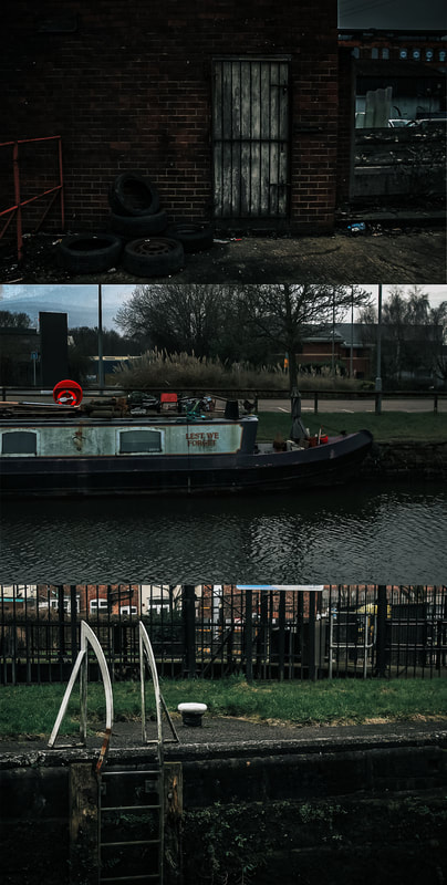
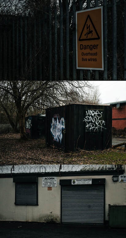
POSITIVE

META DATA
Image one
- 1/160 sec, f/ 4.5, ISO 100
- 1/30sec, f/4.5, ISO 100
- 1/30sec, f/4.5, ISO 100
Image two
- 1/320, F/4.5, ISO 100
- 1/100sec, f/4.5, ISO 100
- 1/500sec, f/4.5, ISO 100
Image three
- 1/640sec, f/4.5, ISO 100
- 1/320sec, f/4.5, ISO 100
- 1/500sec, f/ 4.5, ISO 100
Image four
- 1/500sec, f/4.5, ISO 100
- 1/100sec, f/5.0, ISO 100
- 1/100sec, f/5.0, ISO 100
Image five
- 1/30sec, f/4.5, ISO 100
- 1/500sec, f/4.5, ISO 100
- 1/250, f/4.5, ISO 100
Image six
- 1/500sec, f/4.5, ISO 100
- 1/500sec, f/4.5, ISO 100
- 1/640sec, f/4.5, ISO 100
Image seven
- 1/750 sec, f/ 1024, ISO 200
- 1/640 sec, f/4/5, ISO 100
- 1/1200 sec, f/1024, ISO 200
Image eight
- 1/60sec, f/1024, ISO 640
- 1/75sec, f/ 1024, ISO 200
- 1/110 sec, f/1024, ISO 200
Image nine
- 1/140 sec, f/ 1024, ISO 200
- 1/60sec, f/1024, ISO 400
- 1/520 sec, f/1024, ISO 200
Image ten
- 1/60 sec, f/1024, ISO 250
- 1/750 sec, f/ 1024, ISO 200
- 1/60sec, f/1024, ISO 200
HANGING PLAN
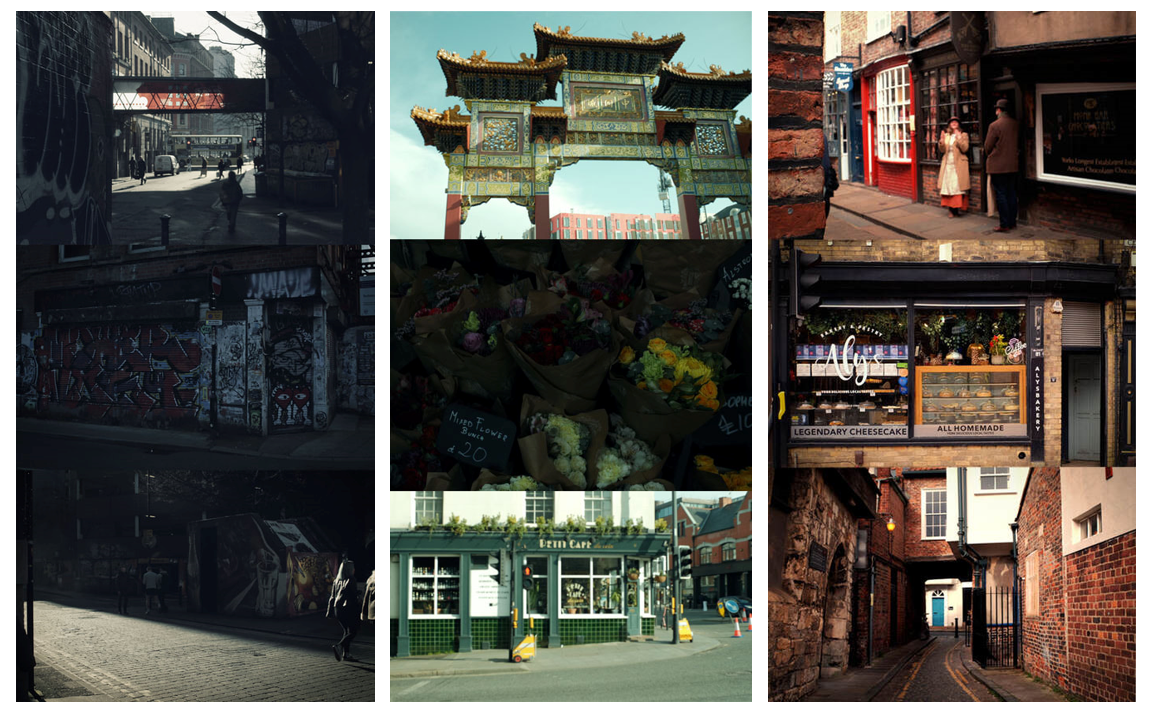
Despite being happy with the outcomes, I once again decided to display them as a set of three to create a smooth, impactful transition. For example, the first image feels bleak due to the run-down areas combined with a lack of vibrant colours. As it shifts to the second image, we see small, beautiful moments from around the city. However, this still has a cooler colour scheme. Finally, we reach the final image, which not only shows these beautiful moments, but presents them with warm colours. Interestingly, these images are all taken in cities, but I wanted to show how people can have a completely different experience of the same places based on their perspective. Out of all the images, I believe that these displayed the transition most effectively. Quite a lot of my images showed abandoned, run-down buildings, however, I chose the first image due to its cohesive colour scheme. I also believed this fit into the set, as, unlike the others, these run-down buildings were found in a city. Moreover, out of the two warm images I took, I believe the third image worked better as it showed smaller, candid moments.
EVALUATION
Using my understanding of composition and simplicity from Todd Hido and colour from Uta Barth, I combined these elements to lead to this shoot. Although I relied heavily on knowledge from past artists I had used, this shoot taught me how to organise images as sets. I took many photographs in this process, but I had to carefully group them and decide which images complement each other best. I gained an understanding of how you do not need to be limited to one image, but different images can work together to tell a story. In most cases, the images work better with the others placed next to them, rather than just on their own. I now understand how a combination of small moments can come together to capture the essence of a place. This would be useful going forward in my project as it will help me to organise my photographs effectively to best display a gradual journey. Overall, I am happy with the finished outcomes. I was pleased with how I put my understanding of colour to the test and used this to alter the mood of each image. However, I'd wish to improve going forward by trying different ways of creating a set of images rather than stacking them.
SHOOT SIX - EMPTY SPACE
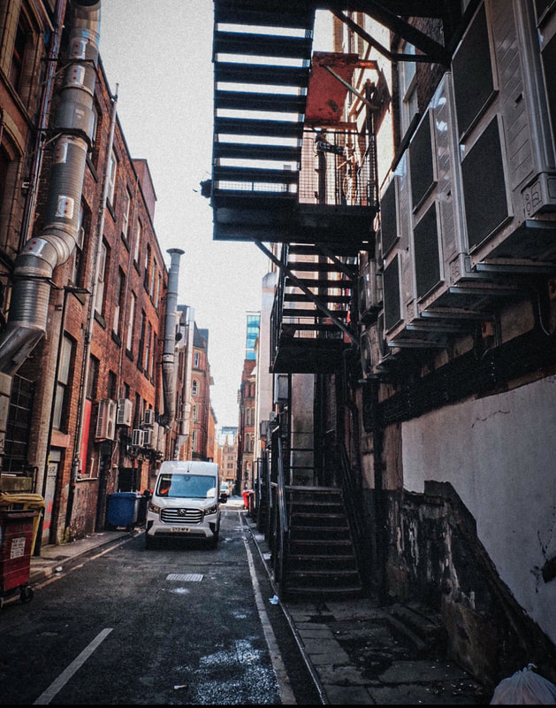
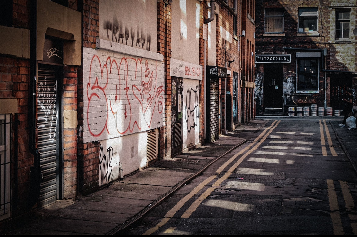
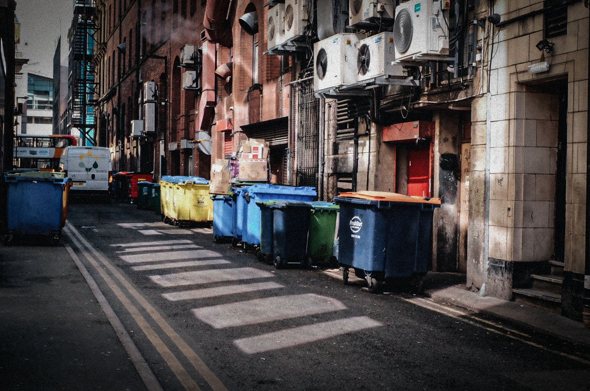
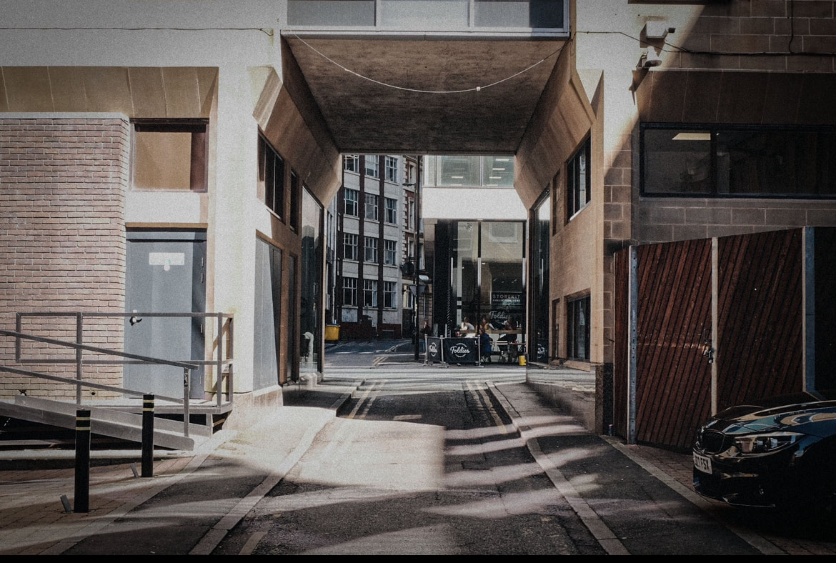
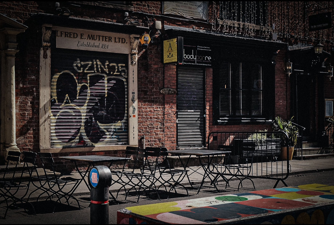
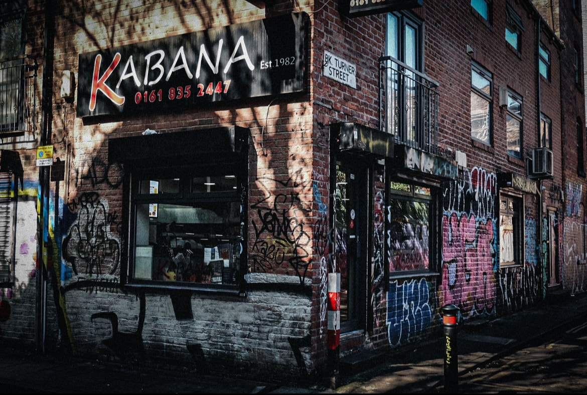
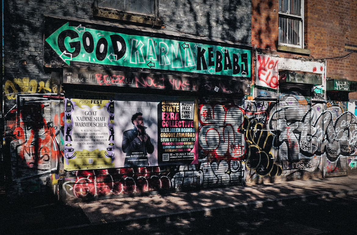
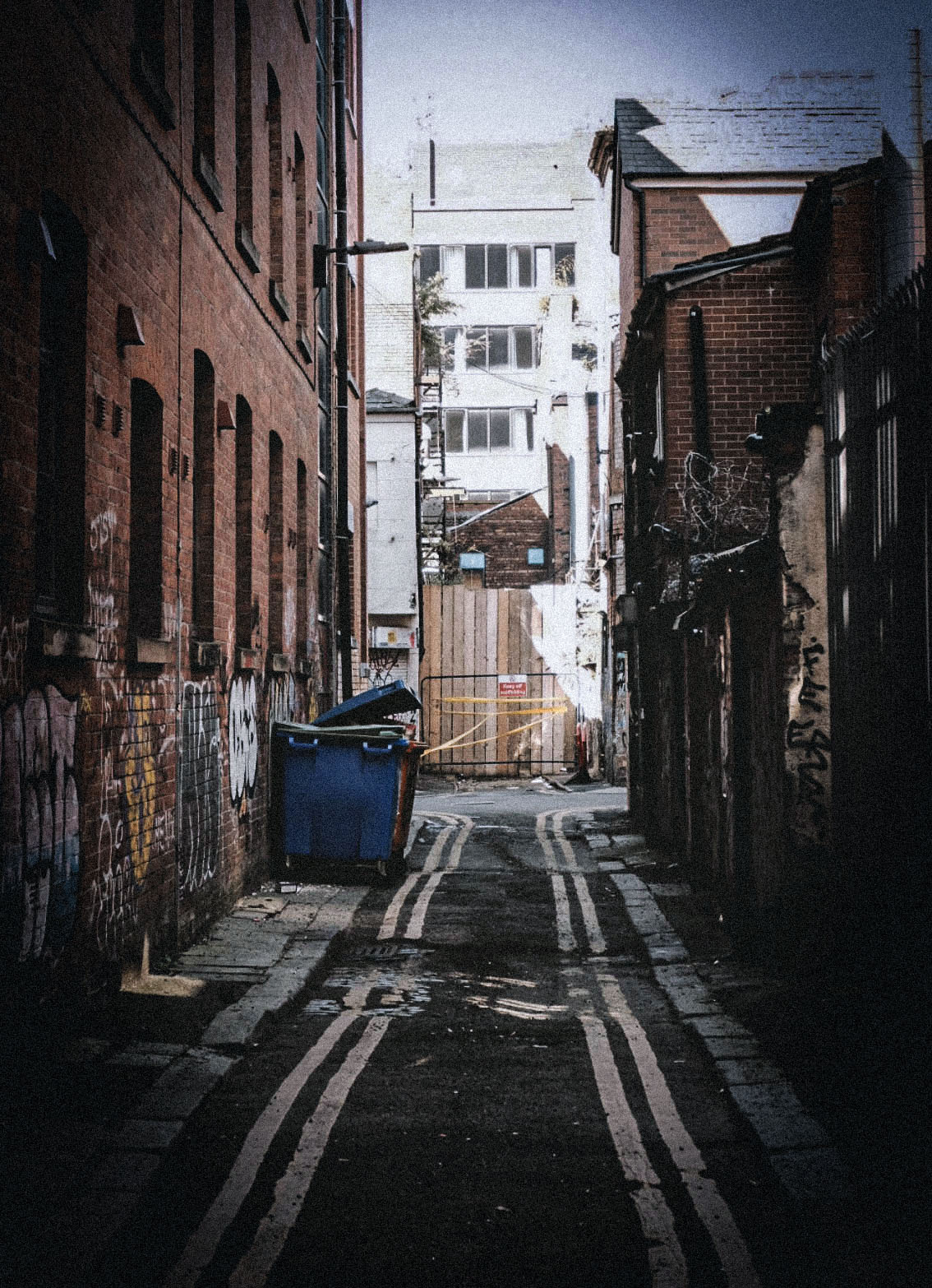
Throughout this project, I learned that the actual subject can have a significant impact on the overall mood of the piece. As a development, I decided to explore this by focusing on the less glamorous, run-down parts of cities. I wanted to photograph little alleyways that are neglected and slightly eerie. I thought this would be useful for my 'negative' images, as it is hard for these spaces to have positive connotations. When taking these photographs, it was important to use space and ensure that no people were in the image to get the full lonely and melancholic effect.
PROCESS
Step one: I travelled to different cities and looked for run down or abandoned areas. I made sure to photograph these when they were completely empty and include lots of empty space.
Step two: Once I was happy with these, I opened them up in Photoshop and adjusted the colours to make them cooler and bleaker to achieve this moody look and create an unsettling image.
CONTACT SHEETS
FINAL EDITS

ALTERNATIVE WAY
To take a different spin on this shoot, I decided to experiment with how these quieter alleyways could also have positive connotations and how the 'emptiness' could be seen as comforting rather than eerie. I concluded that this contrast could show someone's changing and growing perspective. To achieve this, I photographed another empty alleyway in a city, but used warm lighting to symbolise a sense of light in the darkness.
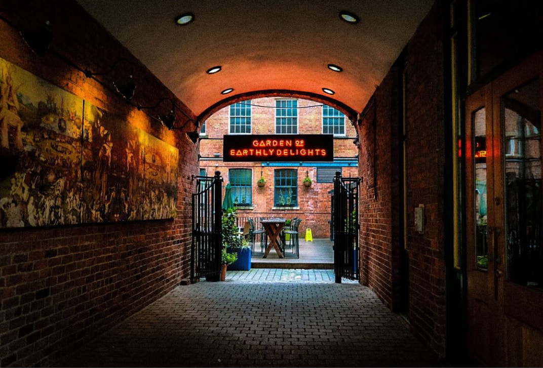
I was happy with how this turned out, as it took a different spin on the shoot and taught me that any subject can be captured in a positive light with the right colour grading and editing. This was useful knowledge to take forward in my project, as this can reflect someone's mindset.
META DATA
Image one: 1/60sec, f/20, ISO 2000
Image two: 1/70sec, f/5.6 ISO 200
Image three: 1/60sec, f/22, ISO 3200
Image four: 1/60sec, f/14, ISO 800
Image five: 1/320sec, f/5.6, ISO 200
Image six: 1/400, f/5.6, ISO 640
Image seven: 1/520, f/5.6, ISO 200
Image eight: 1/90sec, f/22, ISO 200
Image nine: 1/60sec, f/5.3, ISO 250
Image ten: 1/125, f/4.0, ISO 1600
HANGING PLAN
Although I was happy with all my outcomes, I decided to display my images as a set of six to have an intentional outcome and avoid repetition. I excluded the portrait images, as I believed that these didn't work as well with the set. With the remaining landscape images, to avoid repetition, I chose the images that I believed worked best. I selected these because I believed that they had the most architectural detail and interesting shadows compared to the others. When arranging these final images, I placed the warmest ones in the middle column to represent the light overshadowing the dark. Additionally, these images could be split into two categories: images of streets and images of individual structures. To create balance and an interesting contrast, I placed these opposite each other.
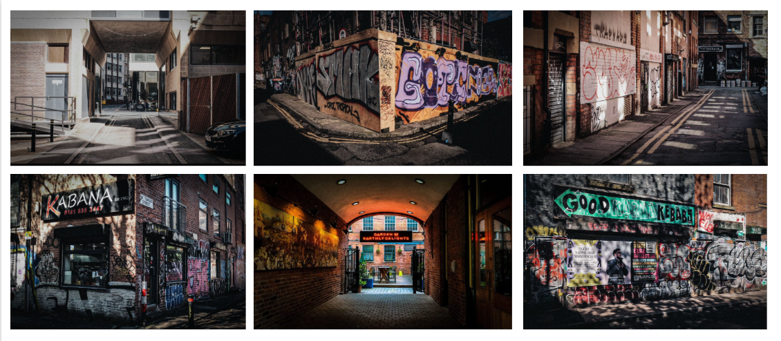
EVALUATION
Overall, I was happy with the outcome of this shoot. I liked how there was a strong variety between alleyways and individual buildings, and how the colours and locations reflected the mood. Moreover, I was happy with how the reflections and lighting made a strong tonal contrast, making a more visually interesting image. This shoot allowed me to use my knowledge on the importance of colour grading to set the mood, and it taught me, moving forward in my project, the importance of location and composition. If I were to improve going forward, I would experiment with adding a subject into the mix and using empty space to show this sense of isolation more.
DEVELOPMENT
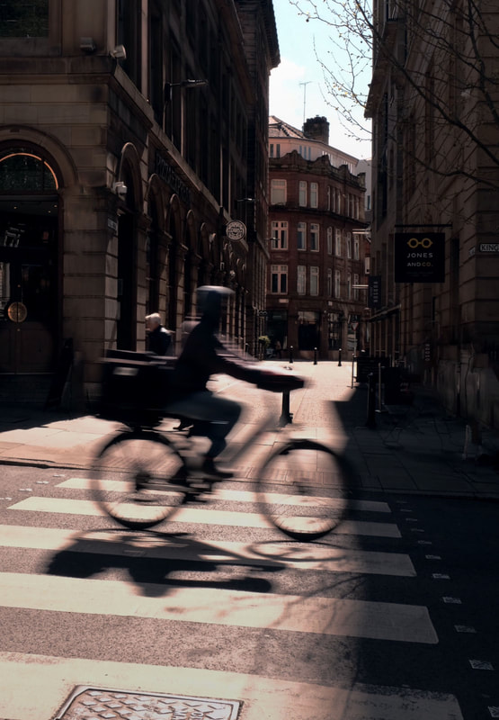
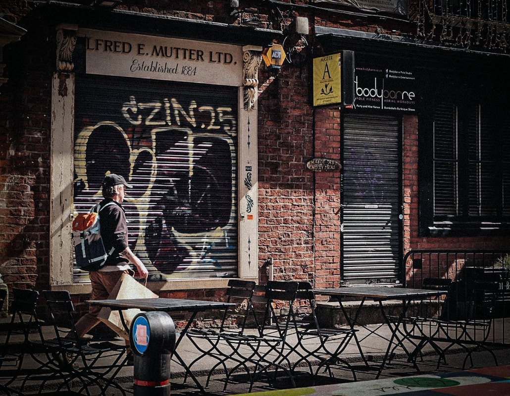
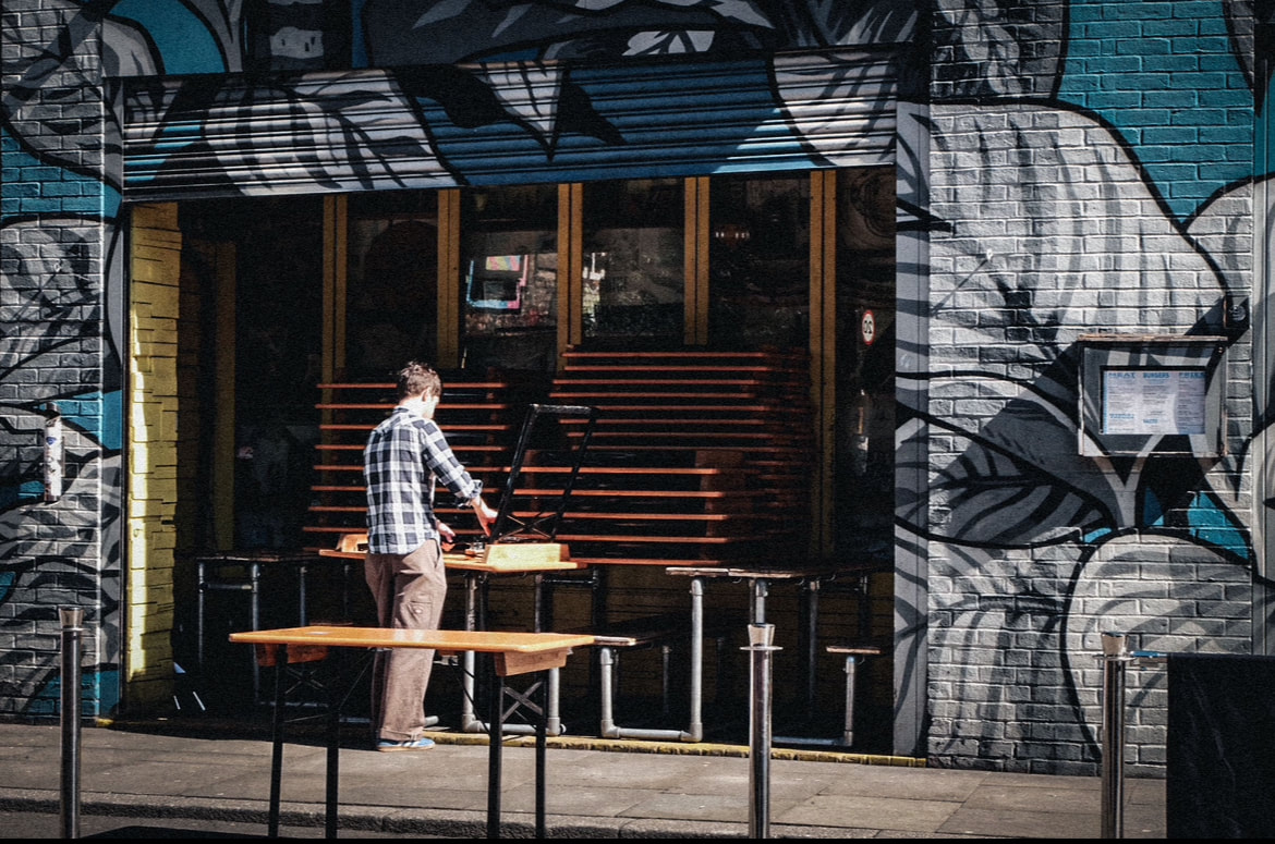
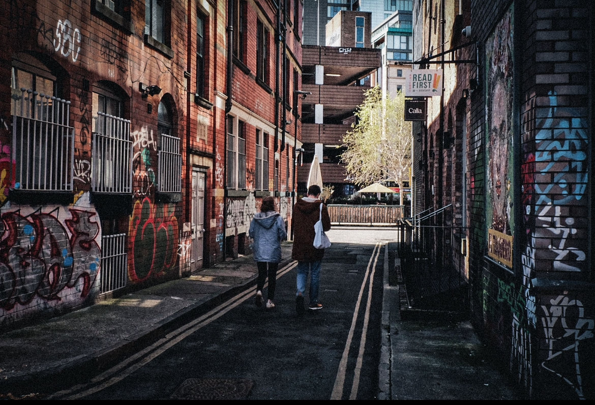
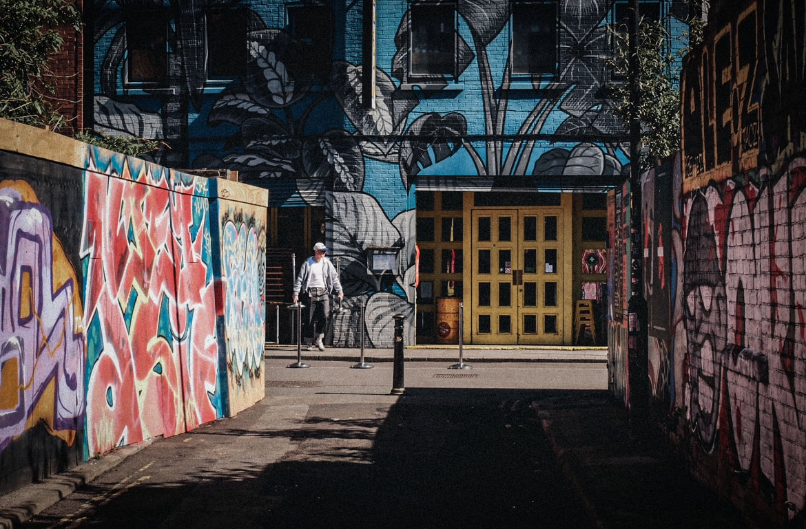
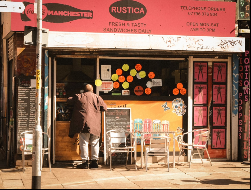
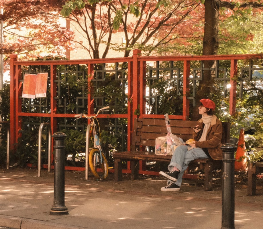
Now that I had explored empty spaces, I decided that I could develop this by capturing people in these run-down, quiet locations. However, not lots of people, but just one subject on their own, surrounded by space to demonstrate the feelings of isolation. This would be a useful experiment to see if having one subject or no people at all would be more poignant. Additionally, I realised in my last shoot that using light and colour can make any image more positive. I decided to put this to the test and do a few images that showed people being alone but in a positive light. I thought that this could make a strong contrast for my piece and show the journey of one's perspective changing.
PROCESS
Step one: Similarly to the last shoot, I travelled to cities and looked for these abandoned areas or just locations with interesting shadows.
Step two: I then waited with my camera for someone to turn up or for some kind of interesting action to happen, and then took the photograph at the perfect moment.
Step three: Once I was happy with these images, I opened them on to Photoshop and adjusted the colours based on what I wanted the effect to be. For example, for the positive images I increased the saturation.
CONTACT SHEETS
FINAL EDITS
NEGATIVE

POSITIVE
META DATA
Image one: 1/60sec, f/14, ISO 250
Image two: 1/60sec, f/20, ISO 1600
Image three: 1/250, f/5.6, ISO 200
Image four: 1/125sec, f/22, ISO 1250
Image five: 1/35sec, f/22, ISO 800
Image six: 1/60sec, f/22, ISO 320
Image seven: 1/200sec, f/5.6, ISO 200
Image eight: 1/125sec, f/20, ISO 4000
HANGING PLAN
Although I was happy with all my outcomes, I decided to display these images as a set of four. I excluded the portrait image as this didn't work as well with the set and would appear like an odd one out. With the remaining images, I wanted to have half positive and half negative to create a balance. I only had two warm images, so I included these, which left me to choose between the images with cooler tones. I settled on these two in the end as I thought that they complemented each other nicely, since they have similar architectural patterns and one is up close, with the other being further away.

EVALUATION
Overall, I was happy with the outcome of these images. I liked how adding a subject to the piece made it feel more raw and human, and I felt like I was capturing real moments in the city. I think this was more poignant than empty spaces, as it told more of a story and added a sense of humanity to the image. I was also happy with how the colours, backgrounds and lighting matched the mood of each piece and helped to bring it together perfectly. This shoot allowed me to bring together all the knowledge I had gathered so far on composition and use it to make the most effective image. It also taught me to capture moments in my photographs rather than just still images, developing my storytelling skills. If I were to improve moving forward, I would look for more variety with my subjects in terms of the types of activities they are doing.
FINAL PIECE
EXPLANATION OF IDEA
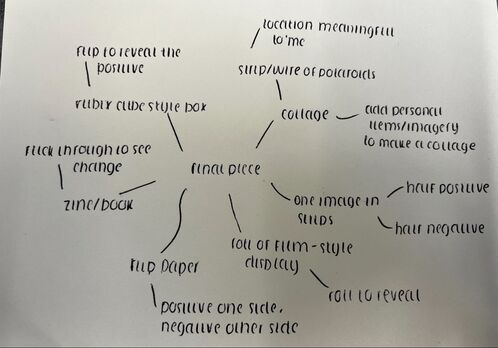
So far in this process, I have explored a negative and positive viewpoint of the world through photographing urban landscapes. However, so far, my images show them as entirely separate things, whereas I wanted my work to display a gradual process and show a story of a journey from one to the other. To achieve this, I needed to find a way to tie them together. As seen below, I thought about doing some kind of flipping image or combining the two. However, whilst this could have been good, it didn't feel gradual enough, as it still shows them as two completely different states. I concluded that the best way to display these images would be to make a collage. This way, you can see the journey whilst also seeing the bigger picture.

RESEARCH
WHAT IS A COLLAGE?
A photo collage is simply a piece of art created by assembling different photographs into one composition. Traditionally, this has been characterised by cutting and sticking pictures into visually pleasing shapes. However, as technology has advanced, this can even be done digitally by arranging the photos on digital software. At its core, the process simply involves selecting materials and images and arranging them into a unified picture. There are many ways that this can be done, but the general 'rule' is that the pictures should be in some way related and tell a story.
A BRIEF HISTORY OF COLLAGE
Despite all the modern technology that can make collage-making accessible, this art form has been around longer than one might imagine. Collaging dates back to 200 BC, when Japanese calligraphers glued bits of paper and fabric together to create paper for their poetry. Following this, artists began embellishing religious artworks with pieces of precious metal, gemstones and fibres. However, this became recognised as an art form and took off in the nineteenth century. This was when photos became a popular medium, and collage became widely considered as more of a craft than an art. This was explored by Hans Christian Andersen, who adopted this as an art form to illustrate his books.
WHY DO PHOTOGRAPHERS USE COLLAGE?
This poses an interesting question: why collage? Why not just take a singular image and call it a day? Well, collage has been widely renowned for providing a new way to interpret reality. As powerful as paintings and different art mediums are, they are merely a reproduction of reality. However, using objects in a collage brings these physical elements of reality into a piece. This explains why newspaper clippings were, and remain, so popular in collage. The texts in these add a precise meaning to the work and create reference to current events, helping to enhance the piece and add depth. This is why collages are so effective: they add extra layers and meaning to a piece that may be missed in a singular image. One image or painting can be effective by itself, but adding these extra details and materials can add context and enhance the piece, even making it more poignant and personal.
A FAMOUS EXAMPLE: PICASSO
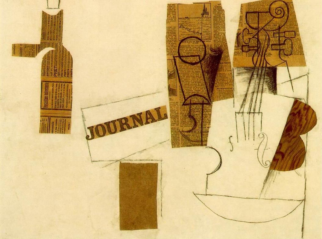
Although Picasso was not a photographer, it would be hard to mention this medium without giving credit to this artist. Picasso is perhaps one of the most renowned artists who used collage in much of his work and brought attention to this as an art form. As seen in the image below, by adding different materials and texts, Picasso was able to enhance his work, tell a story, and create direct links and references. Despite this piece being dated and linked to fine art, there is a lot to be learned from Picasso. Through exploring these early forms of collage, I have learned the importance of composition and the relevance of what I include. It is vital to be intentional with the images and materials that I choose to tell my story most effectively.
CREATING MY COLLAGE
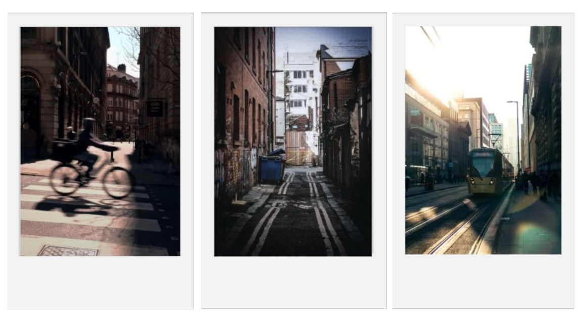
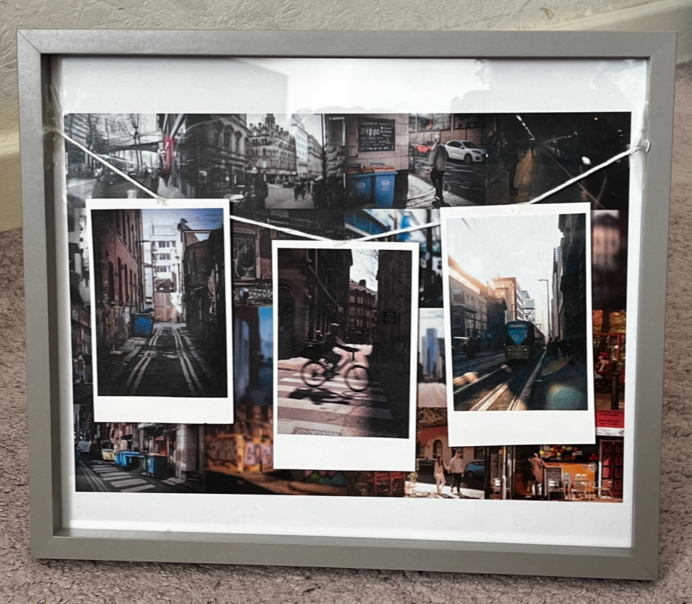
For my collage, I decided to make it more personal to add meaning and impact. So far in my project, I had explored a variety of different locations and areas. But there is one location that holds a special place in my heart, Manchester. Despite not being my home town, it has always felt that way. It's a city I have visited since I was a child, and made numerous memories with different people over the years, and it has seen all the different phases of my life. It was the first city I travelled to on my own, and since then, I have come to know it like the back of my hand. Rather than using a variety of different places for my final piece, I thought it would be most effective to focus on Manchester. Not only is this a meaningful location to me, but this would also create consistency and tell a more poignant story. I decided to show one's perspective changing by the way that they see the city shifting. To demonstrate this, I decided to make a collage in the background showing a gradual shift from negative to positive images. Alongside this, I decided to add a strip of three Polaroids to sum this up and show a simpler change. This is reflective of my journey falling in love with the city over the years and growing to appreciate it and notice all the small moments that make it so special.
ORGANISING THE PHOTOGRAPHS
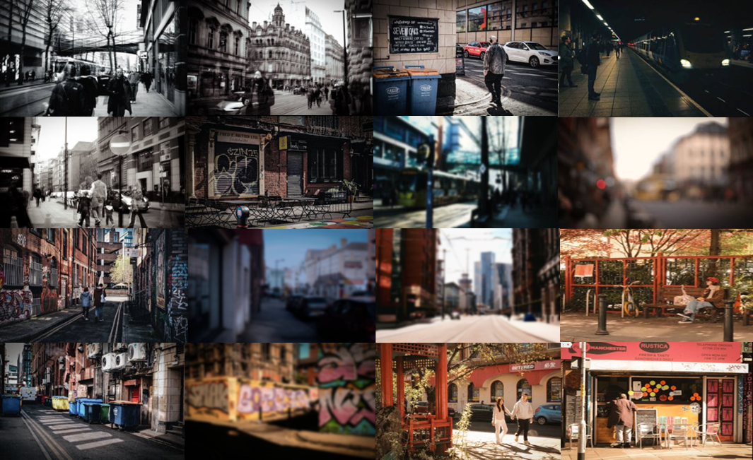
To make this collage most effective and show a gradual process, I had to organize my images intentionally. I wanted to create a smooth and subtle transition. As you can see below, the colours gradually change as it moves from left to right. They start completely black and white, then move into bleak, then into cool tones, before finally warming up and being fully saturated. Moreover, it is not only the colours that change. It goes from long exposure that feels hectic, dehumanising and overwhelming. Then, as the person withdraws, it moves to isolation before moving to complete empty space. Following this, when they completely can't see any good in their surroundings and reach their worst, it moves into a blur. After this turning point, it moves from blur with cool colours to blur with warm colours, showing them gradually feeling the good around them. Finally, it moves into full focus, and at the end, they start to notice the small, beautiful moments. This mirrors the 'isolation' seen earlier on, but instead of seeing it as lonely, they see it as beautiful, demonstrating their growth.
CREATING THE POLAROIDS
To create the Polaroids, I found a Polaroid template online. I then chose my desired images and opened them up with the template in Photoshop, layering these on the same document and aligning them to fit.
PUTTING IT ALL TOGETHER
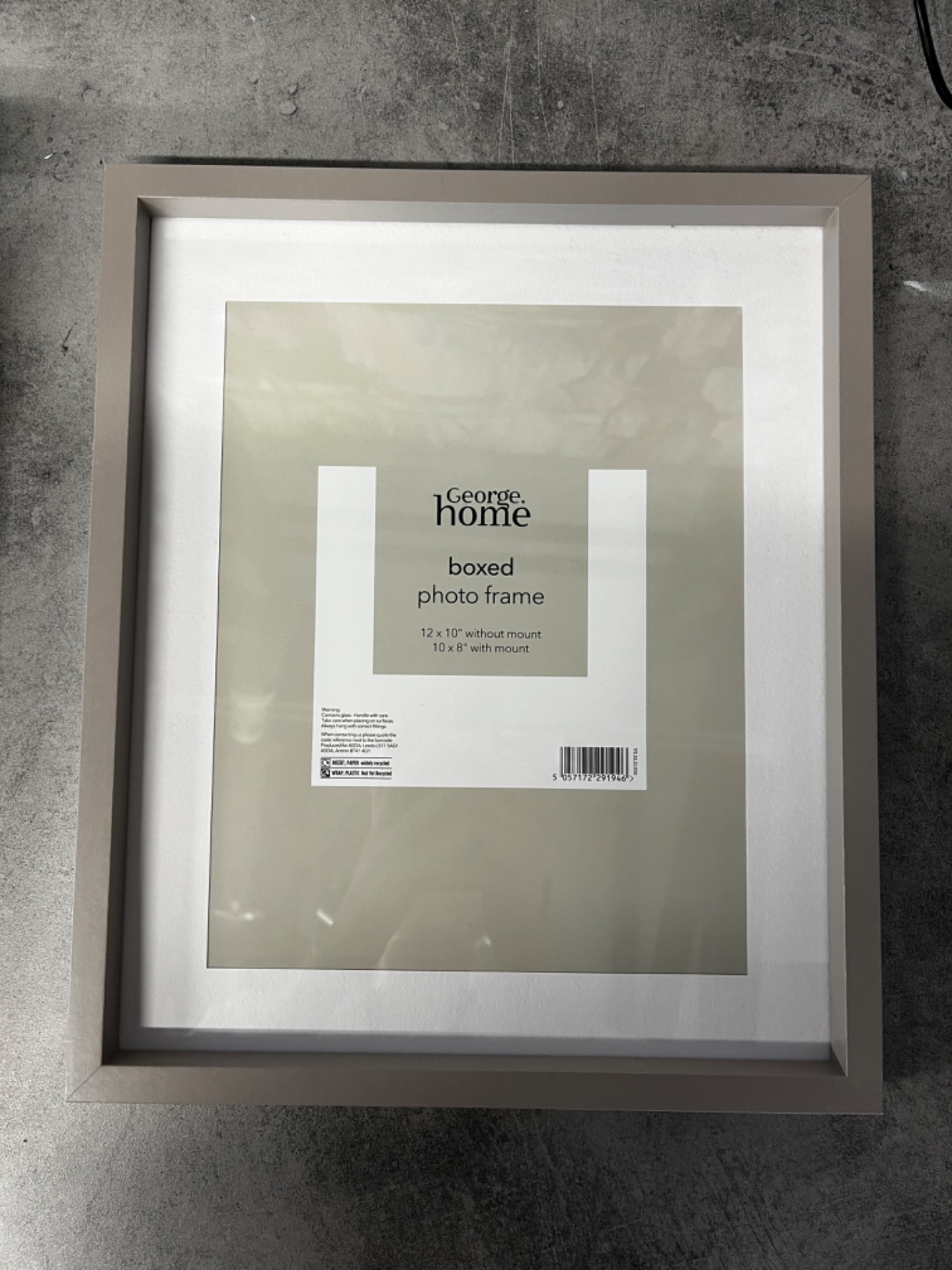
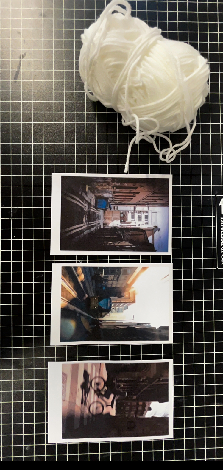
Once I had created everything, it was time to print it all off. Following this, I placed the collage inside a frame. I made sure to purchase a 'box frame' as this gave me space to attach the Polaroids on top with a piece of string.
THE FINAL PIECE
EVALUATION
Overall, I was happy with my final piece as I believe it was the perfect way to tie my project together. Being able to see the bigger picture and the gradual transition all in one made all of my shoots feel meaningful, as they all contributed to the wider outcome. I liked how the organisation of the photos created a smooth and seamless transition that slowly became warm and positive, as I thought that this helped to create a poignant piece. Moreover, I liked how the elements of collage with the Polaroids not only made my work feel more personal and meaningful, but also made the piece feel more visually interesting and gave it more depth. Since Manchester is such a meaningful location to me, it was nice to see a celebration of the city and of personal growth. If I were given the opportunity to improve or develop this, I would branch out and make it into a series, exploring different cities and people's perspectives changing through them.
FINAL EVALUATION
By choosing the theme of 'metamorphosis', I was able to explore a journey in my work and tell a story that matters. I believe that this project effectively reflects this theme as it shows a transformation, but one that feels raw and human, that a lot of people can relate to. When I first started the project, I wanted my work to help people feel seen and less alone in their journeys, and I believe that my outcome effectively creates that sense of hope and optimism that could hopefully speak to people. Not only has this project reflected the theme, but it has also allowed me to develop my creativity and photography in general. Before this project, I focused more on just capturing pictures, but through this, I have learned to capture moments and tell stories with my images. I have also discovered the importance of having a clear mood with a photograph and how to create that using colour and light. In general, this project has made me more aware of how each element can impact a photograph: from the composition, to the lighting, to the time of day, and how removing any of these can have a vast impact on the final piece. Knowing this will allow me to be aware of all of these factors moving forward, and use them intentionally to create the best outcomes. All of this knowledge has allowed me to develop a strong sense of style and voice in my work, which is something that I will continue to explore and develop in the future. To move on from this and improve further, I can consider taking photos from a range of different perspectives. I could even consider using specific people and their journeys as inspiration, and see how this could translate into a work of art.